Explore: The first steps with a new pattern (e.g., get info you need, take stock, smell checks).
Understand: Learning anything can involve asking questions (what kinds? How to actually translate to code? Interpreting outputs personally, may lead to more exploration).
Explain: How do we take the answers and rationalize with the investigations? That’s covered in this pattern. How to document to oneself, programmatic text for resilient reporting. This is really about talking to yourself, in a way.
Share: Communication and collaboration. We’ll show you ways you can make everything presentable and create outputs in a format that allows for easy consumption and feedback. An example: reordering plots or tables to make them easier to interpret.
In this chapter, we will look at the batch creation of plots. We endeavor to do it in a way that doesn’t require us to type out all the different options each and every time. We’ll do this by making functions that take in data and use ggplot under the hood. To get this going, a dataset will be explored and we’ll arbitrarily try out different forms of plotting and styling. Once we have plots that look good, the code will be developed into a reusable function. We want to have others be able to use that function consistently their own workflows, so, we’ll test it thoroughly before handing it off!
We’ll need a few packages loaded in for this chapter:
tidyverse: for various functions from dplyr, tidyr, and ggplot
intendo: for the dataset we’ll be using (all_sessions)
gt: for the pizzaplace dataset (not for table making)
patchwork: for arranging plots together in the most professional way imaginable
glue: for combining strings with the greatest of ease
12.1 Explore
Let’s grab some data from within the intendo package. This data package contains synthetic datasets that deal with activity and revenue from an online game. The dataset we want for our examples is called all_sessions and that’s accessed by using the all_sessions() function.
Let’s have a quick look at the dataset using dplyr’s glimpse() function. This gives us an idea of what’s contained in the dataset, even though we only see a small portion of it:
This dataset has lots of information on player sessions for an entire year. Our task is to create an effective visualization of player session length and revenue throughout the year. This will also our imagined stakeholders to make comparisons between engagement and revenue.
Because there is so much data that can be plotted we will summarize the data to daily means of session_duration, revenue from in-app purchases (rev_iap), and revenue from ad views (rev_ads). This will be done with a little bit of dplyr:
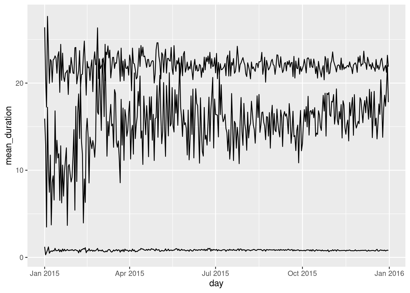
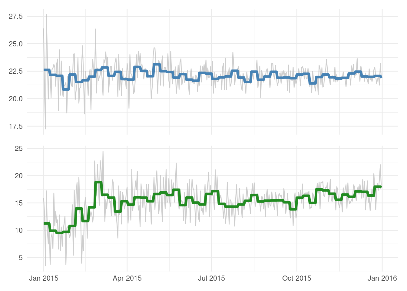
We want to develop a plot that shows the changes in these daily average over the entire 2015 year. We can start the process by making a basic plot with each of these variables having their own line:
session_revenue_summary|>ggplot()+geom_line(aes(x =day, y =mean_duration))+geom_line(aes(x =day, y =mean_rev_iap))+geom_line(aes(x =day, y =mean_rev_ads))
While this is definitely not what we’d want as a final plot, it can certainly serve as a good exploratory plot. Two things are important to note:
duration and revenue lines shouldn’t belong on the same y axis
the lowest of the three lines (representing mean_rev_ads) is small and probably insignificant
With both of these things in mind, we probably ought to split the visualization to show two plots: one for session duration and the other for daily revenue. Since ad revenue is small compared to revenue from in-app purchases (and fairly unchanging throughout the year), we could safely omit that from any future plotting.
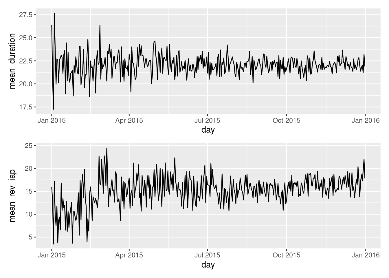
The x axis is common to both the mean_duration and mean_rev_iap values that we’ll carry forward. Owing to that, it makes sense to stack the plots vertically so that we can easily compare session duration and revenue values for the same time range. How do we do this? One great solution involves using the patchwork package.
mean_duration_plt<-ggplot(session_revenue_summary)+geom_line(aes(x =day, y =mean_duration))mean_rev_iap_plt<-ggplot(session_revenue_summary)+geom_line(aes(x =day, y =mean_rev_iap))session_revenue_summary_plt<-mean_duration_plt/mean_rev_iap_pltsession_revenue_summary_plt
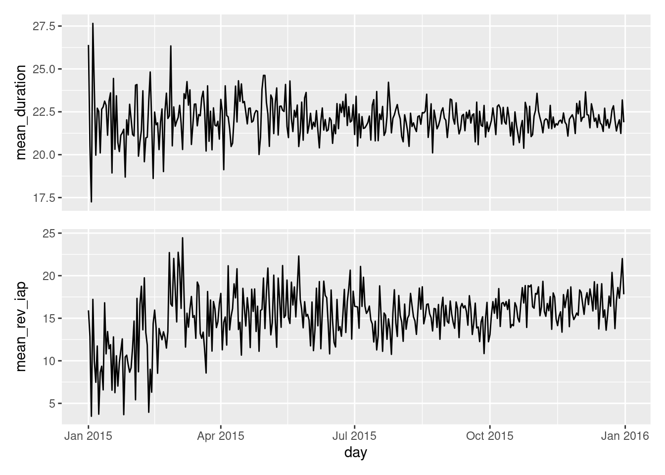
This looks a bit closer to what we need! We now can see these two plots are perfectly stacked such that the x-axis ticks line up vertically across both plots, regardless of what labeling is on the y axes. Because of this concordance, we might find that the x-axis labels don’t need to be seen twice. So, let’s remove all labels and tick marks from the upper plot.
mean_duration_plt<-ggplot(session_revenue_summary)+geom_line(aes(x =day, y =mean_duration))+theme( axis.ticks.x =element_blank(), axis.text.x =element_blank(), axis.title.x =element_blank())mean_rev_iap_plt<-ggplot(session_revenue_summary)+geom_line(aes(x =day, y =mean_rev_iap))session_revenue_summary_plt<-mean_duration_plt/mean_rev_iap_pltsession_revenue_summary_plt
With that bit of plotting code, we’ve eliminated the unnecessary repetition of the x-axis ticks, text, and title.
12.2 Understand
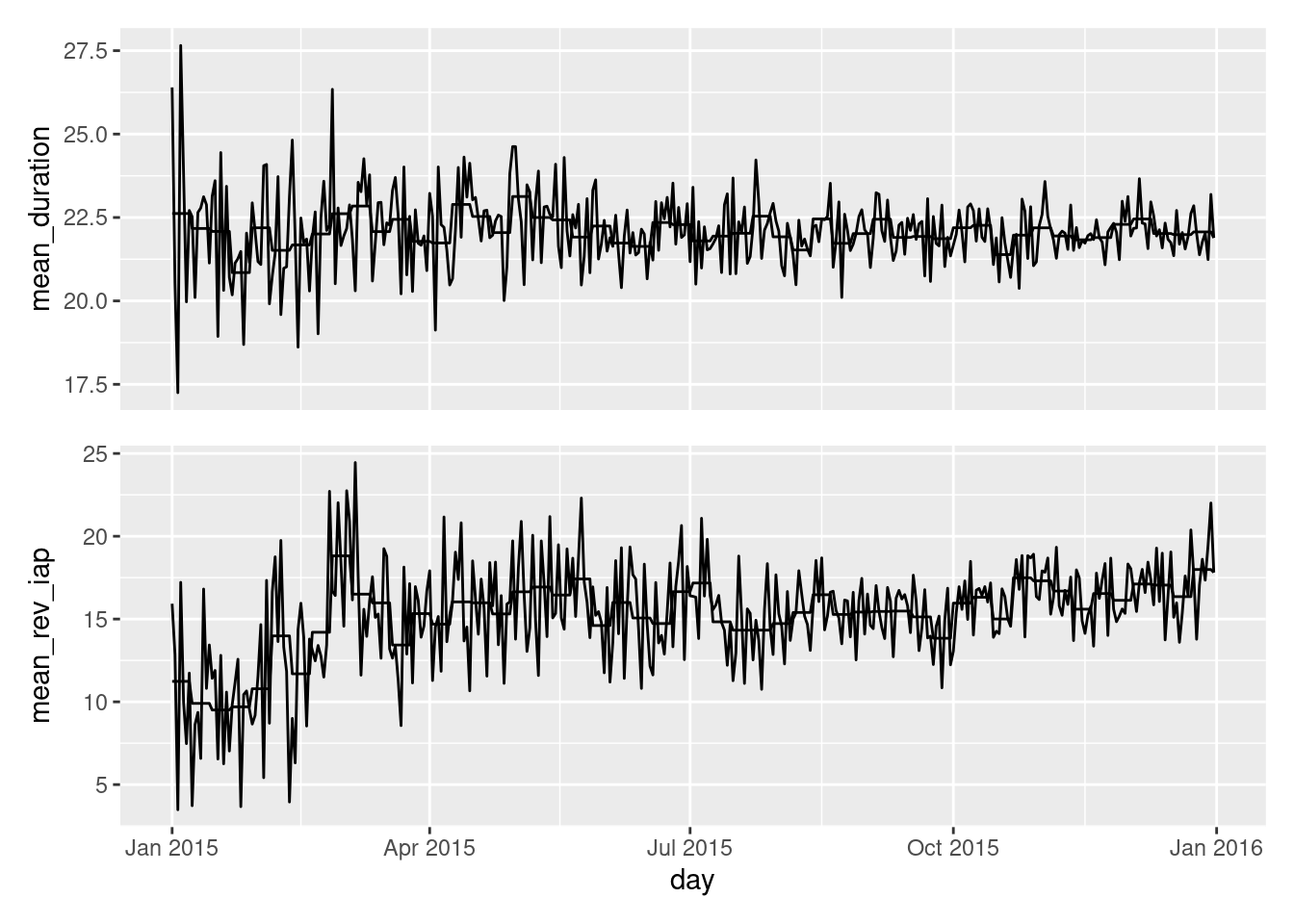
Now that we have the basic structuring of the two plots now in place, it would be interesting to plot average value lines for each of the plots. A good way to divide them up is by week. To do this, we need to go back to the session_revenue_summary table and make changes so that we have that data in separate columns (one for session duration and the other for revenue).
In the above dplyr code, we are taking means of means. We needed first to have the week number in a new column, and lubridate’s week() function is perfect for that. Then, the next key combination was the use of group_by() and then mutate(). This lets us adds new columns of summarized data that belongs to each week category.
Now we can plot again, adding in the weekly average lines as separate layers via additional geom_line() statements:
mean_duration_plt<-ggplot(session_revenue_summary)+geom_line(aes(x =day, y =mean_duration))+geom_line(aes(x =day, y =mean_duration_wk))+theme( axis.ticks.x =element_blank(), axis.text.x =element_blank(), axis.title.x =element_blank())mean_rev_iap_plt<-ggplot(session_revenue_summary)+geom_line(aes(x =day, y =mean_rev_iap))+geom_line(aes(x =day, y =mean_rev_iap_wk))session_revenue_summary_plt<-mean_duration_plt/mean_rev_iap_pltsession_revenue_summary_plt
The weekly average lines are now in the plots, so, this is progress! The next things to be done are to package this up in a better visualization, one that is better understood by others.
12.3 Explain
We need to style this combined set of plots so that the results are more easily explainable to others. It all begins with a set of requirements though, so let’s think through what was not so good in the previous plot and what would be great in a highly-presentable plot. We’ll start with the good and then dwell on the parts that need improvement.
Good
the stacking of plots and distance apart
the x values are lined up perfectly across both plots (thanks, patchwork!)
the shared x-axis and the nicely-formatted labels on that axis
the y-axis values are also good
Bad
the lines are all the same color (four lines across two plots)
on each plot, it’s hard to tell the lines apart (again, same color)
it’s pretty obvious that the x axis is time, don’t need a label for it
the y-axis labels are technical and a bit boring
we don’t have a title or a subtitle describing the data
it would be nice to know the data source from a simple note, but we don’t have that either
With this critique of the table we find slightly more bad than good things, however, we can address all the badness with a few tweaks and a little bit of good taste. We got this.
So let’s lay out a plan for how this can be improved. First off, those lines… we need some color here. The bottom plot could have a green line (it’s money after all), and, the top line could be blue in color (always a safe bet and oh so calming). But, there are two lines per plot; which one is the important one? Most likely, it is the weekly average line (and not the fast moving daily data trace). Let’s diminish the latter and emphasize the former.
That thinking on ‘linework’ was the most important change we could make since it is what people looking at the plot will inevitably focus on the most. It doesn’t mean the other negatives needn’t be addressed! While the rest of the changes aren’t as radical, they are still important. We’ll clean up the axis labels, add the appropriate titling and captioning, and use a minimalistic theme so that the data will pop (out to the viewer). Okay, here comes attempt #2:
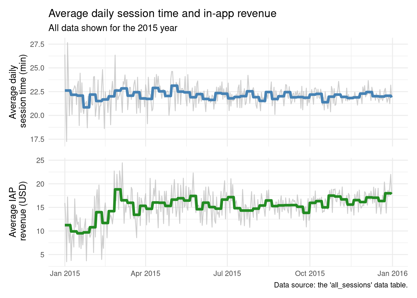
mean_duration_plt<-ggplot(session_revenue_summary)+geom_line(aes(x =day, y =mean_duration), color ="gray", alpha =0.75)+geom_line(aes(x =day, y =mean_duration_wk), color ="steelblue", linewidth =1.5)+labs( title ="Average daily session time and in-app revenue", subtitle ="All data shown for the 2015 year", x =NULL, y ="Average daily\n session time (min)")+theme_minimal()+theme( axis.ticks.x =element_blank(), axis.text.x =element_blank(), axis.title.x =element_blank())mean_rev_iap_plt<-ggplot(session_revenue_summary)+geom_line(aes(x =day, y =mean_rev_iap), color ="gray", alpha =0.75)+geom_line(aes(x =day, y =mean_rev_iap_wk), color ="forestgreen", linewidth =1.5)+labs( caption ="Data source: the 'all_sessions' data table.", x =NULL, y ="Average IAP\n revenue (USD)")+theme_minimal()session_revenue_summary_plt<-mean_duration_plt/mean_rev_iap_pltsession_revenue_summary_plt
This plot definitely something that is much more presentable to others! I like how the weekly-average data lines overlay the daily values in a substantial way. Those daily values are still in the mix but those volatile lines are subdued, made secondary. We can clearly see that average daily session time is pretty much always the same and the average daily revenue initially climbed to a somewhat steady state and is perhaps slowly increasing during the course of the year. The titles are descriptive but succinct, telling you exactly what you’re looking at. The y-axis titles let you know which plot is which and what units the numbers have (minutes and U.S. Dollars).
This is something that could be shared. But one thing that would make this more amenable to sharing (and sharing more often) would be wrapping this all into a reusable function. Your collegues can learn from the code used within that, they could re-use that function, and they might even use it as inspiration to build more functions with beautiful plots. In the next section, we’ll do the thing where we make a function from this code, allowing for different time spans to be chosen.
12.4 Share
Sharing code is often very important. We can do that with packages but just as easily do it in a low-key way by sharing R scripts. Let’s go part way to making that shareable script by re-working the code developed earlier into a reusable function.
Let’s go with the idea of providing a general function that makes a top-and-bottom time-series plot (with daily values). You can provide two traces for each plot, and the only condition is that you use a single table with a "Date"-type column. The colors used have default values, but you can tweak them to your liking.
The way to do this is to copy the existing, working code into the new function body and replace the existing variable names with general names. In this general function, session_revenue_summary becomes data_tbl, and mean_duration_plt becomes plot_1 (among other changes). The convention will be that plot_1_... refers to the top plot and plot_2_... is the bottom plot. Here’s the function, called daily_plot_two().
daily_plot_two<-function(data_tbl,date_col,plot_1_y,plot_2_y,plot_1_y_sec,plot_2_y_sec,plot_1_color="steelblue",plot_2_color="forestgreen",title=NULL,subtitle=NULL,caption=NULL,x_title=NULL,plot_1_y_title=NULL,plot_2_y_title=NULL){plot_1<-ggplot(data_tbl)+geom_line(aes(x ={{date_col}}, y ={{plot_1_y_sec}}), color ="gray", alpha =0.75)+geom_line(aes(x ={{date_col}}, y ={{plot_1_y}}), color =plot_1_color, linewidth =1.5)+labs( title =title, subtitle =subtitle, x =NULL, y =plot_1_y_title)+theme_minimal()+theme( axis.ticks.x =element_blank(), axis.text.x =element_blank(), axis.title.x =element_blank())plot_2<-ggplot(data_tbl)+geom_line(aes(x ={{date_col}}, y ={{plot_2_y_sec}}), color ="gray", alpha =0.75)+geom_line(aes(x ={{date_col}}, y ={{plot_2_y}}), color =plot_2_color, linewidth =1.5)+labs( caption =caption, x =x_title, y =plot_2_y_title)+theme_minimal()plot_1/plot_2}
It has six required parameters:
data_tbl: the data table that contains a date column and four other columns with values to plot.
date_col: the name of the column containing the date values.
plot_1_y: the main data values for the top plot.
plot_2_y: the main data values for the bottom plot.
plot_1_y_sec: the secondary data values for the top plot.
plot_2_y_sec: the secondary data values for the bottom plot.
We need to use the rlang embracing scheme to inject bare column names into the ggplot expression. We embrace with: {{ and }}, and, for more information on this check out the rlang data-masking article. Because that’s all in place we can test out daily_plot_two with the session_revenue_summary table and the same column names as used in the earlier statements that made the plot:
It works! Notice we don’t really have much in the way of titles/text in the produced plot. That’s totally intentional. In a general plotting function, we can’t really know anything about which titles to use. The following optional arguments allow the person that you’re sharing the function with to add in the titles:
title: The title for the collection of plots.
subtitle: The subtitle for the collection of plots.
caption: The caption for the collection of plots (appears bottom right).
x_title: The x-axis title (wasn’t used in original plot)
plot_1_y_title: The y-axis title for the top plot.
plot_2_y_title: The y-axis title for the bottom plot.
In the interest of further testing the daily_plot_two() function, we can add the same titles as in the original visualization and check that everything is faithfully reproduced:
daily_plot_two( data_tbl =session_revenue_summary, date_col =day, plot_1_y =mean_duration_wk, plot_2_y =mean_rev_iap_wk, plot_1_y_sec =mean_duration, plot_2_y_sec =mean_rev_iap, title ="Average daily session time and in-app revenue", subtitle ="All data shown for the 2015 year", caption ="Data source: the 'all_sessions' data table.", plot_1_y_title ="Average daily\n session time (min)", plot_2_y_title ="Average IAP\n revenue (USD)")
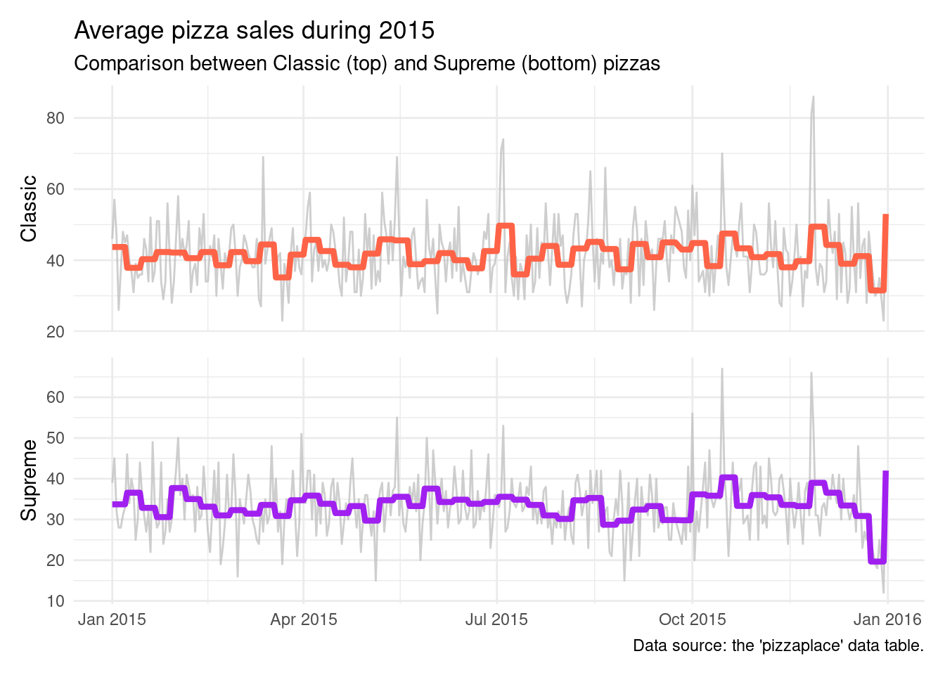
It is. Which is wonderful to see. Now it just makes sense to see if this function works for other data tables as a sort of final QA/QC task. But what data? Well, we could use the pizzaplace dataset from the gt package. Interestingly enough, it also has data throughout the year of 2015. Let’s manipulate that dataset and use daily_plot_two() to plot the data. The pizza analytics here involves the comparison of pizza sales between the "classic" and "supreme" group. Here’s all of the dplyr and tidyr work needed to get a table pizzas sold by day and the average daily sales per week:
Now, let’s use that table with the daily_plot_two() function. We’ll even change up the colors used in the two plots:
daily_plot_two( data_tbl =pizza_sales_summary, date_col =date, plot_1_y =mean_daily_per_wk_classic, plot_2_y =mean_daily_per_wk_supreme, plot_1_y_sec =n_sold_day_classic, plot_2_y_sec =n_sold_day_supreme, plot_1_color ="tomato", plot_2_color ="purple", title ="Average pizza sales during 2015", subtitle ="Comparison between Classic (top) and Supreme (bottom) pizzas", caption ="Data source: the 'pizzaplace' data table.", plot_1_y_title ="Classic", plot_2_y_title ="Supreme")
That we get a usable plot with the newly-crafted daily_plot_two() with entirely different data is so good to see. And it looks like the pizzas from "classic" pizza group has an edge over those pizzas from the "supreme" group.