Making lollipop plots, Cleveland dot plots, and scatter plots
Plotting distributions with histograms, box plots, violin plots, density plots, and ridgeline plots
Customizing plot axes so that you can express these important plot elements to your own specifications
Labeling interesting aspects of a plot with annotations
Effective uses of color in plots
In the last section we focused on using ggplot to make line graphs and bar plots. That set the stage to having a closer look at customizing the plots until they were both aesthetically pleasing and presentation ready. In this section, we’ll revisit scatter plots, histograms, box plots, and possibly some you hadn’t heard of before. For those plots that ggplot just can’t do, there are other packages available that extend ggplot for those tasks (and we’ll use one called ggridges to make ridgeline plots). The examples in this section will expose you to new ggplot functions for customizing of plot elements such the axes and legends, and there will be more functions introduced for modifying the colors of plot objects.
In the many examples that follow, we’ll use datasets provided in the dspatterns package. One of them was used before (nycweather) but the imdb and pitchfork datasets are new in this section and great fun to use! You can find out more about them within R by visiting their documentation pages (help(imdb) or help(pitchfork)).
G.1 Lollipop Plots and Cleveland Dot Plots
This section will introduce you to two hybrid plotting types: lollipop plots and Cleveland dot plots. If you squint a bit lollipop plots can look a bit like a plot made up of lollipops. It’s most like a bar plot except that it’s made up of dot and a connecting line. It can be an aesthetically pleasing alternative to the bar plot because the overall amount of ink is less. The dot can be given a color conveys some specialized meaning and could be brighter without having to assault the reader with large swathes of it. The Cleveland dot plot is a variation on the lollipop plot and it’s composed of double-sided lollipops, which makes it useful for conveying range information.
We used the nyc_weather dataset previously and we’ll use it again for all lollipop plots and Cleveland dot plots in this section. The dataset has 2010 weather data obtained at LaGuardia Airport, with metrics such as wind direction, wind speed, temperature, pressure, and relative humidity. A preview of nyc_weather is provided by using the dplyrglimpse() function:
The first thing we’ll do is create a summarized dataset based on nycweather. This will involve using functions from the dplyr, tidyr, and forcats packages. What we obtain from this is four values per month in 2010: (1) minimum temperature in month ("min_temp"), (2) maximum temperature in month ("max_temp"), (3) median of minimum daily temperatures in month ("median_min_temp"), and (4) median of maximum daily temperatures in month ("median_max_temp"). The ordering of factor levels for these value types are: "min_temp", "median_min_temp", "median_max_temp", and "max_temp" (in order of lowest to highest temperature values).
Transforming data in the nycweather dataset so that there are monthly summaries of high and low temperatures.
# A tibble: 48 × 3
   month    name             value
   <ord>    <fct>            <dbl>
 1 January  min_temp        -10
 2 January  median_min_temp  -2.8
 3 January  median_max_temp   3.9
 4 January  max_temp         12
 5 February min_temp         -8.3
 6 February median_min_temp  -2.2
 7 February median_max_temp   3.05
 8 February max_temp          7.8
 9 March    min_temp         -1.7
10 March    median_min_temp   5.6
# ℹ 38 more rows
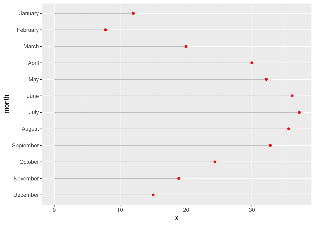
Now that the nyc_highlow_temps table is ready to use, let’s make a lollipop plot! This type of plot will use one of the value types in nyc_highlow_temps: "max_temp". The combination of ggplot geoms to use involves the geom_segment() and geom_point() functions. Order is important here, if the statements are reversed then the line segments will partially overlap the points. The choice which columns are passed to the x and y aesthetics determines whether this will be a horizontal or a vertical lollipop plot. Let’s opt for a plot of the horizontal variety and map value to x and month to y in geom_point(). There are four required aesthetics for geom_segment(): x, xend, y, and yend.
Creating a basic lollipop plot with data from nyc_highlow_temps.
nyc_highlow_temps|>dplyr::filter(name=="max_temp")|>ggplot()+geom_segment(aes(x =0, xend =value, y =month, yend =month), color ="gray75")+geom_point(aes(x =value, y =month), color ="red")
Figure G.1: A basic lollipop plot using temperature data.
Our lollipop plot looks pretty good! Depending on whether you are personally taken to it, you might use it in your own plotting work and improve upon what’s shown above.
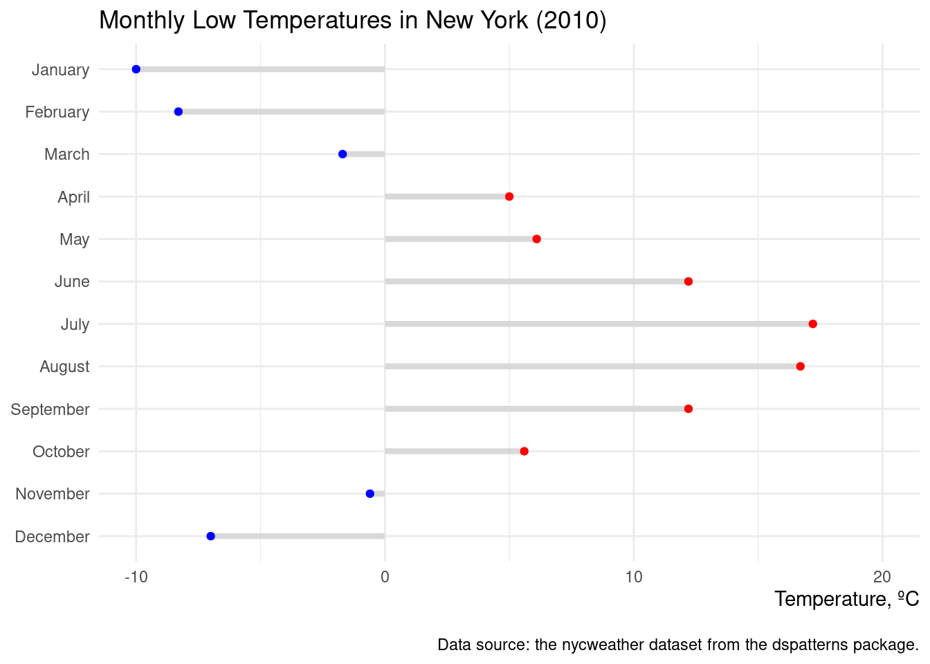
Let’s try making another lollipop plot, this time with positive and negative values that will have an effect on the color of the points. We start this off by creating the side column though a mutate() statement. We can either have "negative" or "positive" and those values are factor values. An extra aesthetic is now given to geom_point()’s aes() statement (color = side). We then manually set the colors of the points using scale_color_manual() with values of "blue" and then "red" (representing cold and warm temps).
Creating a more sophisticated lollipop plot using specific colors on the points (blue and red, for below and above zero degrees Celsius).
nyc_highlow_temps|>dplyr::filter(name=="min_temp")|>mutate( side =if_else(value<=0, "negative", "positive")|>as.factor())|>ggplot()+geom_segment(aes(x =0, xend =value, y =month, yend =month), color ="gray85", linewidth =1.5)+geom_point(aes(x =value, y =month, color =side), show.legend =FALSE)+scale_color_manual(values =c("blue", "red"))+coord_cartesian(xlim =c(-10, 20))+labs( title ="Monthly Low Temperatures in New York (2010)", caption ="\nData source: the nycweather dataset from the dspatterns package.", x ="Temperature, ºC", y =NULL)+theme_minimal()+theme(axis.title.x =element_text(hjust =1))
Figure G.2: A lollipop plot that demonstrates different colors for values that cross a threshold.
This lollipop plot indeed looks very nice. That extra bit of color helps us to quickly distinguish between the very cold lows and those not so cold lows. Some additional tricks were employed in the ggplot code and I think you should know about them. The first is the usage of show.legend = FALSE in geom_point(). This deactivates the automatically generated legend and it’s a useful alternative to using legend.position = "none" in theme(). Did you notice the line axis.title.x = element_text(hjust = 1) in theme()? What that does is right-align the x-axis title, which looks pretty smart. Sometimes, to me anyway, the caption text appears a bit too close to the plot panel. It was brought down a small amount by using \n at the beginning of the caption text.
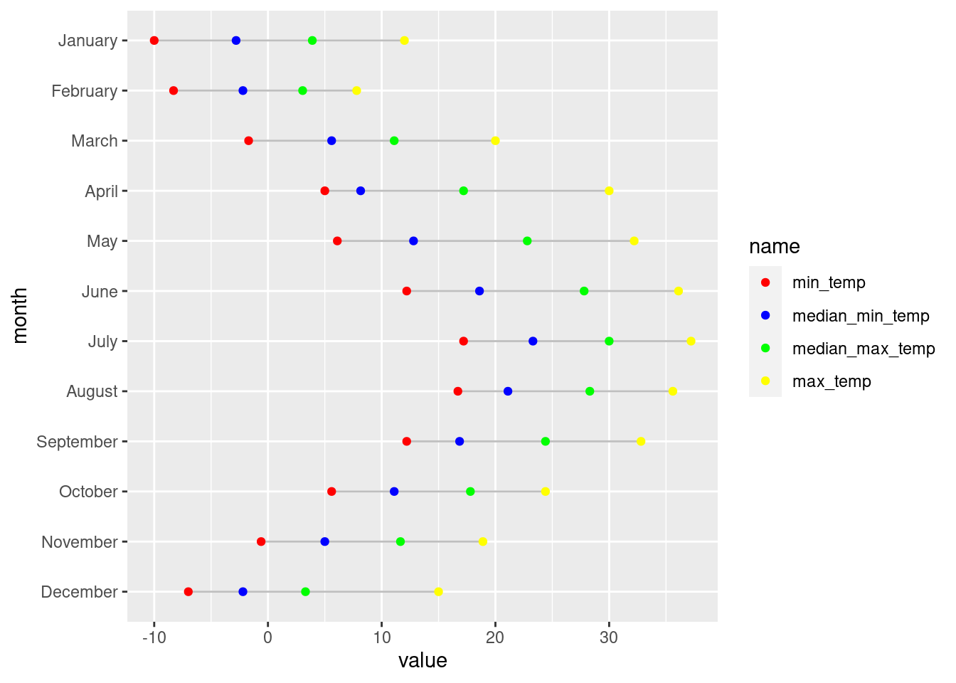
Now it’s time to make a Cleveland dot plot. We’ll actually make two: one with just the basics, and the second will be decked out with well-considered customizations. The big difference between this type of plot and the lollipop plot is the use of geom_line() instead of geom_segment(). We’ll use the nyc_highlow_temps data without any filtering and apply some manual colors (via scale_color_manual()) to the four dots that each line encompasses. The following code listing has the code to make the plot.
Creating a basic Cleveland dot plot with nyc_highlow_temps.
nyc_highlow_temps|>ggplot(aes(x =value, y =month))+geom_line(color ="gray75")+geom_point(aes(color =name))+scale_color_manual(values =c("red", "blue", "green", "yellow"))
Figure G.3: A Cleveland dot plot that incorporates four dots per line.
We can see from the plot, this Cleveland dot plot, that all the dots are arranged properly on the horizontal lines. In other words, the plot looks technically correct and makes perfect sense (July was statistically the warmest month in New York in 2010). Of course, in our second iteration of this plot, things will look a lot better. We’ll use better colors, a theme, a number of theme options, better scales and labels, the works. Is it all worth it? Take a look at the plot below, I think you’ll find the extra lines of ggplot code to be worthwhile.
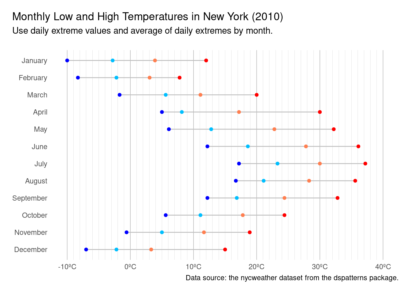
A Cleveland dot plot with more meaningful colors for the points, and, extra touches to make the plot look really nice.
nyc_highlow_temps|>mutate(color =case_when(name=="min_temp"~"blue",name=="median_min_temp"~"deepskyblue",name=="median_max_temp"~"coral",name=="max_temp"~"red"))|>ggplot(aes(x =value, y =month))+geom_line(color ="gray75")+geom_point(aes(color =color))+scale_color_identity(guide ="none")+scale_x_continuous( labels =scales::number_format(suffix ="ºC"), limits =c(-10, 40), minor_breaks =seq(-10, 40, 1))+labs( title ="Monthly Low and High Temperatures in New York (2010)", subtitle ="Use daily extreme values and average of daily extremes by month.\n", caption ="Data source: the nycweather dataset from the dspatterns package.", x =NULL, y =NULL)+theme_minimal()+theme( legend.position ="bottom", plot.title.position ="plot", plot.caption.position ="plot", panel.grid.major.y =element_blank(), panel.grid.major.x =element_line(color ="gray60", linewidth =1/5), panel.grid.minor.x =element_line(color ="gray80", linewidth =1/10), plot.margin =unit(c(15, 15, 15, 15), "pt"))
Figure G.4: A finalized version of a Cleveland dot that is presentation ready.
The additional ggplot code reduced the number of horizontal lines in the plot. In that way, there is less interference with the lines of the Cleveland plot. The amount of vertical lines was actually increased from the default (with a line for every degree). However, the minor gridlines are made to appear very thin and are light in color. It would actually be quite reasonable to further lighten the vertical grid lines. Axis titles are removed because the it’s pretty obvious what the axes represent.
The use of scale_color_identity() is new. What that does is use colors available in your dataset. The second statement in the above code listing is a mutate() call that generates color names based on a dplyrcase_when() statement. This was included to introduce the concept and process of generating color names ahead of plotting, and, it can be a really useful technique for those times when the best choice of color values might rely on specific conditions in your data.
While these examples of lollipop plots and Cleveland dot plots are limited, there is so much potential for excellent-looking plots of these types. These would look great in facets and there is a great deal that can be done to further spice up a plot (e.g., varying the appearance of the dots and the line segments).
G.2 Creating Effective Scatter Plots
Way back in this Appendix we were introduced to the ggplot package and we worked with scatter plots. Lots of scatter plots (we really did nothing but scatter plots). I suppose they are good way to be introduced to plotting with ggplot and it was probably a good idea not to lose focus by introducing a smorgasbord of plot types all at once. Here now, we are revisiting the scatter plot because it is such an important plot type. Whenever you need to compare two numeric variables across multiple observations—and, connecting the data points with lines makes no intrinsic sense—a scatter plot is recommended. They are powerful because they can be used to observe relationships between variables. The points within a scatter plot not only allow us to report the values of individual observations but, taken as a whole, interesting patterns can emerge. Such relationships between the variables used can be described in quite a few ways (e.g., linear or nonlinear, strong or weak, positive or negative, etc.). Given the importance of these plots, let’s do some more work with ggplot’s geom_point() function and learn some new ways to prepare and present scatter plots.
At least we won’t recycle a previously used dataset for this second look at scatter plots. The imdb dataset, part of the dspatterns package, contains quite a few rows (2,607), all the more to scatter about. Each row represents a movie (title) with complete information on year of release (year), its IMDB rating (score), its budget, and its gross earnings (gross). Using glimpse(imdb), we get a preview of the dataset.
Let’s make a scatter plot with the imdb data. There are a few metrics that can be compared but since space is limited, let’s go with score on the x axis and gross on the y axis (and we’ll take a selection of movies released between 2005 to 2015). Do movies’ earnings have much to do with their average rating on IMDB? We’re about to find out in four lines of ggplot code:
A scatter plot with 2005-2015 data from the imdb dataset.
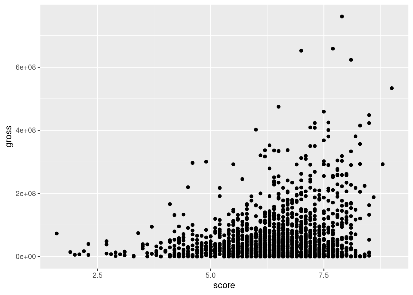
imdb|>filter(year%in%2005:2015)|>ggplot(aes(x =score, y =gross))+geom_point()
Figure G.5: A basic scatter plot that uses movie revenue versus IDMB ratings.
Our scatter plot shows us a few things. Wildly successful movies have pretty good IMDB ratings. For those movies earning above $400M, the score is usually not lower than 7. Also, for the most part, movies with an IMDB rating less than 5 didn’t earn more than $100M. For thousands of movies though, there’s no strong connection between the IMDB rating and earnings.
In terms of plot quality, there’s an awful lot of overplotting. Not only that, but many of the movies’ gross earnings are in the same narrow region while some very high earners pushed the y axis upper limit far above this narrow band. A common strategy for alleviating this is to redefine a plot scale to suit the distribution of data. In this case, we’ll transform the y-axis scale to a log scale. First, let’s transform the data by applying the same filtering operation as before and by transforming the year variable to a factor (where the order of levels is descending by year). In doing this, we obtain the imdb_filtered dataset:
Transforming the imdb dataset for the plot by filtering the years of movies and setting up the year variable as a factor.
# A tibble: 1,804 × 5
   title                                    year  score    budget     gross
   <chr>                                    <fct> <dbl>     <dbl>     <dbl>
 1 Avatar                                   2010    7.9 237000000 760505847
 2 Pirates of the Caribbean: At World's End 2007    7.1 300000000 309404152
 3 The Dark Knight Rises                    2012    8.5 250000000 448130642
 4 John Carter                              2012    6.6 263700000  73058679
 5 Spider-Man 3                             2007    6.2 258000000 336530303
 6 Tangled                                  2011    7.8 260000000 200807262
 7 Avengers: Age of Ultron                  2015    7.5 250000000 458991599
 8 Harry Potter and the Half-Blood Prince   2009    7.5 250000000 301956980
 9 Superman Returns                         2006    6.1 209000000 200069408
10 Quantum of Solace                        2009    6.7 200000000 168368427
# ℹ 1,794 more rows
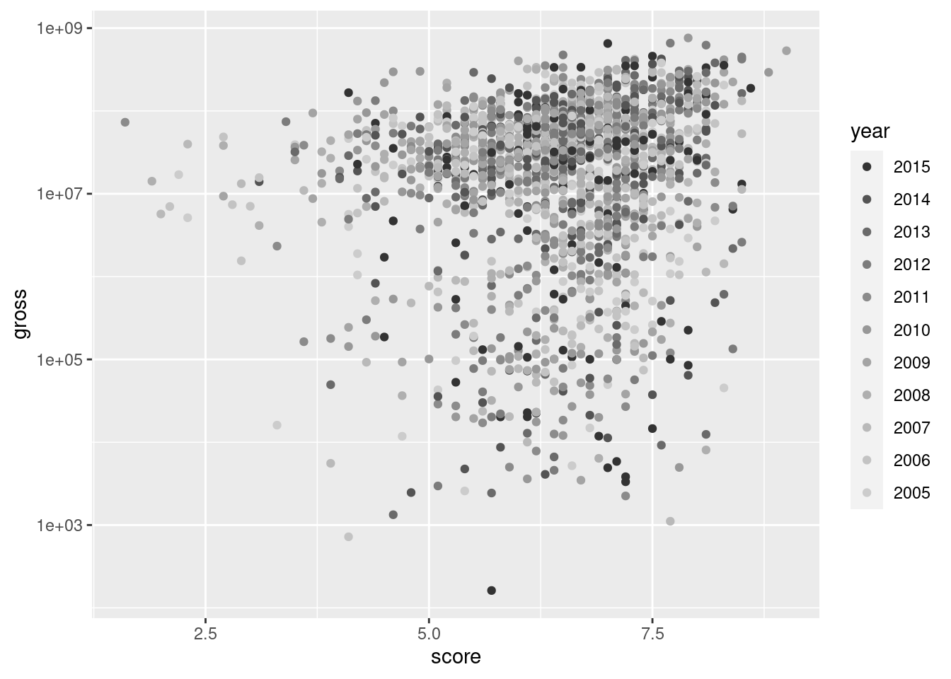
Let’s take a slightly different approach in our second scatter plot. The year variable will be mapped to geom_point()’s color aesthetic. The colors of the data points will be subject to a gray color scale (recent movies are dark grey, the oldest are light gray). Finally, we’ll use the scale_y_log10() function, which efficiently translates the y-axis scale to a log10 scale.
A scatter plot using the imdb_filtered data; uses gray points according to year of release and transforms y values to a log scale.
imdb_filtered|>ggplot(aes(x =score, y =gross))+geom_point(aes(color =year))+scale_color_grey()+scale_y_log10()
Figure G.6: A scatter plot that uses a log scale in the y axis.
The data points in the scatter plot now have a bit more vertical spread. It’s surprising to see that some movies grossed less than $10,000 but that’s entertainment. A plot legend appeared, which is good, but we’re going to axe it in the end anyway (and we know how). Thanks to less overplotting, we now can see two big clusters of points, distinguished by their earnings (generally, one cluster has earnings less than $10M, and the other more than that).
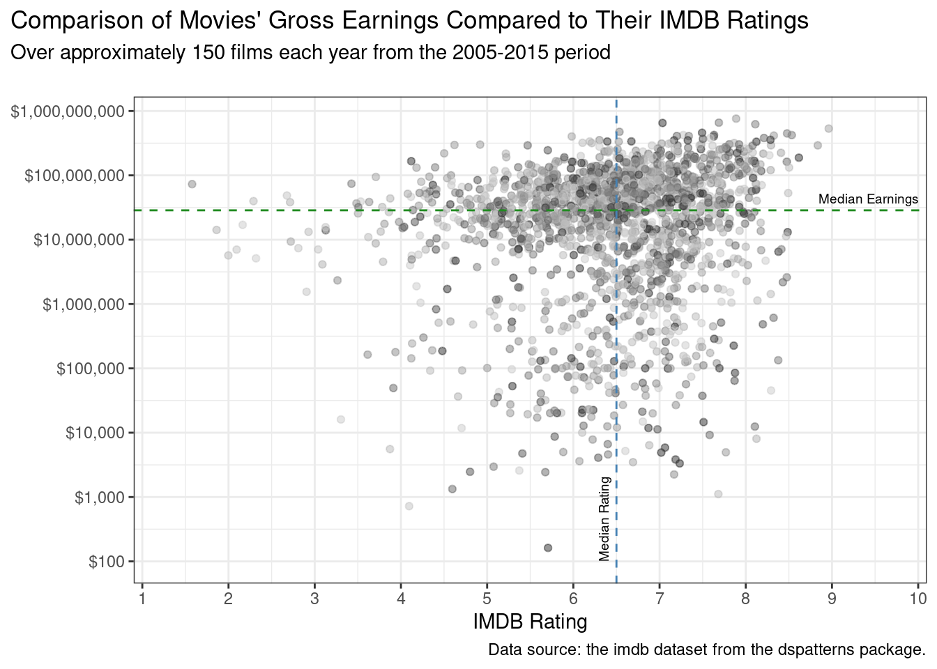
It would be interesting to annotate the plot with two dividing lines. One would be the median of IMDB ratings, the other the median of gross earnings at the box office. This is, of course, a snap in R because statistics it can do well. We only need to use the base R median() function on a vector of gross values and a vector of score values. The following code listing demonstrates how this is done.
Getting the median earnings and median rating from imdb_filtered to generate dividing lines in the finalized plot.
The median_earnings value is 28600343, or $28,600,343 (commas are helpful). Half of all movies in the imdb_filtered dataset made more than that, the other half made less. The median rating is 6.5. Because we now have these values, we can annotate our next plot with median lines. For the dividing line representing median earnings, the strategy is to use a combination of geom_hline() for the horizontal, dashed line and annotate() for the text label. The other dividing line, for median IMDB rating, will use geom_vline() for a vertical, dashed line; the text label (rotated 90º) will be generated with a separate annotate() statement.
Something else we’ll do is add some jitter. What it does is slightly move all datapoints, reducing some of the overplotting. We can make that possible with the position = "jitter" option of geom_point(). The code for the finalized plot is presented next:
The final plot of the filtered imdb dataset, with customized axes and annotated median value lines.
imdb_filtered|>ggplot(aes(x =score, y =gross))+geom_point(aes(color =year), alpha =0.5, position ="jitter")+scale_color_grey()+scale_y_log10( labels =scales::dollar_format(), breaks =c(1e2, 1e3, 1e4, 1e5, 1e6, 1e7, 1e8, 1e9))+scale_x_continuous( limits =c(1, 10), breaks =1:10, expand =c(0, 0.1), )+geom_hline( yintercept =median_earnings, linetype ="dashed", color ="forestgreen")+geom_vline( xintercept =median_rating, linetype ="dashed", color ="steelblue")+annotate( geom ="text", x =10, y =median_earnings+1.5E7, label ="Median Earnings", hjust =1, size =2.5)+annotate( geom ="text", x =median_rating-0.15, y =100, label ="Median Rating", hjust =0, angle =90, size =2.5)+labs( title ="Comparison of Movies' Gross Earnings Compared to Their IMDB Ratings", subtitle ="Over approximately 150 films each year from the 2005-2015 period\n", caption ="Data source: the imdb dataset from the dspatterns package.", x ="IMDB Rating", y =NULL)+theme_bw()+theme( legend.position ="none", plot.title.position ="plot", plot.caption.position ="plot")
Figure G.7: A finalized scatter plot that contains median lines and annotations.
The scatter plot reveals that there is a large variation of earnings across the movies available in the dataset. Ratings above 8 or below 4 are comparatively rare. We get a picture of what movies generally earn and how they are rated by providing the median annotations. Although there is still a lot of overplotting, it’s hard to say that newer movies are more successful than older ones (both in earnings and IMDB ratings). The next section on plotting distributions may better reveal trends across intervening years, using boxplots, histograms, and density plots.
G.3 Plotting Distributions
This section is all about plotting summarized distributions of data. We’ll start with histograms, move on to boxplots, take a look at violin plots, explore density plots, and be wowed by ridgeline plots.
We have a very nice dspatterns dataset for investigating all of these distribution-type plots: pitchfork. Pitchfork is a trusted source for album reviews and it’s a website that’s been around for quite a long time. The pitchfork dataset contains a lot of data on reviews from 2004 up to (and including) 2018. Using glimpse(pitchfork) we can get a preview of the dataset:
A glimpse at the pitchfork dataset.
glimpse(pitchfork)
Rows: 20,852
Columns: 7
$ artist <chr> "Algernon Cadwallader", "Various Artists", "XXX", "Foxwarren", …
$ album  <chr> "Some Kind of Cadwallader", "A Day In The Life: Impressions Of …
$ year   <dbl> 2018, 2018, 2018, 2018, 2018, 2018, 2018, 2018, 2018, 2018, 201…
$ genre  <chr> "Rock", "", "Rap", "Rock", "Metal", "Rock,Pop/R&B", "Rock", "Ro…
$ score  <dbl> 8.3, 7.8, 7.3, 7.3, 7.7, 4.5, 7.2, 7.2, 7.7, 7.5, 7.4, 6.4, 7.5…
$ date   <date> 2018-12-29, 2018-12-28, 2018-12-27, 2018-12-26, 2018-12-22, 20…
$ link   <chr> "https://pitchfork.com/reviews/albums/algernon-cadwallader-some…
G.3.1 Histograms
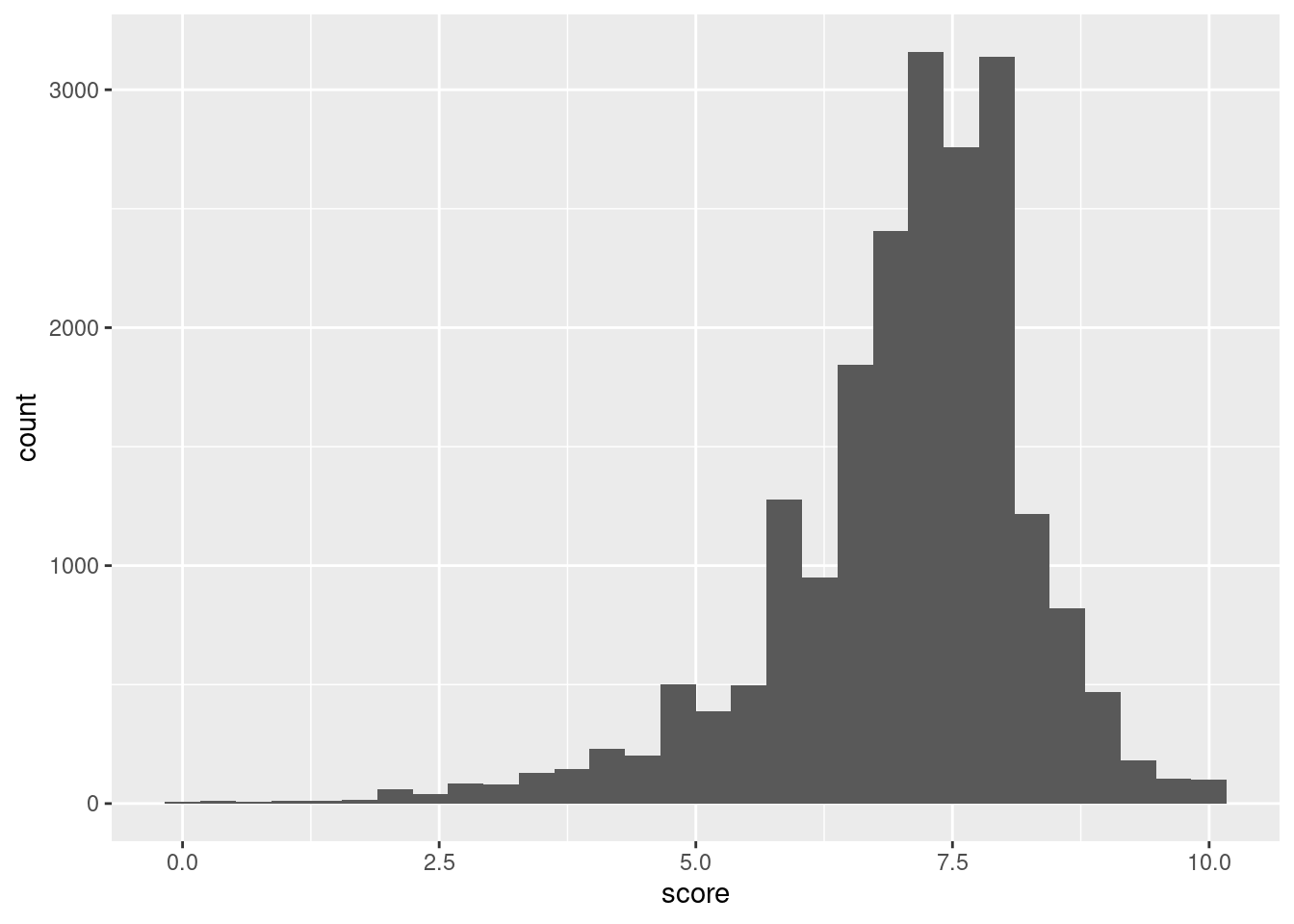
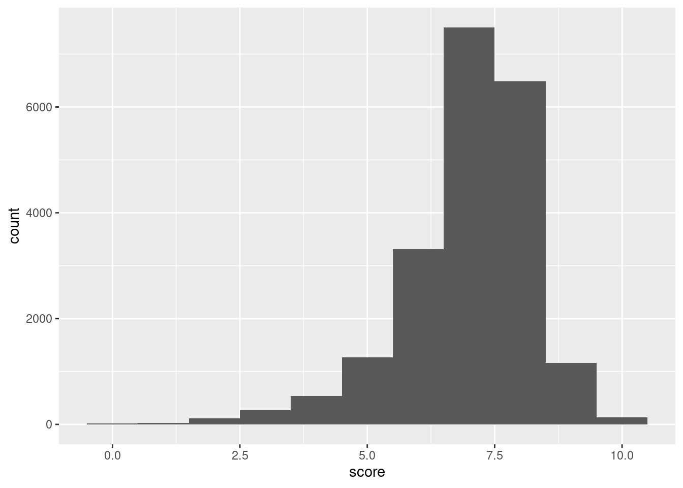
Histograms can be generated in ggplot with the suitably named geom_histogram()geom function. We only need to map values to either x (for a horizontal plot) or y (for a vertical plot). Let’s get a histogram of all pitchfork album ratings (the score variable) ever:
A histogram showing the frequencies of binned scores (0-10) from the pitchfork dataset.
ggplot(pitchfork)+geom_histogram(aes(x =score))
`stat_bin()` using `bins = 30`. Pick better value with `binwidth`.
Figure G.8: A basic histogram that uses pitchfork score data.
The histogram is pretty interesting! Histograms are great as exploratory tools and they don’t really have to look great. That is, the default histogram appearance is just fine for what it is. Getting back to the data in the plot, it looks as though review scores at just below the 7.5 mark are the most frequent. Some albums have gotten 0 scores. I’ve personally seen them in the past and since Pitchfork ratings are single-reviewer scores (unlike the IMDB scores which are an average of potentially thousands of users’ scores) this makes sense. We can also see that, at the other end, perfect scores happen with some regularity (though it’s much rarer to see 10.0 review scores for albums on initial release; re-releases and retrospective reviews are the sources for most 10s).
When making a histogram with the defaults, ggplot issues a warning that reads "stat_bin() using 'bins = 30'. Pick better value with 'binwidth'.". Alright then! Let’s pick our own value, and let’s make it 1:
Setting a binwidth per the recommendation given by the ggplot package: using a value of 1 makes sense here.
Figure G.9: A histogram that uses pitchfork score data but modifies the bin width setting.
The histogram is now coarser. Given that each bin has a width of 1. Given that score can be any value in the inclusive range of 0 to 10, there are 10 bins, right? Nope, there are 11 (they can be counted on the plot). Each bin, with a width of 1 (that’s certain) is centered on the values from 0 to 10 and that makes for 11 bins. For most EDA-based histogram plots this is probably not going to matter (but I thought you should know).
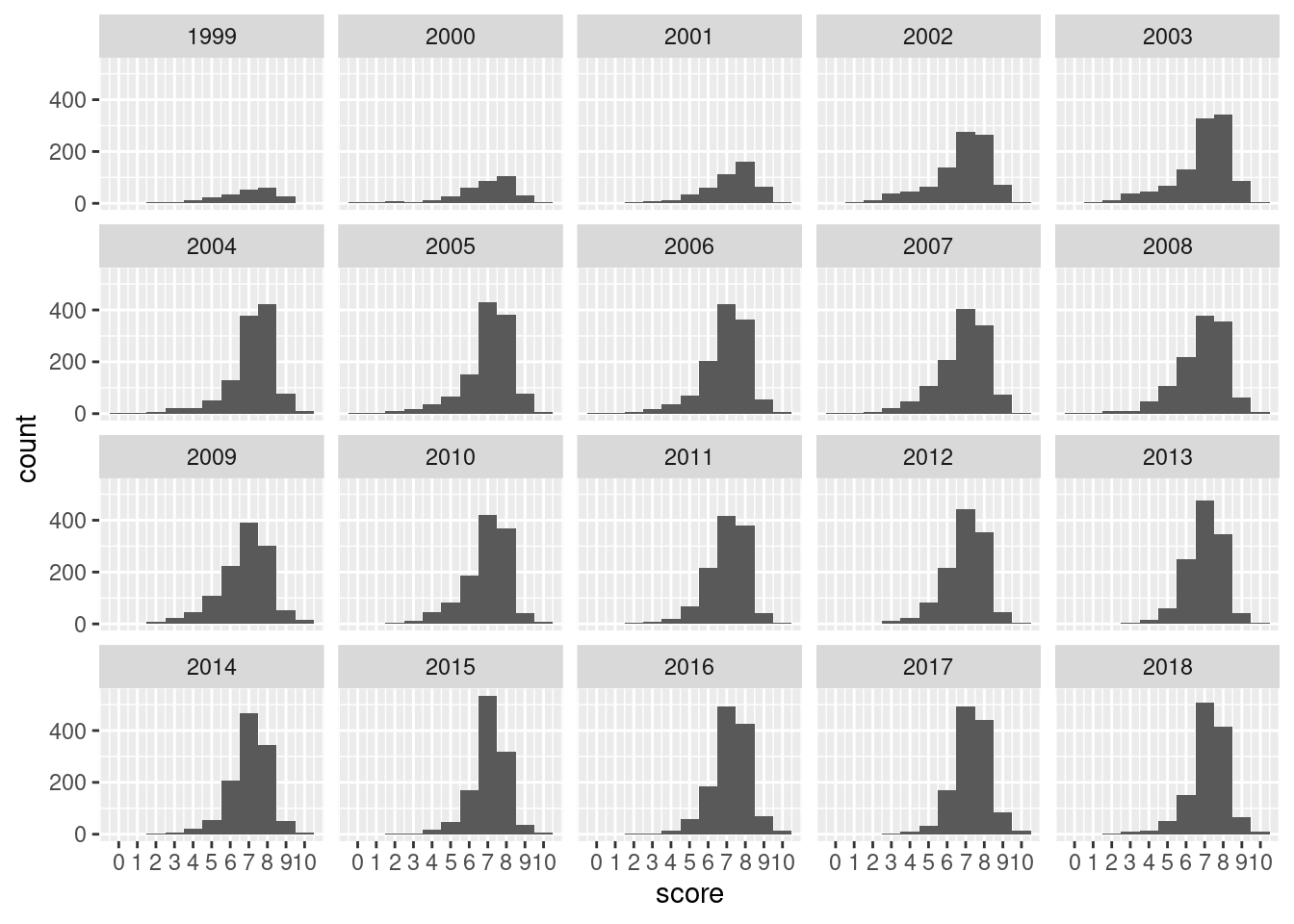
Let’s move on and ask a question: is the distribution of review scores different by the year of the review? One way to look into this is by using a faceted plot of histograms. We can add facet_wrap(vars(year)) to our plotting code to get our facets:
Customizing the x axis (to show labels for all score bins) and faceting by year gives some insight on how the score distribution changed with time.
From the facets of histograms shown, we see that it took until 2003 for reviews to ramp up to 1000 a year (this is verifiable with pitchfork |> group_by(year) |> count() instead of eyeballing the plot). In 2003 and 2004 we can see slightly more favorable reviews in the '8' bin compared to the '7' bin. Though, there is a long tail of low scores in those early years of Pitchfork.
G.3.2 Box Plots
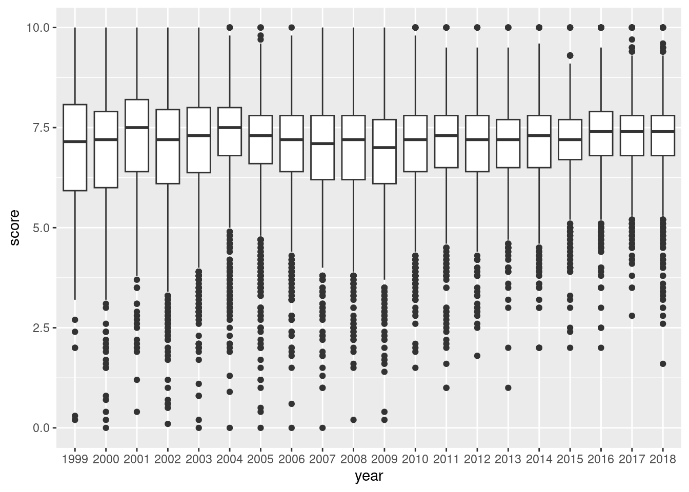
Histograms are nice, but how about box plots? Will they tell me more? Let’s find out with geom_boxplot(). And let’s turn that year variable into a factor; we need it for the x aesthetic. With four lines of ggplot code, we get the following plot:
Using the year as a categorical variable in a boxplot of Pitchfork album ratings can reveal how ratings tended to change over the years.
pitchfork|>mutate(year =factor(year))|>ggplot()+geom_boxplot(aes(x =year, y =score))
Figure G.11: Box plots containing pitchfork score values over all available years.
The box plot gives us summary statistics! The boxes contain the interquartile range (IQR) and encompasses the 25th percentile (bottom), the median or 50th percentile (middle line), and the 75th percentile (top). The whiskers are the vertical lines protruding from the boxes. They are set to extend to the farthest away data point that is within 1.5 times the IQR (again, the height of the box). The dots are the outliers: real data points that lie outside the top and bottom whiskers. From this box plot, we can easily see that the median review score has consistently been a little less than 7.5. Super low scores are far less common; zeros are just not a thing anymore. In more recent years, scores around 5.0 are considered outliers.
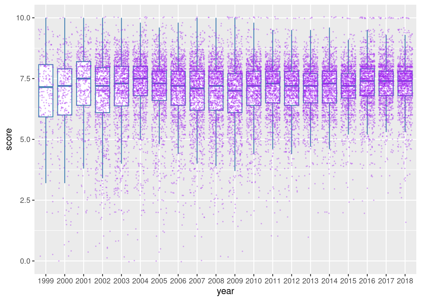
Some people don’t like that box plots hide the underlying data. This is a very valid argument because the summary statistics that constitute a box plot can potentially be the same for very different distributions of the data. So, let’s split the difference and overlay our data points on the boxplot. To do this, add a geom_point() statement after geom_boxplot(). Some tips: remove the interfering boxplot outliers with outlier.shape = NA in geom_boxplot(), jitter the data points with position = "jitter" in geom_point(), use a small data point size and low alpha value if there are a lot of points (as there are in pitchfork).
A box plot with jittered data points can show us the quantity and distribution of ratings along with the summary statistics.
pitchfork|>mutate(year =factor(year))|>ggplot(aes(x =year, y =score))+geom_boxplot(outlier.shape =NA, color ="steelblue")+geom_point(position ="jitter", color ="purple", size =0.2, alpha =0.25)
Figure G.12: A box plot using pitchfork score data overlaid with jittered data points.
This combination of jittered points on top of the conventional box plot is pretty interesting. We can see that perfect ‘10’ scores, previously hampered by overplotting, are way more common than scores like 9.6, 9.7, 9.8, or 9.9. There also seems to be a lot of scores at 8.0, which frequently lies above the IQR, clearly visible in 2016, 2017, and 2018.
This view adds back the information that’s consumed by the box plot and is valuable for exploratory data analysis, a mode of investigation where all data really ought to be visible and thus available for interpretation.
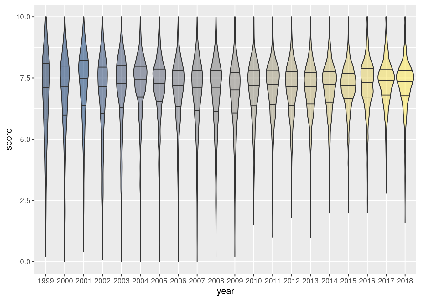
G.3.3 Violin Plots
Violin plots are a way of comparing multiple data distributions. With ordinary density curves, it is difficult to compare more than just a few distributions because the lines visually interfere with each other. With a violin plot, it’s easier to compare several distributions since they’re placed side by side. A violin plot is a kernel density estimate, mirrored so that it forms a symmetrical shape. They also have quantile lines overlaid.
Let’s use the pitchfork data with the geom_violin()geom function. We’ll choose to draw the quantiles with draw_quantiles = c(0.25, 0.50, 0.75), we’ll skip the legend by using show.legend = FALSE.
A violin plot can be more interpretable than overlaid points on a box plot if the number of data points is overwhelming.
pitchfork|>mutate(year =factor(year))|>ggplot()+geom_violin(aes(x =year, y =score, fill =year), draw_quantiles =c(0.25, 0.50, 0.75), show.legend =FALSE)+scale_fill_viridis_d(alpha =0.5, option ="E")
Figure G.13: A violin plot using pitchfork score data over all available years.
The violin plot reveals similar information compared with the box plot and jittered data points. We see that very low scores are pretty much absent in the more recent years. We also see a greater propensity for scores just above 7.5 in the most recent years. The violins from 1999 to 2009 are relatively thin compared to those in later years, suggesting that higher scores (especially above 5) are the norm.
Of special note in the code for creating this plot is the use of the scale_fill_viridis_d() function, with option "E" chosen. This is a color palette that is perceptually uniform in both color and when converted to black-and-white. The "E" option (known as ‘cividis’) is especially well-suited for viewers with common forms of color blindness. Using alpha = 0.5 was a necessary measure to ensure the that quartile lines were visible when darker colors were applied to the violin shapes.
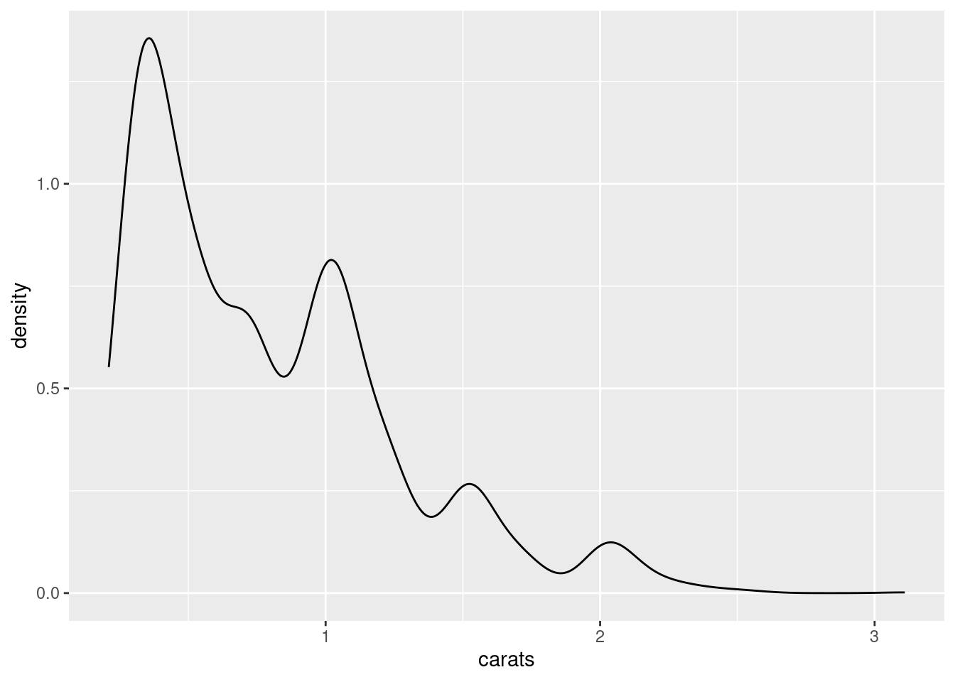
G.3.4 Density Plots
A density plot produces what’s known as a kernel density curve: an estimate of the population distribution that’s based on the sample data. The amount of smoothing depends on a settable parameter called the kernel bandwidth. The larger the bandwidth, the more smoothing there is.
The dmd dataset will be used to in our explorations of density plots. There are 2,697 data points, each representing a single diamond. The variables in the dataset are evenly split between continuous (carats, depth, price) and discrete or categorical (color, cut, clarity).
Let’s create a density plot in the simplest manner possible: using geom_density() and accepting all the defaults. The carats variable in dmd is mapped to the x aesthetic in the next bit of code.
Creating a simple density plot, mapping carats from the dmd dataset to x.
ggplot(dmd, aes(x =carats))+geom_density()
Figure G.14: A basic density plot using dmd data.
The plot uses a default kernel bandwidth of 1. Depending on the situation, accepting the default value may not capture the variation in a way that is acceptable.
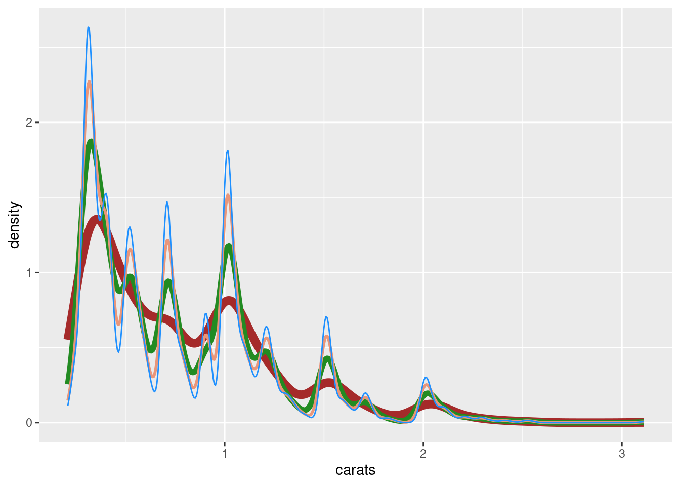
Again, the larger the bandwidth, the more smoothing there is. The bandwidth can be set with the adjust parameter, which has a default value of 1. In the following code listing, several layers of geom_density() plots are made and the adjust value is progressively lowered (i.e., resulting in less smoothing, more inclination toward movement). It’s operating on the same dmd dataset but the difference in the curves can be rather striking.
The geom_density() function has a default bandwidth but modifying it with the adjust parameter has a strong effect on the plotted density curve.
ggplot(dmd, aes(x =carats))+geom_density(adjust =1, color ="brown", size =3)+geom_density(adjust =1/2, color ="forestgreen", size =2)+geom_density(adjust =1/3, color ="darksalmon", size =1)+geom_density(adjust =1/4, color ="dodgerblue", size =0.5)
Warning: Using `size` aesthetic for lines was deprecated in ggplot2 3.4.0.
ℹ Please use `linewidth` instead.
Figure G.15: A comparison of density plots using different bandwidth adjustment levels.
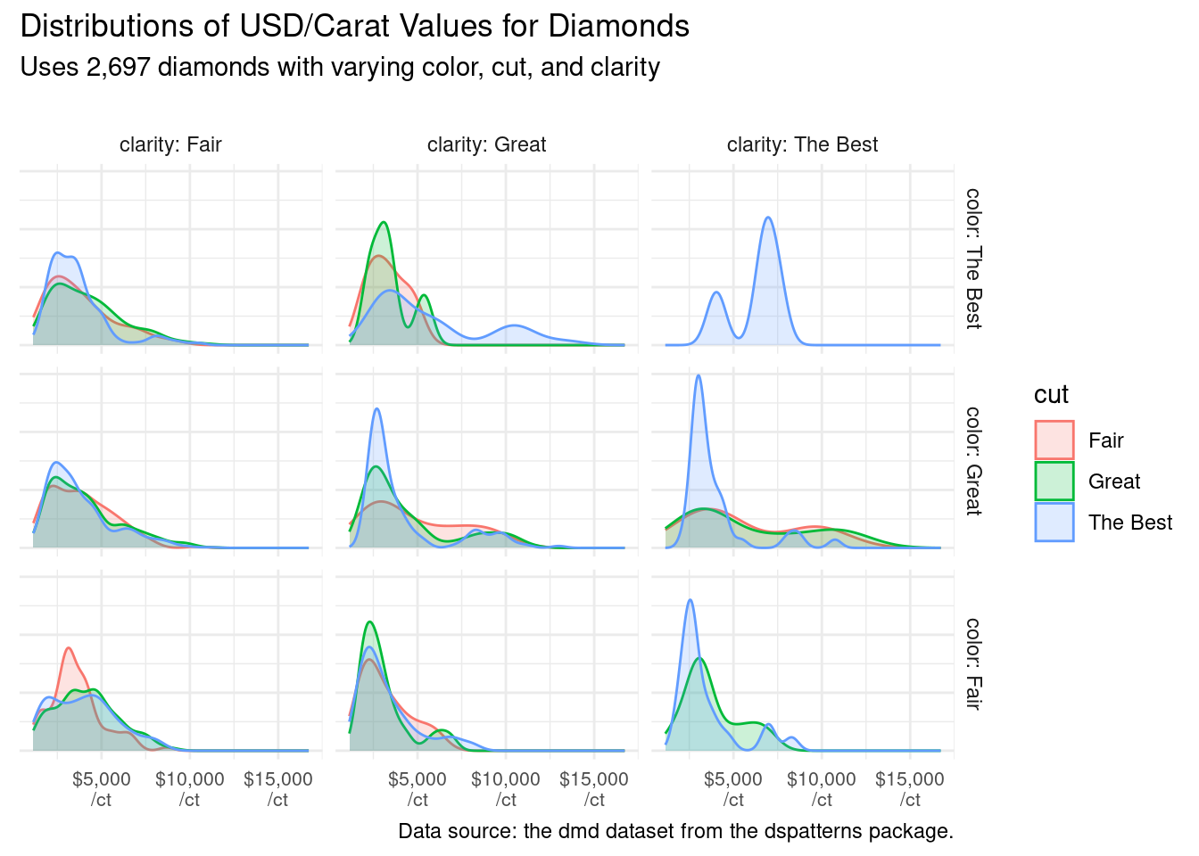
Let’s modify the dmd dataset a bit to incorporate the dollars_carat column, which takes the ratio of price (in U.S. Dollars) to carat weight. Then, the color, cut, and clarity columns will be converted to factors.
The dmd dataset is mutated to add a new column (dollars_carat) and to produce factors for better control of ordering facets.
dmd_mutated<-dmd|>mutate( dollars_carat =price/carats, color =color|>fct_rev(), cut =cut|>as.factor(), clarity =clarity|>as.factor())dmd_mutated
# A tibble: 2,697 × 7
   carats depth color cut      clarity price dollars_carat
    <dbl> <dbl> <fct> <fct>    <fct>   <int>         <dbl>
 1   0.29  62.4 Fair  Great    Fair      334         1152.
 2   0.24  62.3 Fair  Great    Great     336         1400
 3   0.3   62.3 Fair  The Best Fair      367         1223.
 4   0.26  61.8 Fair  The Best Fair      371         1427.
 5   0.23  64.3 Great Fair     Fair      373         1622.
 6   0.3   62.1 Fair  The Best Fair      384         1280
 7   0.31  59.5 Fair  Great    Fair      390         1258.
 8   0.3   61.6 Fair  Great    Fair      394         1313.
 9   0.3   63.3 Great Fair     Fair      394         1313.
10   0.21  61.9 Great Great    Fair      394         1876.
# ℹ 2,687 more rows
Let’s try something a little more ambitious with our next density plot: faceting. The dmd_mutated dataset is introduced to geom_density(), mapping dollars_carat to x and cut to both fill and color. After that, we’ll use facet_grid() to make a grid of facets. The rows will differ in color, and the columns will differ in clarity. As we’ve done before to make the plot presentable, we’ll apply a theme, add titles, and clean up the plot axes.
With dmd_mutated, a set of faceted density plots (through facet_grid()) is generated to compare distributions of diamond value by mass.
ggplot(dmd_mutated)+geom_density(aes(x =dollars_carat, fill =cut, color =cut), alpha =0.2)+facet_grid( rows =vars(color), cols =vars(clarity), labeller =label_both)+scale_x_continuous( labels =scales::dollar_format(suffix ="\n/ct"), )+labs( title ="Distributions of USD/Carat Values for Diamonds", subtitle ="Uses 2,697 diamonds with varying color, cut, and clarity\n", caption ="Data source: the dmd dataset from the dspatterns package.", x =NULL, y =NULL)+theme_minimal()+theme( axis.text.y =element_blank(), axis.text.x =element_text(size =8))
Warning: Groups with fewer than two data points have been dropped.
Groups with fewer than two data points have been dropped.
Warning in max(ids, na.rm = TRUE): no non-missing arguments to max; returning
-Inf

Warning in max(ids, na.rm = TRUE): no non-missing arguments to max; returning
-Inf
Figure G.16: Faceted density plots using dmd data.
The grid of faceted density plots shows us that the rarest diamonds, those with the best color, cut, and clarity, can more often fetch higher prices on a per carat basis (the top-right facet).
G.3.5 Ridgeline Plots
A ridgeline plot shows the distribution of a numeric value for several groups. Distributions can be represented using density plots or histograms, all aligned to the same horizontal scale and presented with a slight overlap. For this section, we’ll demonstrate ridgeline plots that exclusively use density plots. They are made possible with the ggridges package, which must be first installed with install.packages("ggridges") and loaded with library(ggridges).
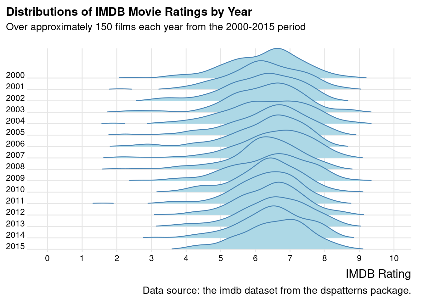
Using the imdb dataset as is, we can make a very nice ridgeline plot with the geom_density_ridges() and theme_ridges() functions from the ggridges package. The geom_density_ridges() function has a few parameters that can wildly change the appearance of the ridgelines, which are scale, rel_min_height, and size. I’d recommend using the values shown in the next code listing but do experiment with them so that your final plot is how you want it to appear. One final note: the use of theme_ridges() is highly recommended as it gives this type of plot its characteristic look.
With the functions available in ggridges, it's possible to make a compact, ridgeline density plot of IMDB movie ratings over 15 years.
ggplot(imdb, aes(x =score, y =year, group =year))+geom_density_ridges( scale =3, rel_min_height =0.01, size =1, color ="steelblue", fill ="lightblue")+scale_x_continuous(breaks =0:10)+scale_y_reverse(breaks =2000:2015, expand =c(0, 0))+coord_cartesian(clip ="off", xlim =c(0, 10))+labs( title ="Distributions of IMDB Movie Ratings by Year", subtitle ="Over approximately 150 films each year from the 2000-2015 period\n", caption ="Data source: the imdb dataset from the dspatterns package.", x ="IMDB Rating", y =NULL)+theme_ridges()+theme( plot.title.position ="plot", plot.caption.position ="plot", axis.text =element_text(size =10))
Figure G.17: A ridgeline plot based on the imdb dataset.
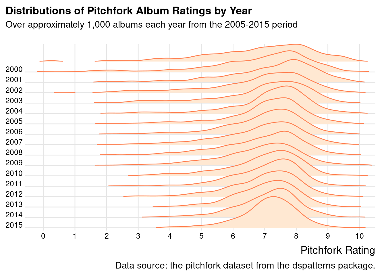
The IMDB ratings plot allows us to easily compare the shapes of lot of density plots by up and down scanning. These types of plots are also a pleasure to look at. Because they are so great, let’s make a companion ridgeline plot that uses the pitchfork dataset in the same manner. The code shown below is virtually the same as that of the previous code listing, save for differences in colors and labels.
The comparable ridgeline density plot with 15 years of Pitchfork album reviews makes for a great companion piece to the IMDB plot.
pitchfork|>filter(year<=2015)|>ggplot(aes(x =score, y =year, group =year))+geom_density_ridges( scale =3, rel_min_height =0.01, size =0.5, color ="coral", fill ="#FFE8D2")+scale_x_continuous(breaks =0:10)+scale_y_reverse(breaks =2000:2015, expand =c(0, 0))+coord_cartesian(clip ="off", xlim =c(0, 10))+labs( title ="Distributions of Pitchfork Album Ratings by Year", subtitle ="Over approximately 1,000 albums each year from the 2005-2015 period\n", caption ="Data source: the pitchfork dataset from the dspatterns package.", x ="Pitchfork Rating", y =NULL)+theme_ridges()+theme( plot.title.position ="plot", plot.caption.position ="plot", axis.text =element_text(size =10))
Figure G.18: A ridgeline plot based on the pitchfork dataset.
From the ridgeline plot, it’s quite easy to compare density curves across the years of reviews. Even comparisons between 2015 and 2000 seem to be easier than at least one of the alternative views of the data (e.g., faceted density plots).
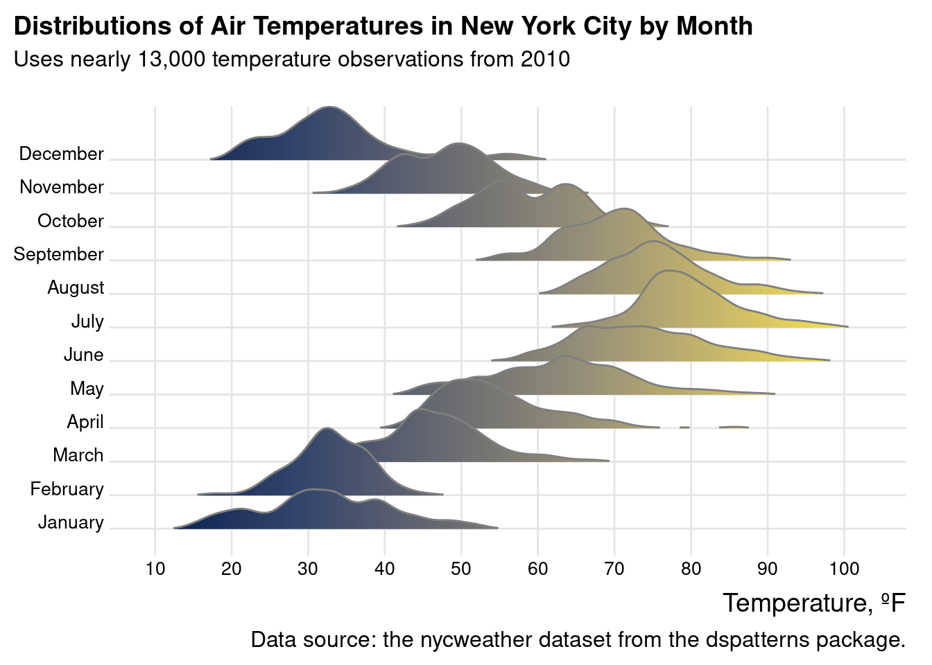
For the last ridgeline plot, the nycweather dataset will be used. In this case, all of the temperature data is converted to degrees Fahrenheit (with a dplyrmutate() statement) and passed to the geom_density_ridges_gradient() function. The fill color uses the ‘cividis’ color scale that was used previously (through scale_fill_viridis_c(), option "E"). As in all the previous code listings with ridgeline plots, the theme_ridges() function is used.
The nycweather dataset is a natural fit for a ridgeline plot, where temperature distibutions are compared by month in 2010.
nycweather|>filter(!is.na(temp))|>mutate( month =lubridate::month(time, label =TRUE, abbr =FALSE), tempf =(temp*9/5)+32)|>ggplot(aes(x =tempf, y =month, fill =stat(x)))+geom_density_ridges_gradient( scale =2, rel_min_height =0.01, color ="gray50", show.legend =FALSE)+scale_fill_viridis_c(option ="E")+scale_x_continuous(breaks =seq(10, 100, 10))+labs( title ="Distributions of Air Temperatures in New York City by Month", subtitle ="Uses nearly 13,000 temperature observations from 2010\n", caption ="Data source: the nycweather dataset from the dspatterns package.", x ="Temperature, ºF", y =NULL)+theme_ridges()+theme( plot.title.position ="plot", plot.caption.position ="plot", axis.text =element_text(size =10))
Warning: `stat(x)` was deprecated in ggplot2 3.4.0.
ℹ Please use `after_stat(x)` instead.
Picking joint bandwidth of 1.48
Figure G.19: A ridgeline plot based on the nycweather dataset.
The ridgeline plot clearly conveys the distributions of temperatures for each month of 2010. The gradient used in each fill is pleasing to the eye and is highly interpretable. The other comparable plot that uses this data (the Cleveland dot plot) has much less information than this plot contains, and the ridgeline variation simply presents so much better.
G.4 Summary
Lollipop plots (similar to bar plots but using less ink) are composed of a dot and a connecting line and they can be made in ggplot by using geom_segment() and geom_point() (specifically in that order).
Cleveland dot plots are composed of two or more dots connected by a line, making these plots suitable for ranged data with an appearance similar to lollipop plots; they are made in ggplot by using geom_line() and geom_point() (again, order matters here).
Scatter plots are useful during exploratory data analysis and, with a little care, can make for highly presentable plots that compare two variables across multiple observations; they are generated in ggplot using geom_point() and require at least the x and y aesthetics (mapped to continuous data values).
There are several plot types that are useful for understanding the distributions of data: histograms (geom_histogram()), boxplots (geom_boxplot()), violin plots (geom_violin()), density plots (geom_density()), and ridgeline plots (geom_density_ridges() and geom_density_ridges_gradient(), both provided by the ggridges package).
We can make a plot more presentation ready by adding/modifying labels (with labs()), setting a predefined theme (e.g., theme_minimal() or theme_bw()), modifying one or more theme elements (with the huge amount of options in theme()), using plot annotations (with geom_text() or annotate()), modifying axis breaks (by using breaks in the scale_x_*() or scale_y_*() functions), and more!
To help ggplot make better plots (with automatic legends and a sensible ordering of plot elements), we often need to transform the data with functions from dplyr (e.g., select(), filter(), mutate(), group_by()/summarize(), arrange(), etc.), tidyr (pivot_longer()), and forcats (any relevant fct_*() function for setting/modifying factor levels).