datatable(pitchfork |> dplyr::slice_head(n = 1000))Appendix H — Making Presentation Tables with DT and gt
This appendix chapter covers
- Making presentation tables with the DT package for an interactive display of thousands of rows
- Creating smaller scale, yet highly customized, presentation tables with the gt package
Here, we’re going to learn how to generate tables for reports or presentations. There’s potential to confuse data tables (e.g., tibbles, data frames, database tables) with those tables that are provided in reports or presentations. To avoid further confusion let’s call the latter type of table product presentation tables. The DT and gt packages will be used in this section to generate a wide set of presentation tables, using data tables as the primary inputs.
There are a lot of packages available in R for making presentation tables. The common thread permeating all these packages is a workflow that: (1) begins with a data table (e.g., data frame, tibble, etc.) that’s in a shape close to what you’d want in the final table, (2) uses functions from the package to do formatting of values and cell styling, and (3) prints the finalized presentation table in a specified or inferred output format. Let’s examine two packages for making display tables: DT and gt. If you currently don’t have them in your R library, you can get them both by using install.packages("DT") and install.packages("gt").
You might wonder, why look at two different R packages for making presentation tables? Shouldn’t just one suffice? The reason for learning about both DT and gt has to do with their relative strengths. DT is great at displaying large data tables (i.e., multiple screenfuls of rows) and has interactive components for pagination, sorting rows by particular columns, filtering rows, and much more. It works exceedingly well if the data isn’t summarized to just a few rows. The gt package takes a different approach. It is optimized for smaller summary-type tables. It gives you lots of control over formatting values, applying styling to individual cells, adding footnotes, and even transforming the content of cells. Knowing how to use both of these will allow you to confidently create reporting tables that meet the different concerns of the aforementioned packages (and they both work exceedingly well in Quarto).
H.1 Making Presentation Tables with DT
Sometimes you’ll want to present a table with lots of rows. This non-summarized data is perhaps more interesting than summarized data because it provides an essential resource and aggregating would possibly make no sense. The DT package doesn’t ship with any datasets, but we do have the pitchfork dataset (accessible from the dspatterns package) and it’s a lot of fun to peruse. As a reminder of what’s in that dataset each record is a review of an album, where the artist, album, year columns identify the album, the score is the reviewer’s rating (from 0 to 10), and the link column provides links to the review pages.
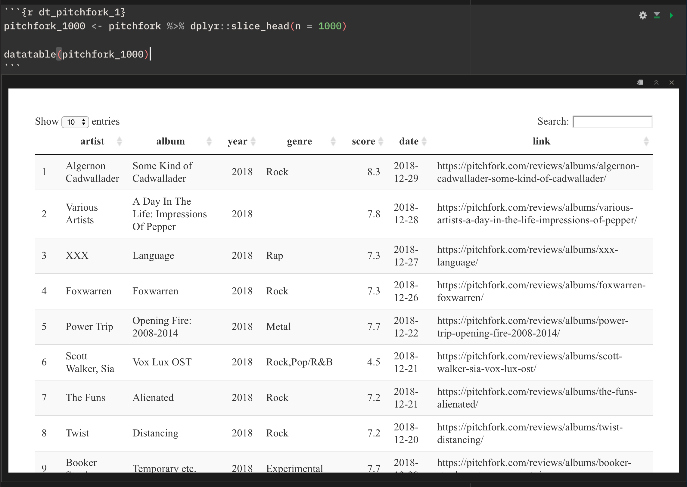
The function in DT that is used to generate the table is called datatable(). The following code shows just how easy it is to generate a table:
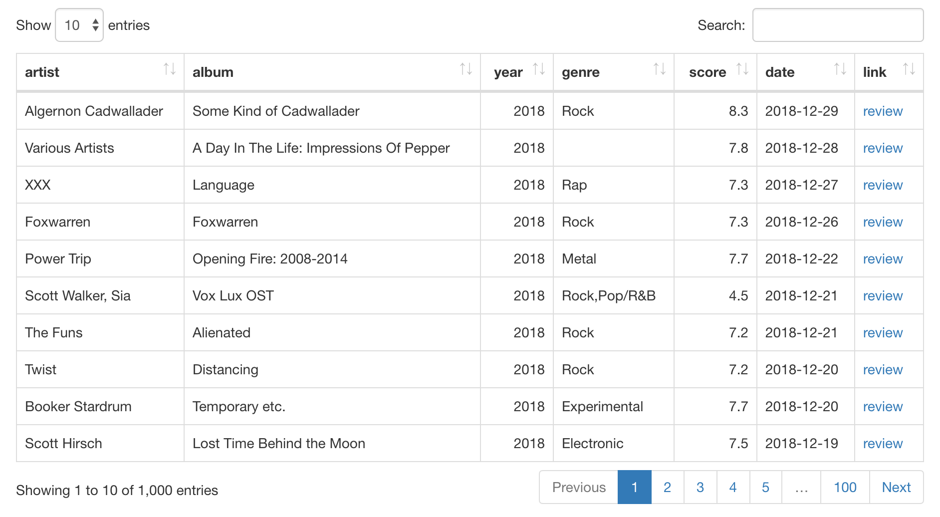
Making a DT table from 1000 rows of pitchfork data.
If executing the chunk above in an Quarto document (with CTRL + ENTER), the output will appear just below the chunk. This gives you a pretty operational DT table, however all text may be shown with the default browser font (usually Times New Roman), and, the full height of the table may be cut off. Not to worry though, the inline output should serve as a preview and knitting to HTML will show the entire table in the rendered document.
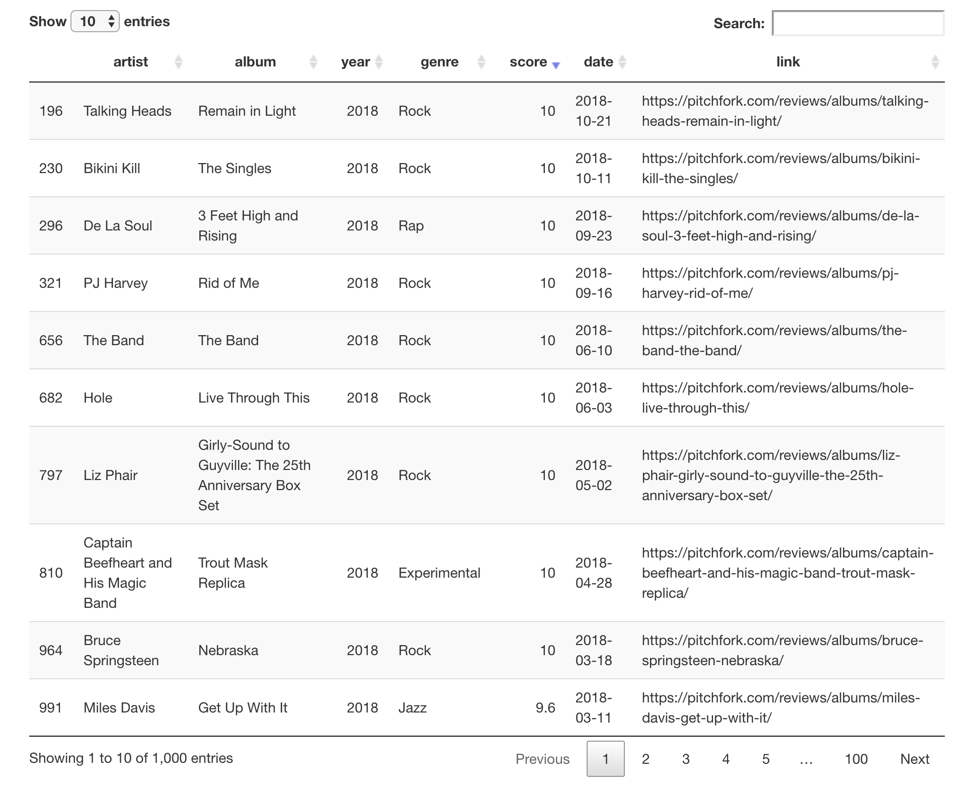
When the Quarto document is rendered to an HTML document through knitting (easily done by clicking the Knit button on the top toolbar), the DT table looks a whole lot nicer. Before taking the screenshot, I sorted the rows in a descending manner by clicking on the up/down arrow button next to the "score" label. This is one of the great things that DT offers without any extra configuration.
While the default look is reasonable and good, there are all sorts of customizations that might appear even better. In the next few examples, we’ll add more options and tweaks to demonstrate some of the things that DT is capable of.
First up, taking those links in the link column and making them clickable and navigable. We ultimately want to be taken to the relevant review page on the Pitchfork website. To do this we first need to understand how to an HTML link. It takes the form <a href="url">link text</a>. That bit of information (and so much more related to the web) can be found at the MDN web docs site. To generate the links as HTML links, we can use dplyr’s mutate() function on the pitchfork_1000 tibble with some paste0().
Creating usable links with the <a> HTML tag in the link column.
pitchfork_1000 <-
  pitchfork |>
  dplyr::slice_head(n = 1000) |>
  dplyr::mutate(link = paste0("<a href='", link ,"'>review</a>"))

pitchfork_1000 |> select(link)
# A tibble: 1,000 × 1
link
<chr>
1 <a href='https://pitchfork.com/reviews/albums/algernon-cadwallader-some-kind…
2 <a href='https://pitchfork.com/reviews/albums/various-artists-a-day-in-the-l…
3 <a href='https://pitchfork.com/reviews/albums/xxx-language/'>review</a>
4 <a href='https://pitchfork.com/reviews/albums/foxwarren-foxwarren/'>review</…
5 <a href='https://pitchfork.com/reviews/albums/power-trip-opening-fire-2008-2…
6 <a href='https://pitchfork.com/reviews/albums/scott-walker-sia-vox-lux-ost/'…
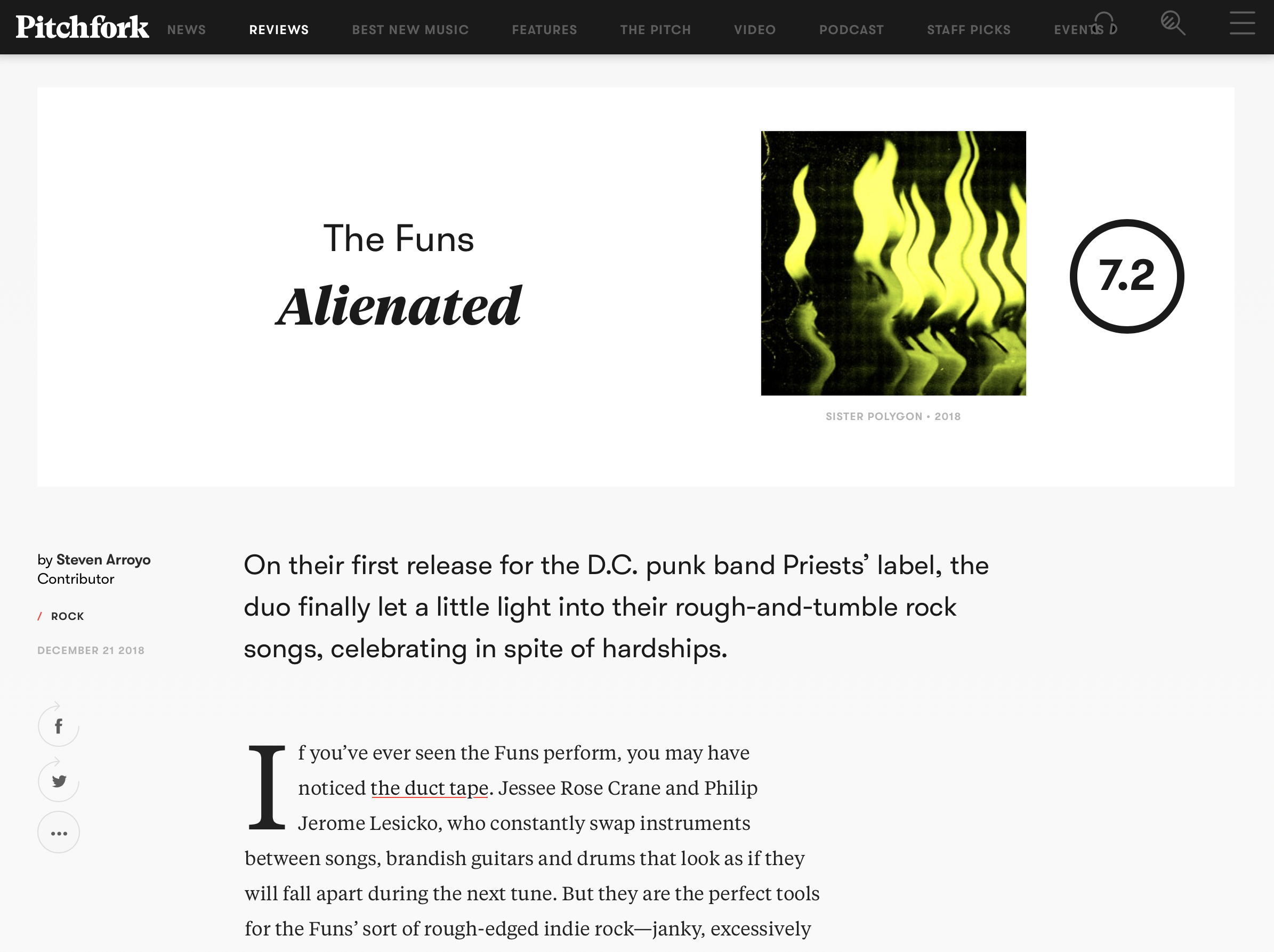
7 <a href='https://pitchfork.com/reviews/albums/the-funs-alienated/'>review</a>
8 <a href='https://pitchfork.com/reviews/albums/twist-distancing/'>review</a>
9 <a href='https://pitchfork.com/reviews/albums/booker-stardrum-temporary-etc/…
10 <a href='https://pitchfork.com/reviews/albums/scott-hirsch-lost-time-behind-…
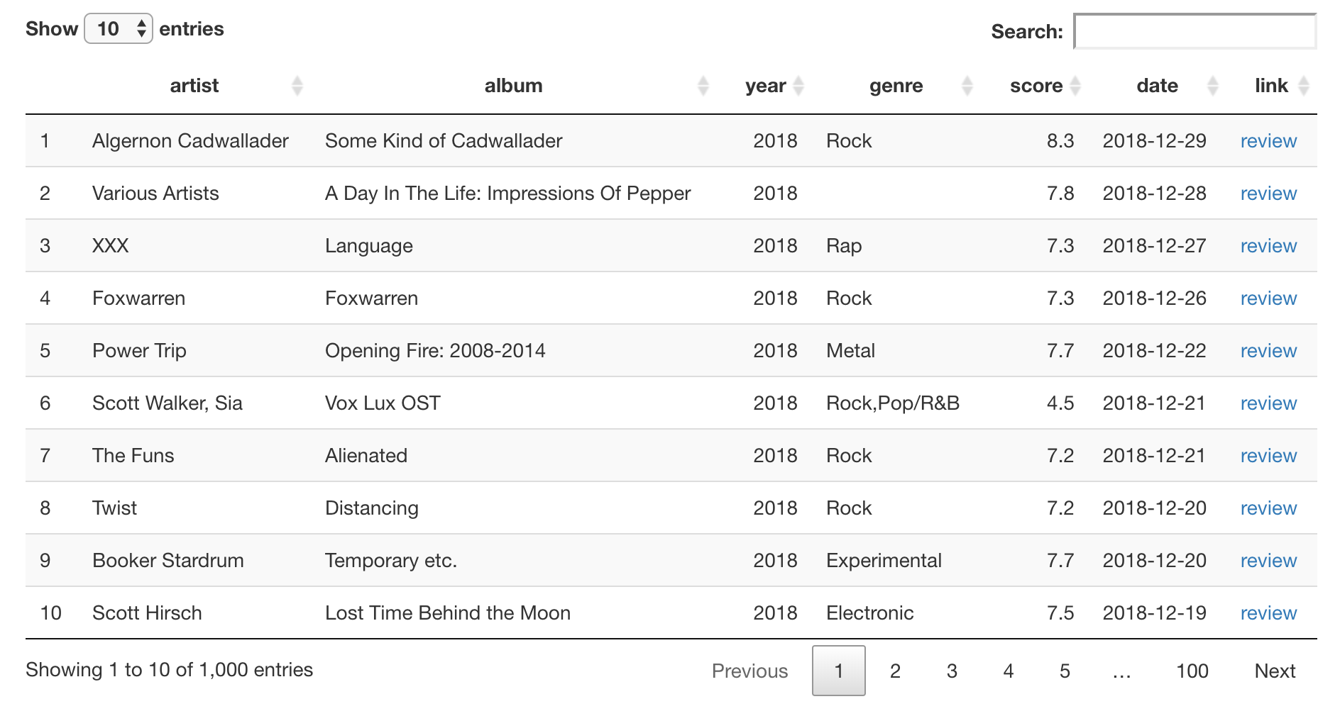
# ℹ 990 more rowsAnother thing that needs to be considered is that DT automatically escapes certain characters in every bit of text in the table. This effectively means that characters that have special meaning in HTML are replaced with HTML entities. For example, the characters <, >, and & are replaced with the HTML entities <, >, and &. This HTML sanitization is done as a security measure but can be circumvented here by using the escape argument of datatable(). It can sound like we shouldn’t do this, but, it’s okay here because we are providing our own trusted HTML strings. In the following code listing, we use the transformed pitchfork_1000 table to generate a DT table, where column 8 (link) is set to be not escaped (hence the negative sign).
Making the column of links functional in a DT table by removing the escape condition from column 8.
pitchfork_1000 |> datatable(escape = -8)The output table, when rendered to HTML via knitting, is shown in the screen capture. Do the links work? They do! I clicked on one and I was brought to the correct web page.
Let’s make more modifications to our DT table. We can freshen up the look of it with some keywords in the style and class arguments of datatable(). We’ll elect to use style = "bootstrap4", which utilizes a fairly current vintage of the Bootstrap framework. On top of that, let’s set class = "table-bordered". This will give the table consistent horizontal and vertical lines. Oh, and we don’t need those row numbers in the first column. They can be gotten rid of by using rownames = FALSE. In the following code listing, there is one final change to make: the index of the column to escape (link) is now column 7 instead of 8 (because of the dropped column with row names). A screenshot of the output HTML table is presented here.
Changing the table appearance of the DT table with the style and class parameters, and, by removing the column with row names.
pitchfork_1000 |>
  datatable(
    escape = -7,
    style = "bootstrap4",
    class = "table-bordered",
    rownames = FALSE
  )
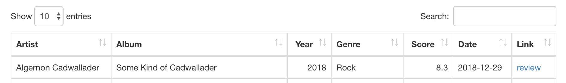
A thing that’s often changed when going from data tables to presentation tables is the column names. It can be better to have them in title case. Quite conveniently, the stringr package has the function str_to_title() that competently transforms strings to title case. We’ll use that function to generate a vector of modified column names for the colnames argument of datatable(). Because of this, the column label "artist" is now "Artist", "album" becomes "Album", etc., and this looks quite a bit better (and fits the usual convention for columns labels in presentation tables). The top portion of the revised presentation table is shown below.
The column names of the DT table can be modified using the colnames argument.
pitchfork_1000 |>
  datatable(
    escape = -7,
    style = "bootstrap4",
    class = "table-bordered",
    rownames = FALSE,
    colnames = stringr::str_to_title(colnames(pitchfork_1000))
  )
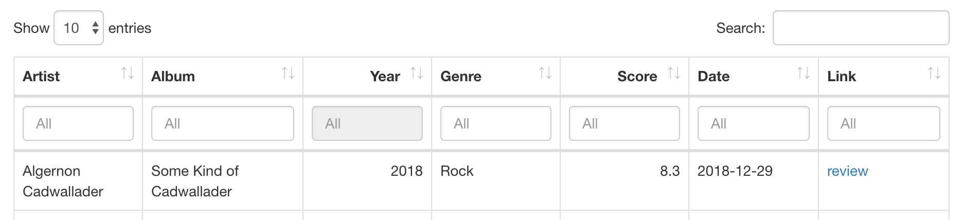
The last two modifications to the DT table involve adding UI elements. Given that there is a substantial number of rows, having controls to filter the table down to perhaps a handful based on per-column criteria is desirable. We can add intelligent filtering controls that adapt their UI to the type of data in each column. This is done by using the filter argument of datatable() and specifying a location. There are two options, and we’ll elect to use "top" instead of "bottom". We show the top of the HTML output table, with interactive controls below each column label.
Adding filtering functionality to the DT table (UI applied to the top of the table).
pitchfork_1000 |>
  datatable(
    escape = -7,
    style = "bootstrap4",
    class = "table-bordered",
    rownames = FALSE,
    colnames = stringr::str_to_title(colnames(pitchfork_1000)),
    filter = "top"
  )
And now, our last modification will be made. This one can come in handy when viewers of your table want to have some or all of the data in the table for their own, separate analysis. It involves the addition of buttons that allow for downloading of the data, copying of the data (to the system clipboard), or printing (sounds archaic but, to be fair, this could be printing to PDF). Activating these buttons requires a carefully written incantation within datatable() that uses the extensions and options arguments. The code for this is given here and a full screenshot of the finalized HTML table is shown below.
Adding useful buttons for exporting the table data to various files, copying the data, and printing.
pitchfork_1000 |>
  datatable(
    escape = -7,
    style = "bootstrap4",
    class = "table-bordered",
    rownames = FALSE,
    colnames = stringr::str_to_title(colnames(pitchfork_1000)),
    filter = "top",
    extensions = "Buttons",
    options = list(
      buttons = c("csv", "excel", "pdf", "copy", "print"),
      dom = "Bfrtip"
    )
  )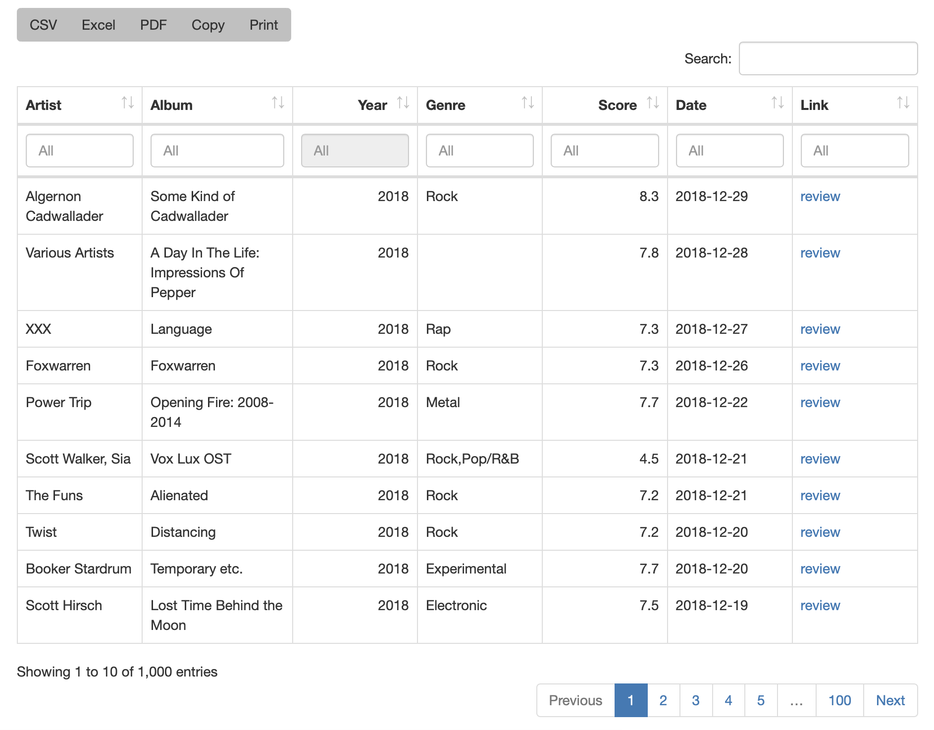
These buttons are fully functional: when pressed they either initiate a file download, copy text to the system clipboard, or active the system’s printing dialog. Another nice thing about these buttons is that the data retrieved will reflect the state of the visible rows. For example, if the rows have been sorted and filtered, the user of the table can download an Excel file with just those rows in the reordered state. A drawback is that the easy functionality ends here. Should you want a button that provides data in a different format, you’ll have to write some JavaScript to make that happen. Nonetheless, the available options are pretty good and should cover most of the needs of users in a self-service situation.
H.2 Creating gt Tables
When you need a smaller table that has a ton of possibilities for styling, then consider using the gt package. The interface is very high-level and declarative, where you can provide general instructions versus very specific (though, that’s possible too). There are lots of formatting options, with fine control for number, values in scientific notation, values with uncertainties, ranges, percentages, currency, and dates/times. This package also lets you add footnotes without the common and unnecessary problem of manually ordering them in the footer section of the table. The main workflow involves preprocessing your table data (be it a tibble or a data frame) into a form that resembles the final presentation table. You then decide how to compose your gt table with the elements and formatting you need for the task at hand. Finally, the table is rendered by printing it at the console, including it in an Quarto document, or exporting to a file using the gtsave() function.
The gt package ships with a number of datasets and for our first set of examples, we’ll use the exibble dataset. This tibble contains only eight rows with numeric-, character-, and factor-type columns. It’s great for experimentation because it’s small enough to see the whole thing when rendered to HTML. Let’s see how exibble looks by feeding it to gt’s gt() function.
The exibble table as a gt table.
gt_tbl_1 <- exibble |> gt()

gt_tbl_1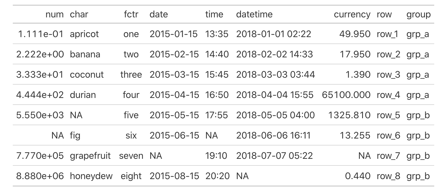
exibble dataset as a gt table.Before we get deeper into the functions of the gt package, we should take some time to understand gt’s model of a table.
H.2.1 The Parts of a gt Table
The gt philosophy is such: we can construct a wide variety of useful tables with a cohesive set of table parts. These include the table header, the stub, the column labels and spanner column labels, the table body, and the table footer. Here’s a diagram that shows how these parts fit together.
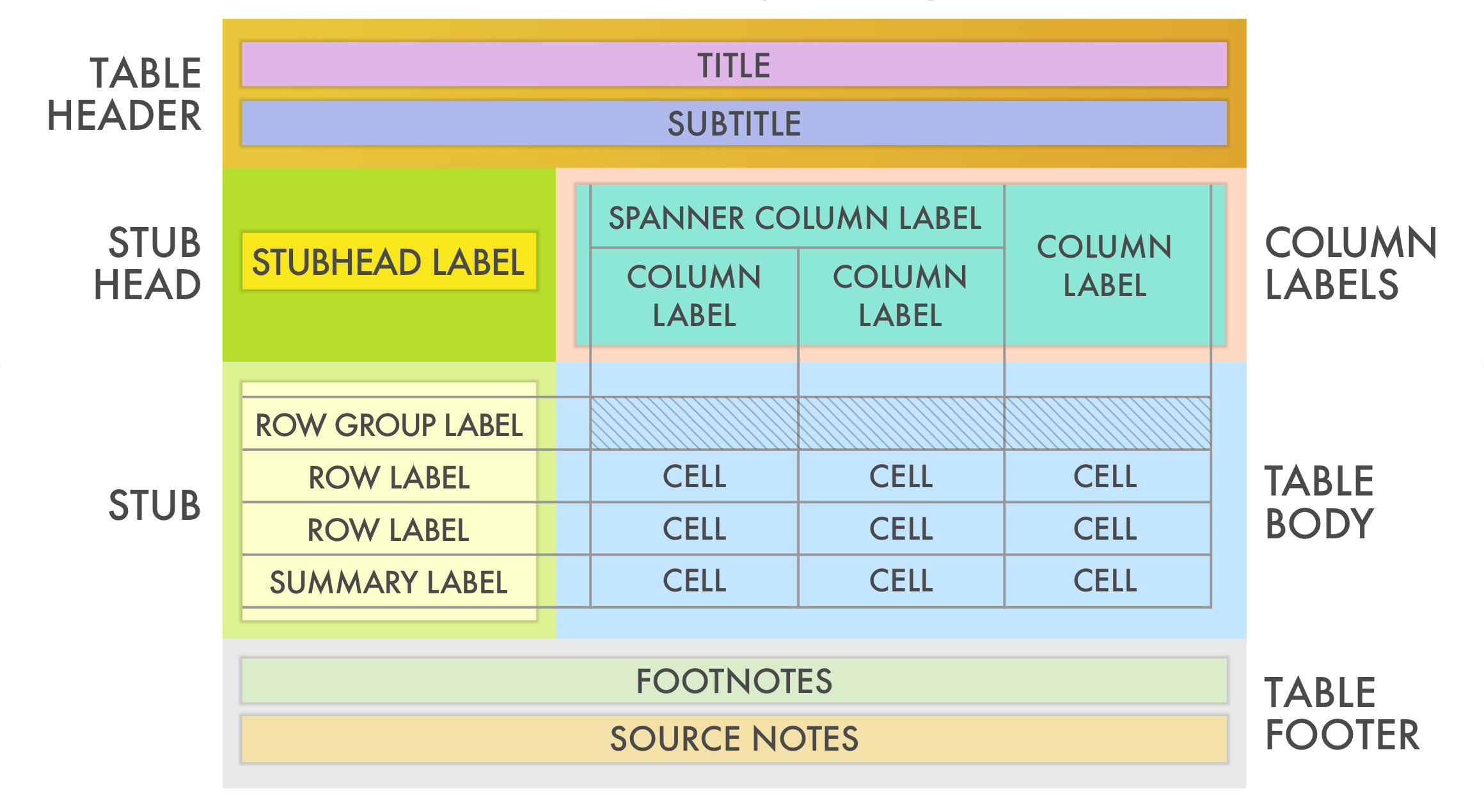
The parts of a gt table are then (roughly from top to bottom):
- the Table Header (optional; with a title and possibly a subtitle)
- the Stub and the Stub Head (optional; contains row labels, optionally within row groups having row group labels and possibly summary labels when a summary is present)
- the Column Labels (contains column labels, optionally under spanner column labels)
- the Table Body (contains columns and rows of cells)
- the Table Footer (optional; possibly with footnotes and source notes)
The way that we add parts like the table header and footnotes in the table footer is to use the tab_*() family of functions. There are quite a few tab_*() functions, and they are concerned with creating or modifying parts of a table. Here is a listing of these fundamental gt functions, with short descriptions of what they do:
-
tab_header(): Add a table header -
tab_spanner(): Add a spanner column label -
tab_spanner_delim(): Create column labels and spanners via delimited names -
tab_row_group(): Add a row group to a gt table -
tab_stubhead(): Add label text to the stub head -
tab_footnote(): Add a table footnote -
tab_source_note(): Add a source note citation -
tab_style(): Add custom styles to one or more cells -
tab_options(): Modify the table output options
H.2.2 Adding/Modifying Parts of a gt Table with tab_*() Functions
A table header is easy to add so let’s see how the previous table looks with a title and a subtitle. We can add this part using the tab_header() function. The arguments are simply title and subtitle.
Adding a table header with the tab_header() function.
gt_tbl_2 <-
  gt_tbl_1 |>
  tab_header(
    title = "The exibble dataset",
    subtitle = "(It's available in the gt package.)"
  )

gt_tbl_2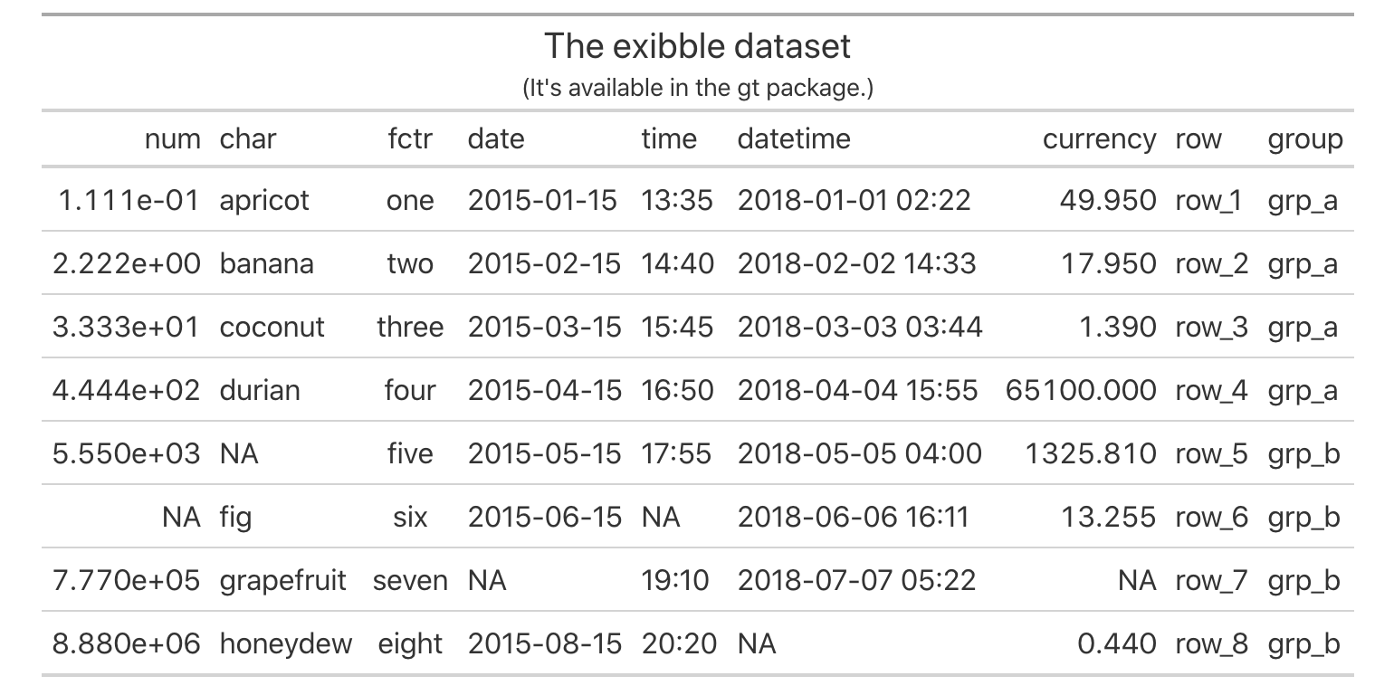
exibble gt table with a table header added (via the tab_header() function).Let’s add a source note to the footer part of the gt table based on exibble. A source note is useful for citing the data included in the table. Several can be added to the footer and the key to that is using multiple calls of tab_source_note(). They will be inserted in the order provided.
Adding table source notes with multiple calls of the tab_source_note() function.
gt_tbl_3 <-
  gt_tbl_2 |>
  tab_source_note("The gt package is available in CRAN.") |>
  tab_source_note("This example is provided by the dspatterns book.")

gt_tbl_3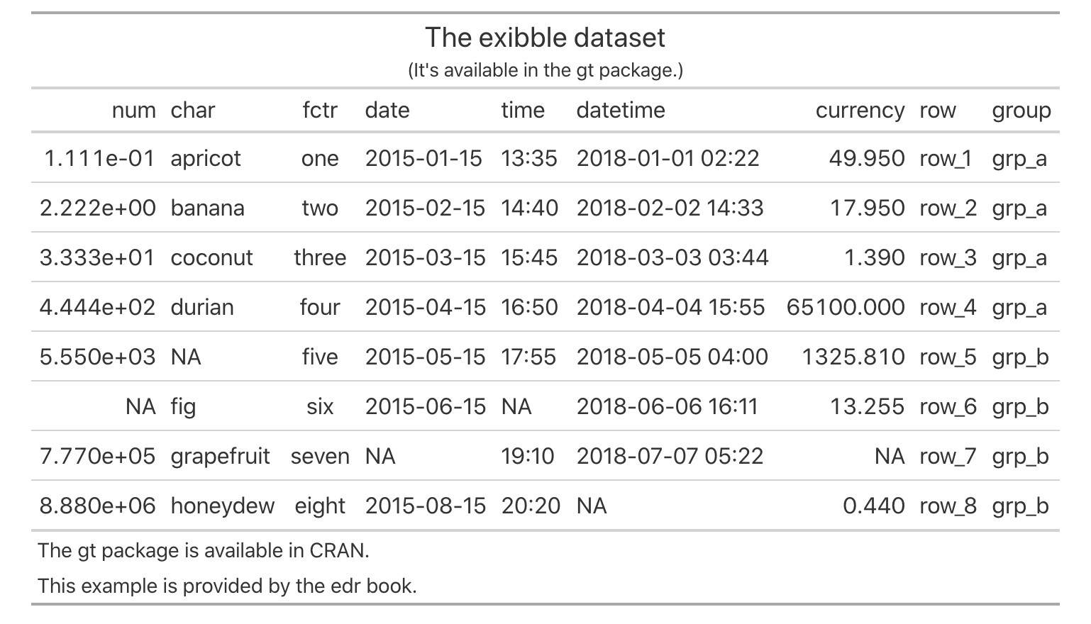
exibble gt table with a both a table header and a table footer (containing two source notes provided by two uses of the tab_source_note() function).Footnotes also live inside the footer part of the table and their footnote marks are attached to cell data. Put another way, there are two components to a footnote: (1) a footnote mark that is attached to the targeted cell text, and (2) the footnote text (that starts with the corresponding footnote mark) that is placed in the table’s footer area.
Footnotes are added with the tab_footnote() function. The helper function cells_body() can be used with the location argument to specify which data cells should be the target of the footnote. The cells_body() helper has the two arguments: columns and rows. For each of these, we can either supply (1) a vector of column names or row names, (2) a vector of column/row indices, (3) bare column names wrapped in c() or row labels within c(), or (4) a select helper function (e.g., starts_with(), ends_with(), contains(), matches(), one_of(), everything(), etc.). For rows specifically, we can use a conditional statement with column names as variables (e.g., size > 15000).
What follows is a simple example of how a footnote can be added to a table cell. Let’s add a footnote to the cell with the word "coconut". We don’t have any row names in this table (we’ll see how those can be generated in a later example); however, we can easily see that the target cell in row 3 of the char column. The following code provides a way to create a footnote for that table cell.
Adding a footnote for a specific cell with the tab_footnote() function.
gt_tbl_4 <-
  gt_tbl_3 |>
  tab_footnote(
    footnote = "This coconut contains a tape and half a necklace.",
    locations = cells_body(columns = char, rows = 3)
  )

gt_tbl_4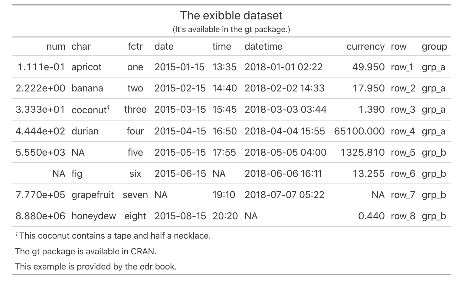
exibble gt table now has a footnote that’s associated with a specific body cell. With multiple calls of tab_footnote(), several footnotes can be added.Footnotes can be associated with text in different parts of the table. There is a family of functions of the form cells_*() that are termed location helper functions. They are used in the locations argument of tab_footnote() (and also tab_style()). Should we want to add a footnote that explains the char column label, we can make a similar call to tab_footnote() and use cells_column_labels() to target that column label.
Adding a footnote for a specific column label with the tab_footnote() and cells_columns_labels() functions.
gt_tbl_5 <-
  gt_tbl_4 |>
  tab_footnote(
    footnote = "This column contains alphabetical fruit.",
    locations = cells_column_labels(columns = char)
  )

gt_tbl_5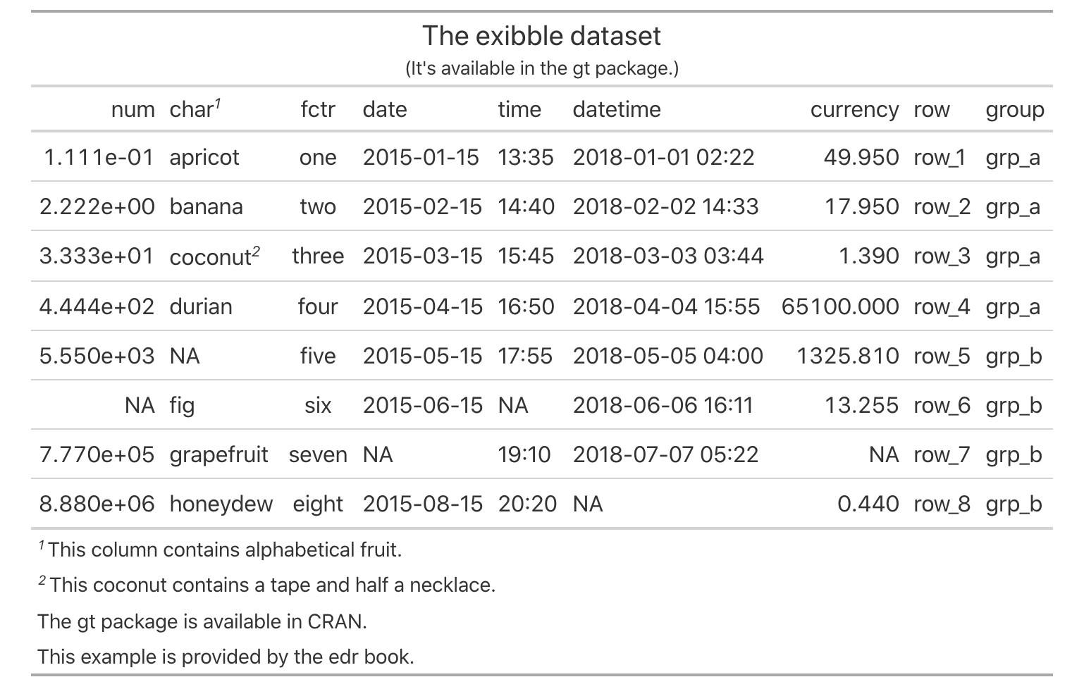
From the table shown, we can see that the order of footnotes is handled automatically by gt The ordering of footnotes proceeds from left-to-right and goes top-to-bottom.
Adding footnotes wouldn’t be possible without using one of the many different location helper functions. It could be hard to keep those straight; here is a listing of them (roughly ordered by locations that run from the top to the bottom of a gt table) with short descriptions:
-
cells_title(): targets the table title or the table subtitle depending on the value given to the groups argument ("title"or"subtitle"). -
cells_stubhead(): targets the stubhead location, a cell of which is only available when there is a stub; a label in that location can be created by using thetab_stubhead()function. -
cells_column_spanners(): targets the spanner column labels, which appear above the column labels. -
cells_column_labels(): targets the column labels. -
cells_row_groups(): targets the row group labels in any available row groups using the groups argument. -
cells_stub(): targets row labels in the table stub using the rows argument. -
cells_body(): targets data cells in the table body using intersections of columns and rows. -
cells_summary(): targets summary cells in the table body using the groups argument and intersections of columns and rows. -
cells_grand_summary(): targets cells of the table’s grand summary using intersections of columns and rows.
H.2.3 gt Case Study: Making a Table with the countrypops dataset
The gt package comes with a variety of interesting datasets and, for the next set of examples, let’s use the countrypops dataset. This is a dataset that presents yearly, total populations of countries. Total population is based on counts of all residents regardless of legal status or citizenship. Country identifiers include the English-language country names, and the 2- and 3-letter ISO 3166-1 country codes. Each row contains a population value for a given year (from 1960 to 2017). It’s a pretty big dataset at 12,470 rows so the first thing we’re going to do is whittle it down to pretty small size. How? We’ll focus on just a few countries, and, use only a few data points. Here are our requirements for the final table:
- use countries from Oceania (e.g., Australia, New Zealand, Tuvalu, etc.)
- countries in different regions of Oceania will be grouped together
- provide populations for the
1995,2005, and2015years only; they should appear as separate columns with a spanner column label above them stating that these columns refer to population values - format population figures to contain commas
- provide a descriptive title
Alright! The first two parts involve (1) knowing which countries are located in Oceania, and (2) knowing the regions of Oceania and which countries belong to each of those. The dplyr and tidyr code shown next transforms the large countrypops table into the 17 row, 5 column oceaniapops table (just the right size for a readable presentation table). This can be considered a pre-processing exercise and it’s a very common first step in a gt workflow.
Making the oceaniapops table from the (much larger) countrypops table.
Australasia <- c("AU", "NZ")
Melanesia <- c("NC", "PG", "SB", "VU")
Micronesia <- c("FM", "GU", "KI", "MH", "MP", "NR", "PW")
Polynesia <- c("PF", "WS", "TO", "TV")

oceaniapops <-
  countrypops |>
  dplyr::filter(country_code_2 %in% c(
    Australasia, Melanesia, Micronesia, Polynesia)
  ) |>
  dplyr::filter(year %in% c(1995, 2005, 2015)) |>
  dplyr::mutate(region = case_when(
    country_code_2 %in% Australasia ~ "Australasia",
    country_code_2 %in% Melanesia ~ "Melanesia",
    country_code_2 %in% Micronesia ~ "Micronesia",
    country_code_2 %in% Polynesia ~ "Polynesia"
  )) |>
  tidyr::pivot_wider(names_from = year, values_from = population) |>
  dplyr::arrange(region, desc(`2015`)) |>
  dplyr::select(-starts_with("country_code"))

oceaniapops
# A tibble: 17 × 5
country_name region `1995` `2005` `2015`
<chr> <chr> <int> <int> <int>
1 Australia Australasia 18004882 20176844 23815995
2 New Zealand Australasia 3673400 4133900 4609400
3 Papua New Guinea Melanesia 4616439 6498818 8682174
4 Solomon Islands Melanesia 375189 482486 612660
5 Vanuatu Melanesia 170612 217632 276438
6 New Caledonia Melanesia 193816 232250 269460
7 Guam Micronesia 150094 164430 167978
8 Kiribati Micronesia 81481 98164 116707
9 Micronesia (Federated States) Micronesia 110328 110940 109462
10 Northern Mariana Islands Micronesia 48717 69025 51514
11 Marshall Islands Micronesia 50702 54337 49410
12 Palau Micronesia 17209 19831 17794
13 Nauru Micronesia 10316 10318 11185
14 French Polynesia Polynesia 231446 271060 291787
15 Samoa Polynesia 174902 188626 203571
16 Tonga Polynesia 99977 105633 106122
17 Tuvalu Polynesia 9585 9912 10877Now that we have the oceaniapops data table, we might go ahead and pass that to the gt() function as we did before with the exibble dataset.
Making a very simple gt table with the oceaniapops tibble.
oceaniapops |> gt()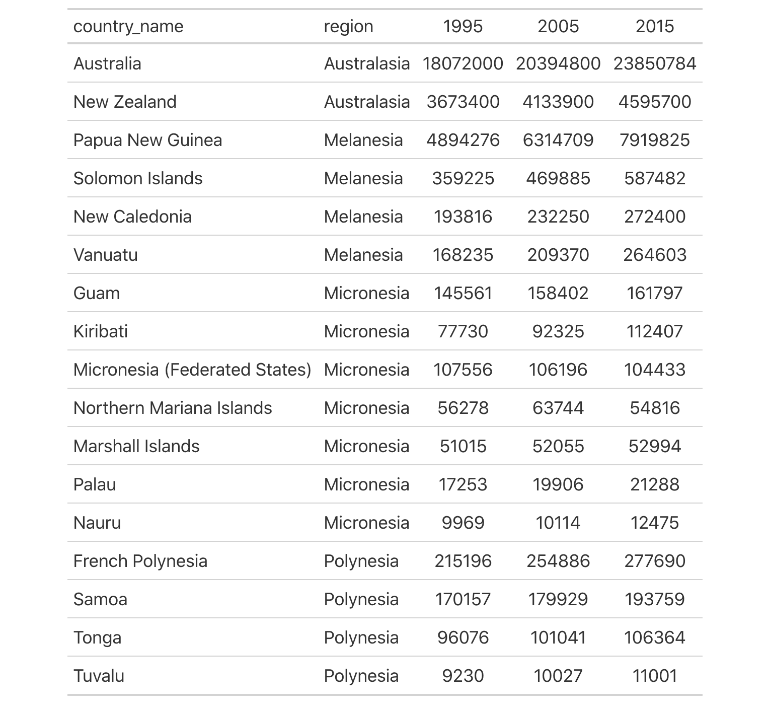
oceaniapops data table by just using gt(). It’s nice but it could be made nicer.While the presentation of the table looks adequate, there are ways to make it look better. We can use the rowname_col and groupname_col arguments of the gt() function to generate row labels (in a stub) and to generate row group labels (that span across the table in header rows). Let’s try that out and take a look at the resulting presentation table.
Taking a different approach in making the gt table by defining a stub and row group labels.
oceaniapops_1 <-
  oceaniapops |>
  gt(
    rowname_col = "country_name",
    groupname_col = "region"
  )

oceaniapops_1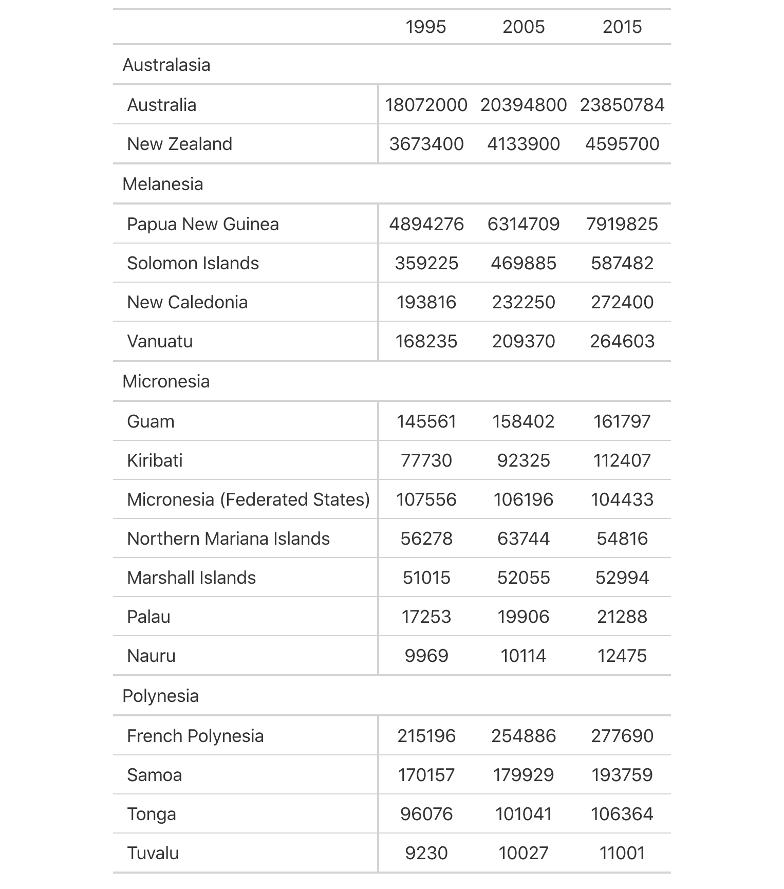
As can be seen in the improved gt table that is oceaniapops_1, the stub column on the left acts as a specialized column for row labels (a vertical border is automatically placed between the stub and the table body to the right). The labels in the region column were used to generate the row group labels (e.g., "Australasia", "Melanesia", etc.). This change effectively puts rows into groups, adding structure and reducing needless repetition.
For the third requirement, we’ve already obtained the three columns that contain population data for 1995, 2005, and 2015. With regard to the presentation, a further requirement is that a spanner column label be placed over those column labels. We can do this with the tab_spanner() function. The whole point of this function is to make it extremely easy to place a spanner column label above the columns of your choosing. The following code has an example of this, where the label "Total Population" is placed above the three column labels representing the years.
Adding more structure to the gt table by placing the spanner column label "Total Population" above the three column labels.
oceaniapops_2 <-
  oceaniapops_1 |>
  tab_spanner(
    label = "Total Population",
    columns = c(`1995`, `2005`, `2015`)
  )

oceaniapops_2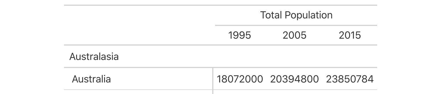
In the gt table, we see that the addition of the spanner column label provides more information as to what the values below represent. This both looks good and gives the reader of the table additional context.
Columns of data can be formatted with the fmt_*() family of gt functions. To do formatting of numbers, we need to use the fmt_number() function. Our requirement is to format numbers so that they should have commas. These are technically called digit group separators and they will appear as commas by default (changeable with the sep_mark or locale arguments of fmt_number()). The arguments of fmt_number() that we need to pay attention to are use_seps, which is TRUE by default, and decimals which we need to set to 0. Important note: the columns are represented by numbers so we need to enclose them with back ticks when including them all in c(). The next code listing provides the necessary gt code to do the numeric formatting of the population values. To make the values even more readable, we should right align them. That’s done with the cols_align() function:
We can make the population values much to easier to read with decimal separators by use of the fmt_number() function.
oceaniapops_3 <-
  oceaniapops_2 |>
  fmt_number(
    columns = c(`1995`, `2005`, `2015`),
    decimals = 0
  ) |>
  cols_align(align = "right")

oceaniapops_3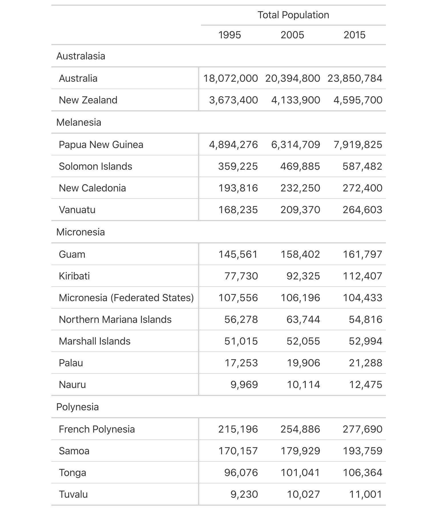
The fmt_number() function has a lot of options for formatting numbers exactly how you want them to appear. By default, it formats larger decimal numbers with commas for the separator mark and periods for the decimal mark (e.g., 32,432.86). This can be changed by using the sep_mark and dec_mark arguments. Setting sep_mark = "." and dec_mark = "," will result in the previous example being formatted as 32.432,86. Another (easier) way to do this is to set the locale argument of fmt_number(). If the numbers in a gt table are intended for a Danish audience, for example, you could set locale = "da" and not have to worry about the sep_mark and dec_mark arguments (they are overridden by the locale setting). For more information on locales and how they are expressed and handled in gt, you can use the info_locales() function. It provides a table with locale names and previews of formatted numbers across all 712 locales supported in gt.
While the updated presentation table looks great, you may find at times that the columns are too close together. This can be remedied with the cols_width() function. It allows for the precise definition of column widths. It uses a formula-based interface where column names in c() or selection helpers go on the left of the ~, and pixel values (best wrapped in px()) go on the right-hand side. The stub? It can be accessed with stub() or the number 1. In the next code listing, the stub column is sized to 250 pixels and all other columns are 125 pixels wide. In addition to sizing the columns, a header is added to the table (with a title and a subtitle). Using the md() function, we can even supply Markdown text to either of the title or subtitle.
The column widths can be finely adjusted with cols_width(), and, a heading is always a good idea.
oceaniapops_4 <-
  oceaniapops_3 |>
  cols_width(
    stub() ~ px(250),
    everything() ~ px(125)
  ) |>
  tab_header(
    title = md("Populations of Countries in Oceania During **1995**, **2005**, and **2015**"),
    subtitle = "Combined land area of 3,291,903 sq mi and a population of over 41 million."
  )

oceaniapops_4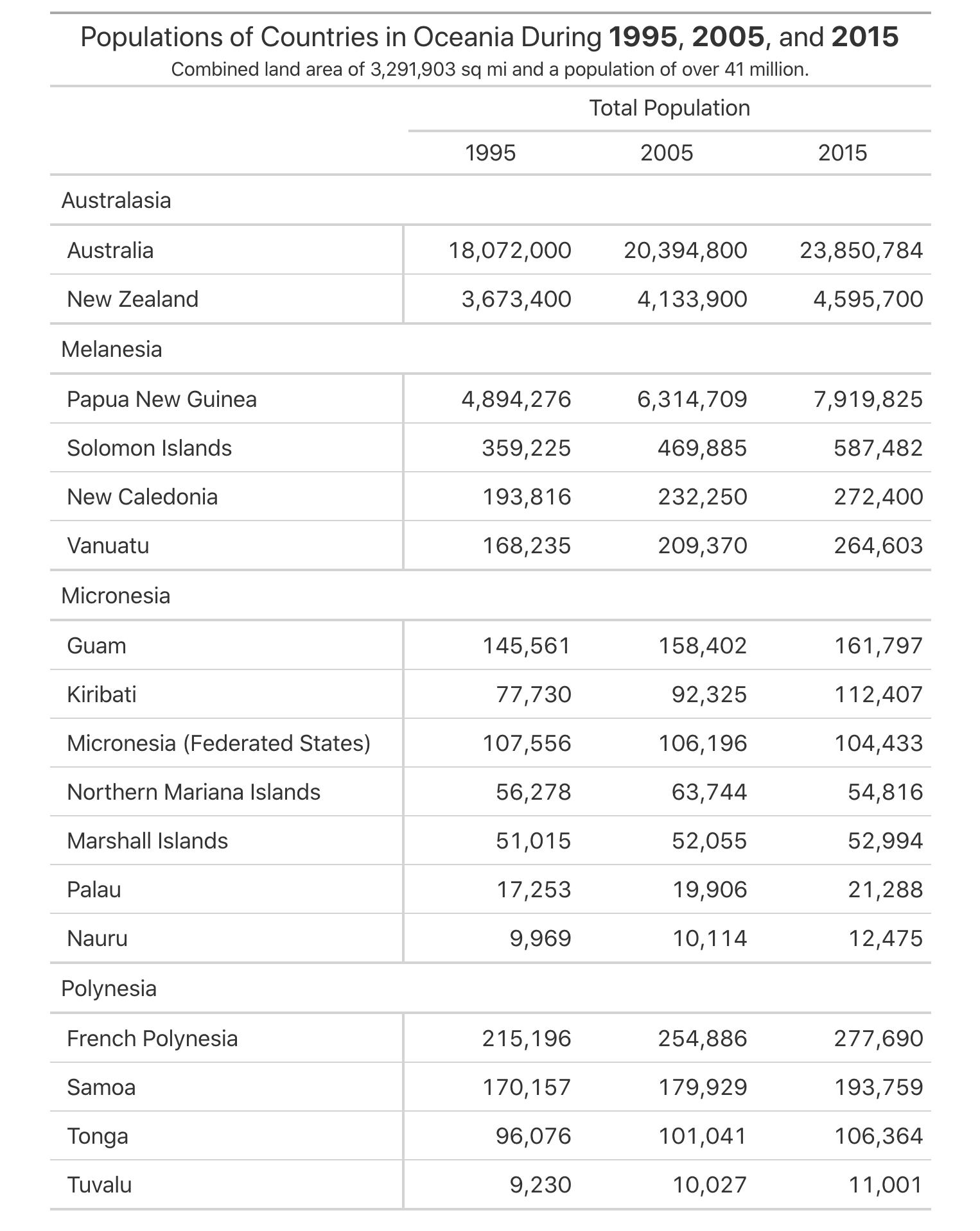
oceaniapops gt table now has a title and it looks great when styled with Markdown text.We’ve shown examples of adding footnotes before (with the exibble dataset). In the code example shown next, there is a more advanced used of locations (with the cells_stub() location helper function). Here, the md() function is again used to add Markdown text for some extra styling opportunities. With the md() function, we can do great things like add Markdown links (as was done with the source note that provides a link to the data on the Web). The following gt table shows the result of this code on footer of the table.
Footnotes and source notes can be added to a gt with the tab_footnote() and tab_source_note() functions.
oceaniapops_5 <-
  oceaniapops_4 |>
  tab_footnote(
    footnote = "United States.",
    locations = cells_stub(rows = starts_with(c("No", "Gu")))
  ) |>
  tab_footnote(
    footnote = "France.",
    locations = cells_stub(rows = starts_with(c("New Cal", "French")))
  ) |>
  tab_source_note(
    source_note = md(
      paste0(
        "Population data obtained from [World Bank Open Data]",
        "(https://data.worldbank.org/indicator/SP.POP.TOTL)."
      )
    )
  )

oceaniapops_5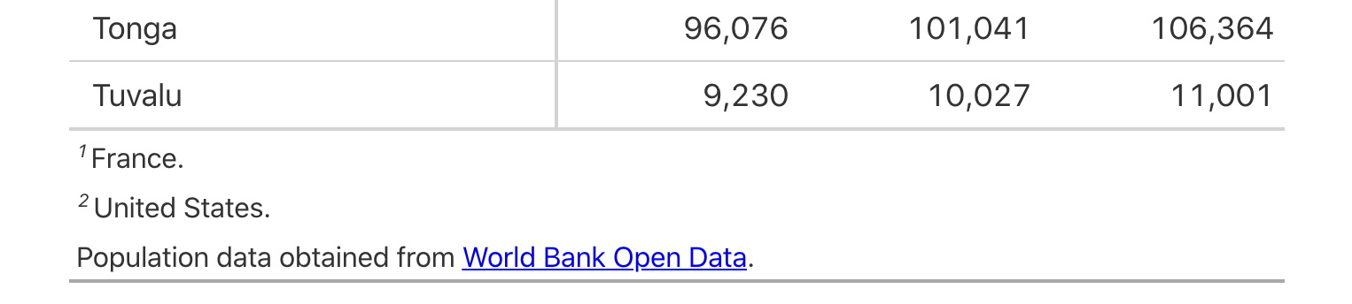
The tab_style() function is quite powerful, in that it can be used to radically change the look of a table. You can: add background colors to cell, modify text styles, add cell borders, and much more. Here is an example where multiple pieces of text are emboldened by using the cell_text() helper function (there are also the cell_fill() and cell_borders() stylizing helper functions). Notable in this code example is the use of multiple locations (wrapped up in a list) that serve as targets for the style application.
Text can be emboldened with combination of the tab_style() and cell_text() functions; we can do this at multiple locations at once.
oceaniapops_6 <-
  oceaniapops_5 |>
  tab_style(
    style = cell_text(weight = "bold"),
    locations = list(
      cells_column_labels(columns = TRUE),
      cells_column_spanners(spanners = TRUE),
      cells_row_groups(groups = TRUE)
    )
  )

oceaniapops_6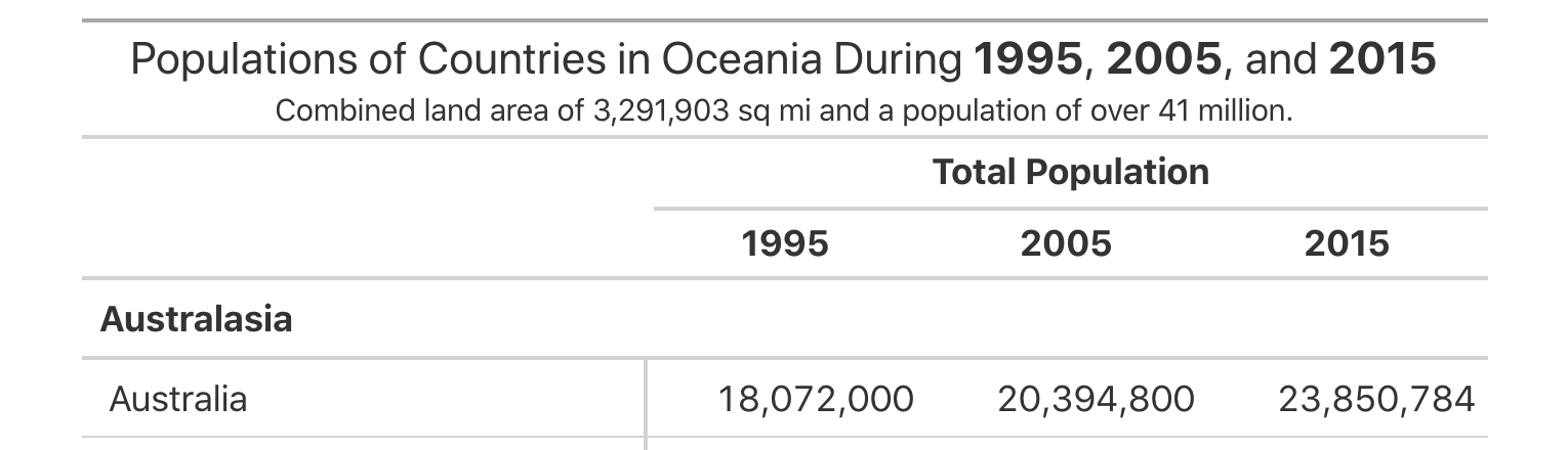
tab_style() function. Here, multiple locations’ cells are styled with bold text.The output table is seen to have multiple locations styled in a single call of tab_style(). You could use three separate calls of tab_style() with a single location specified in each cell, but the use of the list is much more efficient.
This sort of table can be further enhanced with summary rows. There are two functions for this: summary_rows() and grand_summary_rows(). The first operates within groups (and we have them in our table), the second incorporates all of the available data, regardless of whether some of the data are part of row groups
When we choose to use either of these functions, we have to supply a list of aggregation functions to the fns argument. We choose how to format the values in the resulting summary cells by use of a formatter function (e.g, fmt_number, etc.) and any relevant options. It’s a bit difficult to remember all of these things so examples here are very instructive and helpful.
Summary rows can be generated on a per-group basis (with summary_rows()), and, for all rows in the table (with grand_summary_rows()).
oceaniapops_7 <-
  oceaniapops_6 |>
  summary_rows(
    groups = TRUE,
    columns = TRUE,
    fns = list(TOTAL = ~ sum(., na.rm = FALSE)),
    formatter = fmt_number,
    decimals = 0
  ) |>
  grand_summary_rows(
    columns = TRUE,
    fns = list(`GRAND TOTAL` = ~ sum(., na.rm = FALSE)),
    formatter = fmt_number,
    decimals = 0
  ) |>
  tab_options(data_row.padding = px(4))

oceaniapops_7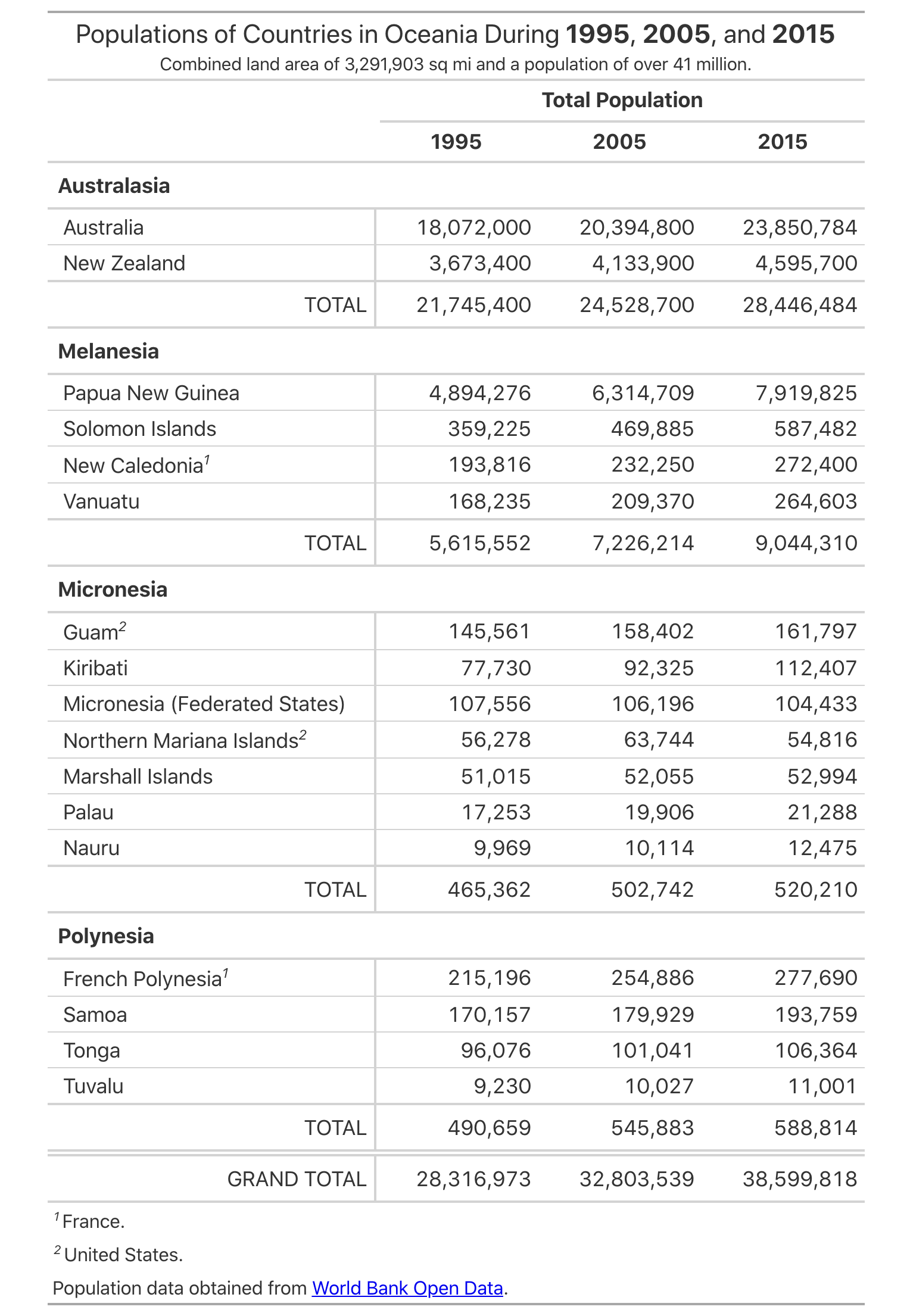
oceaniapops gt table. It has summary rows (per group and for the whole table).The end result? It’s really a great-looking presentation table. It’ll look good in Quarto reports and in other places where HTML is accepted. Should you need to export the table to HTML (to use elsewhere) or capture the table as an image (to put into a presentation), we can use the gtsave() function. The key to getting the right file is to use the correct file extension. An HTML file will be written to the working directory if providing a filename ending in .html and a PNG file is obtained when using the .png file extension (e.g., gtsave(oceaniapops_7, "oceaniapops_tbl.html") or gtsave(oceaniapops_7, "oceaniapops_tbl.png")).
H.3 Summary
- Large presentation tables can be generated using the DT package, where the
datatable()function generates the HTML table. -
DT tables are highly interactive, and these interactive elements can be added/removed though named extensions, and the
optionslist. - Smaller presentation tables are best made with the gt package, and they will look great given all the styling options available in the package.
- Tables made with gt start with the
gt()function, and then you would use thetab_*()functions for creating or modifying table parts. - Data cells in a gt table can be formatted to an exacting specification with the
fmt_*()family of functions (e.g.,fmt_number(),fmt_currency(),fmt_percent(),fmt_date(), etc.). - Footnotes in gt tables can be made with
tab_footnote(), source notes are generated withtab_source_note(); using either for the first time adds a table footer. - A title and subtitle in a gt table can be added with the
tab_header()function. - The
tab_style()function in gt uses a location helper function (just astab_footnote()does) and a stylizing helper function (cell_fill(),cell_text(), orcell_borders()). - Summary rows can be added to a gt table by using
summary_rows()orgrand_summary_rows().