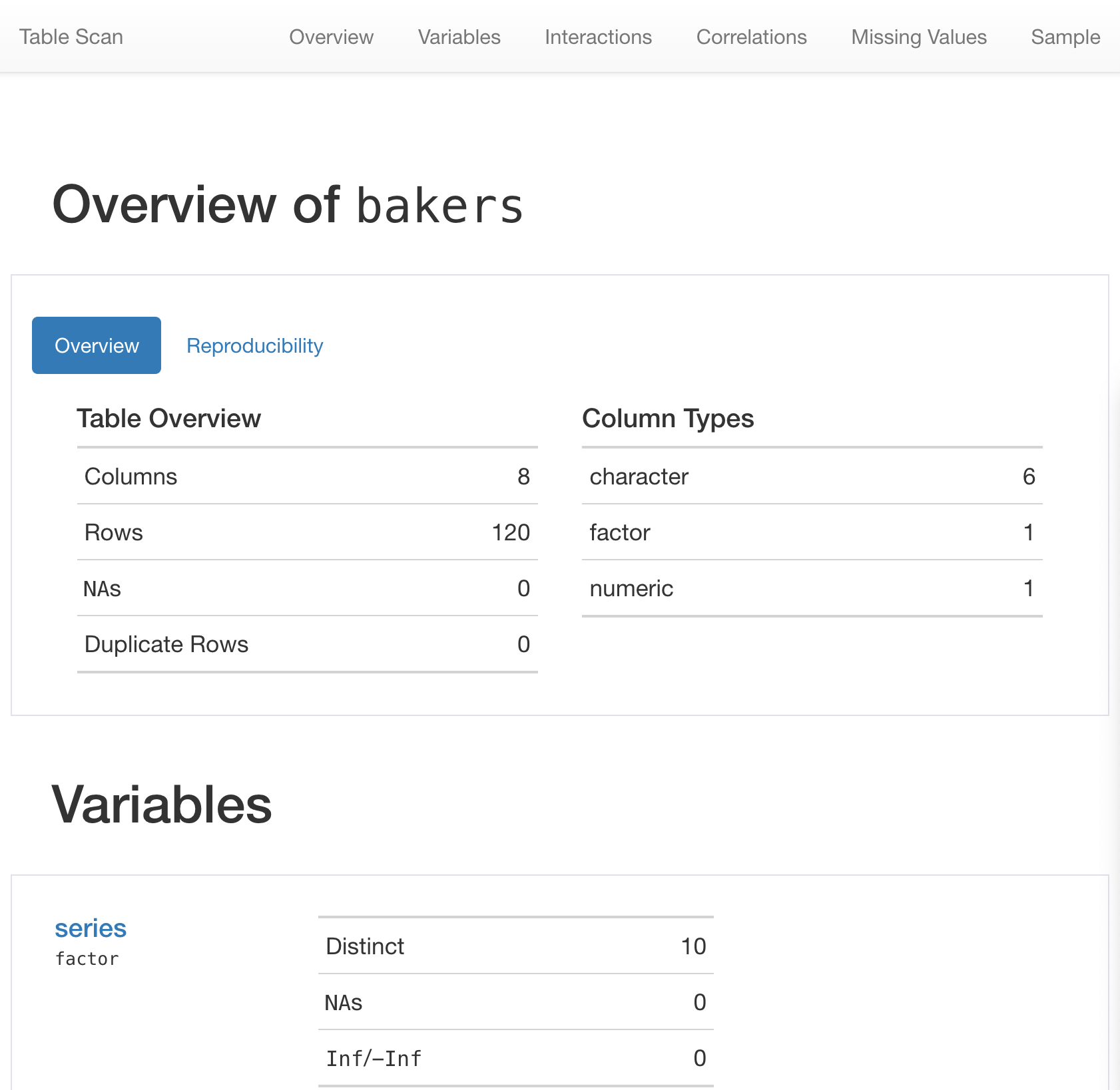
8  Careful Counting Patterns

Explore: The first steps with a new pattern (e.g., get info you need, take stock, smell checks).

Understand: Learning anything can involve asking questions (what kinds? How to actually translate to code? Interpreting outputs personally, may lead to more exploration).

Explain: How do we take the answers and rationalize with the investigations? That’s covered in this pattern. How to document to oneself, programmatic text for resilient reporting. This is really about talking to yourself, in a way.

Share: Communication and collaboration. We’ll show you ways you can make everything presentable and create outputs in a format that allows for easy consumption and feedback. An example: reordering plots or tables to make them easier to interpret.

Counting things in our data is super important. It allows us to account for things and also make sense of data. Sometimes you’ll want sums of values (for example, total amount of revenue earned in a week or a month), other times, you’ll need an accurate count of occurrences (like the daily active users of a service).

We’ll make extensive use of the bakeoff package. It’s a package that contains datasets based on the Great British Bake Off television show. In particular, the bakers dataset will be used for many of the examples.

8.1 Explore

We are going to explore a few datasets from the bakeoff package. It’s primarily a dataset package but it has a few handy functions as well. Let’s begin with bakeoff’s bakers dataset. We know nothing about it at this point so we’ll use glimpse() to inspect the structure of the data table (plus some of row content).

glimpse(bakers)
Rows: 120
Columns: 24
$ series                    <dbl> 1, 1, 1, 1, 1, 1, 1, 1, 1, 1, 2, 2, 2, 2, 2,…
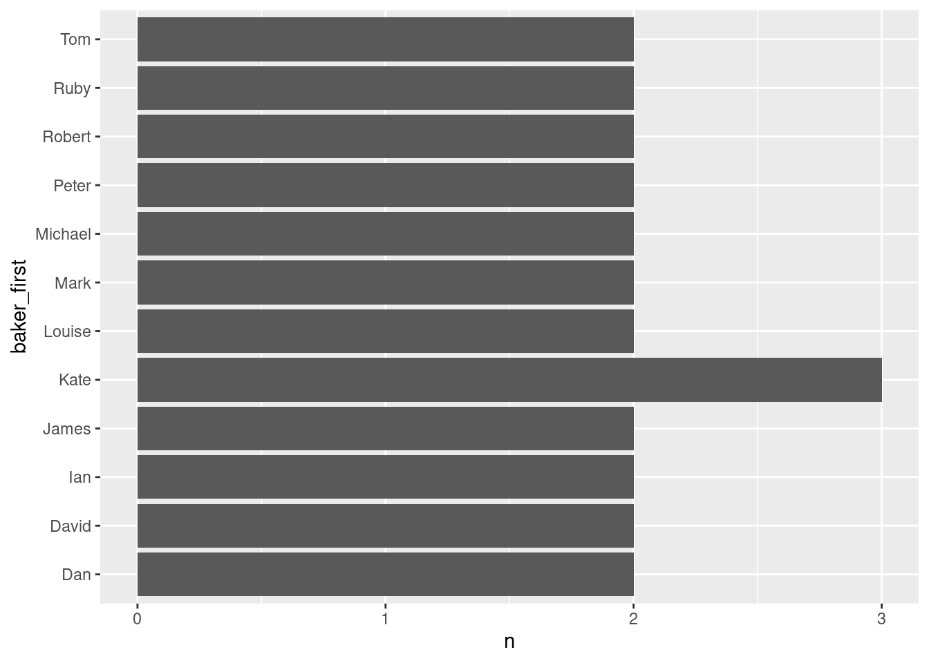
$ baker                     <chr> "Annetha", "David", "Edd", "Jasminder", "Jon…
$ star_baker                <int> 0, 0, 0, 0, 0, 0, 0, 0, 0, 0, 0, 0, 0, 0, 0,…
$ technical_winner          <int> 0, 0, 2, 0, 1, 0, 0, 0, 2, 0, 1, 2, 0, 1, 1,…
$ technical_top3            <int> 1, 1, 4, 2, 1, 0, 0, 0, 4, 2, 3, 5, 1, 1, 2,…
$ technical_bottom          <int> 1, 3, 1, 2, 2, 1, 1, 0, 1, 2, 1, 3, 2, 6, 3,…
$ technical_highest         <dbl> 2, 3, 1, 2, 1, 10, 4, NA, 1, 2, 1, 1, 2, 1, …
$ technical_lowest          <dbl> 7, 8, 6, 5, 9, 10, 4, NA, 8, 5, 5, 6, 10, 8,…
$ technical_median          <dbl> 4.5, 4.5, 2.0, 3.0, 6.0, 10.0, 4.0, NA, 3.0,…
$ series_winner             <int> 0, 0, 1, 0, 0, 0, 0, 0, 0, 0, 0, 0, 0, 0, 0,…
$ series_runner_up          <int> 0, 0, 0, 0, 0, 0, 0, 0, 0, 0, 0, 0, 0, 0, 0,…
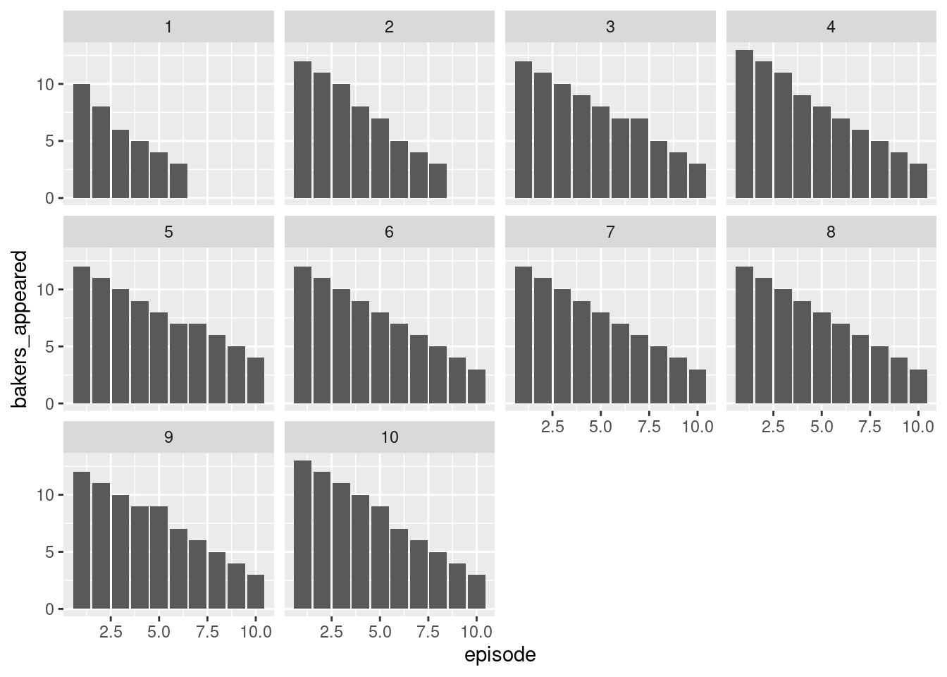
$ total_episodes_appeared   <dbl> 2, 4, 6, 5, 3, 1, 2, 1, 6, 6, 4, 8, 3, 7, 5,…
$ first_date_appeared       <date> 2010-08-17, 2010-08-17, 2010-08-17, 2010-08…
$ last_date_appeared        <date> 2010-08-24, 2010-09-07, 2010-09-21, 2010-09…
$ first_date_us             <date> NA, NA, NA, NA, NA, NA, NA, NA, NA, NA, NA,…
$ last_date_us              <date> NA, NA, NA, NA, NA, NA, NA, NA, NA, NA, NA,…
$ percent_episodes_appeared <dbl> 33.33333, 66.66667, 100.00000, 83.33333, 50.…
$ percent_technical_top3    <dbl> 50.00000, 25.00000, 66.66667, 40.00000, 33.3…
$ baker_full                <chr> "Annetha Mills", "David Chambers", "Edward \…
$ age                       <dbl> 30, 31, 24, 45, 25, 51, 44, 48, 37, 31, 31, …
$ occupation                <chr> "Midwife", "Entrepreneur", "Debt collector f…
$ hometown                  <chr> "Essex", "Milton Keynes", "Bradford", "Birmi…
$ baker_last                <chr> "Mills", "Chambers", "Kimber", "Randhawa", "…
$ baker_first               <chr> "Annetha", "David", "Edward", "Jasminder", "…

Right up front we get told there are 120 rows and 8 columns. That’s very useful because we get a sense of the overall size of the dataset. Because bakers is a tibble, when the core Tidyverse packages are loaded with library(tidyverse) we get a pretty nice printing of the table just by calling its name. Check it out:

bakers
# A tibble: 120 × 24
   series baker     star_baker technical_winner technical_top3 technical_bottom
    <dbl> <chr>          <int>            <int>          <int>            <int>
 1      1 Annetha            0                0              1                1
 2      1 David              0                0              1                3
 3      1 Edd                0                2              4                1
 4      1 Jasminder          0                0              2                2
 5      1 Jonathan           0                1              1                2
 6      1 Lea                0                0              0                1
 7      1 Louise             0                0              0                1
 8      1 Mark               0                0              0                0
 9      1 Miranda            0                2              4                1
10      1 Ruth               0                0              2                2
# ℹ 110 more rows
# ℹ 18 more variables: technical_highest <dbl>, technical_lowest <dbl>,
#   technical_median <dbl>, series_winner <int>, series_runner_up <int>,
#   total_episodes_appeared <dbl>, first_date_appeared <date>,
#   last_date_appeared <date>, first_date_us <date>, last_date_us <date>,
#   percent_episodes_appeared <dbl>, percent_technical_top3 <dbl>,
#   baker_full <chr>, age <dbl>, occupation <chr>, hometown <chr>, …

There’s no shortage of ways to preview a tabular dataset. We can even use the gt package (loaded with library(gt)) to give us an HTML-based preview of bakers. For that, we use the gt_preview() function. Here’s how that looks:

gt_preview(bakers)
series baker star_baker technical_winner technical_top3 technical_bottom technical_highest technical_lowest technical_median series_winner series_runner_up total_episodes_appeared first_date_appeared last_date_appeared first_date_us last_date_us percent_episodes_appeared percent_technical_top3 baker_full age occupation hometown baker_last baker_first
1 1 Annetha 0 0 1 1 2 7 4.5 0 0 2 2010-08-17 2010-08-24 NA NA 33.33333 50.00000 Annetha Mills 30 Midwife Essex Mills Annetha
2 1 David 0 0 1 3 3 8 4.5 0 0 4 2010-08-17 2010-09-07 NA NA 66.66667 25.00000 David Chambers 31 Entrepreneur Milton Keynes Chambers David
3 1 Edd 0 2 4 1 1 6 2.0 1 0 6 2010-08-17 2010-09-21 NA NA 100.00000 66.66667 Edward "Edd" Kimber 24 Debt collector for Yorkshire Bank Bradford Kimber Edward
4 1 Jasminder 0 0 2 2 2 5 3.0 0 0 5 2010-08-17 2010-09-14 NA NA 83.33333 40.00000 Jasminder Randhawa 45 Assistant Credit Control Manager Birmingham Randhawa Jasminder
5 1 Jonathan 0 1 1 2 1 9 6.0 0 0 3 2010-08-17 2010-08-31 NA NA 50.00000 33.33333 Jonathan Shepherd 25 Research Analyst St Albans Shepherd Jonathan
6..119
120 10 Steph 0 1 6 4 1 10 3.0 0 0 10 NA NA NA NA 100.00000 60.00000 Steph Blackwell 28 Shop assistant Chester Blackwell Steph

This table presents really nicely and so it’s great for sharing a preview of the dataset (e.g., in static R Markdown documents).

Sometimes, however, you need more. You need some stats. Descriptive statistics can better aid in the understanding of a dataset. You’ll get a sense of numerical ranges (for numerical columns), if there are missing values in certain columns, and the degree of uniqueness across columns (or variables). There are multiple great solutions for this in R. One of them in the skim() function provided by the skimr package:

skim(bakers)
─ Data Summary ────────────────────────
                           Values
Name                       bakers
Number of rows             120   
Number of columns          24    
_______________________          
Column type frequency:           
  character                6     
  Date                     4     
  numeric                  14    
________________________         
Group variables            None  

── Variable type: character ───────────────────────────────────────────────────────────────────────────────
  skim_variable n_missing complete_rate min max empty n_unique whitespace
1 baker                 0             1   3  10     0      107          0
2 baker_full            0             1   9  23     0      120          0
3 occupation            0             1   5  42     0      106          0
4 hometown              0             1   5  41     0       96          0
5 baker_last            0             1   3  17     0      117          0
6 baker_first           0             1   3  10     0      107          0

── Variable type: Date ────────────────────────────────────────────────────────────────────────────────────
  skim_variable       n_missing complete_rate min        max        median     n_unique
1 first_date_appeared        25         0.792 2010-08-17 2017-08-29 2014-08-06        8
2 last_date_appeared         25         0.792 2010-08-17 2017-10-31 2014-08-06       72
3 first_date_us             120         0     Inf        -Inf       NA                0
4 last_date_us              120         0     Inf        -Inf       NA                0

── Variable type: numeric ─────────────────────────────────────────────────────────────────────────────────
   skim_variable             n_missing complete_rate    mean     sd   p0  p25  p50   p75 p100 hist 
 1 series                            0         1      5.6     2.86   1    3    6     8     10 ▇▇▇▇▇
 2 star_baker                        0         1      0       0      0    0    0     0      0 ▁▁▇▁▁
 3 technical_winner                  0         1      0.775   0.991  0    0    0     1      5 ▇▂▁▁▁
 4 technical_top3                    0         1      2.33    2.31   0    0    2     4      8 ▇▃▂▂▁
 5 technical_bottom                  0         1      3.48    1.68   0    2    3     5      7 ▃▂▇▃▂
 6 technical_highest                 1         0.992  3.26    3.26   1    1    2     4.5   13 ▇▂▁▁▁
 7 technical_lowest                  1         0.992  8.92    2.05   4    7    9    10.5   13 ▂▅▇▇▂
 8 technical_median                  1         0.992  5.64    2.72   1.5  3.5  5     7     13 ▇▇▃▃▂
 9 series_winner                     0         1      0.0833  0.278  0    0    0     0      1 ▇▁▁▁▁
10 series_runner_up                  0         1      0       0      0    0    0     0      0 ▁▁▇▁▁
11 total_episodes_appeared           0         1      5.92    3.09   1    3    6     9     10 ▅▅▆▅▇
12 percent_episodes_appeared         0         1     62.4    31.3   10   33.3 64.6 100    100 ▃▃▃▃▇
13 percent_technical_top3            0         1     30.5    25.4    0    0   33.3  50     80 ▇▃▅▆▂
14 age                               0         1     37.4    12.9   17   28.8 34    45     71 ▃▇▃▂▂

By default, we get a lot of information very quickly. The printed info gives us:

  • the table name and its dimensions (row and column counts)
  • a listing of column types and their frequencies
  • whether there are ‘grouped’ variables (via dplyr’s group_by() function)
  • info tables for variables by their type with the degree of missingness (n_missing) and the completion rate complete_rate; let’s look at the specialized bits of info for the three column types we have in bakers:
    • character: minimum and maximum string lengths, ‘empty’ strings (""), number of unique strings (n_unique), and number of strings that are just whitespace (e.g., " ")
    • factor: is the factor ordered? How many unique factor levels are there? What are the most frequent levels?
    • numeric: descriptive stats like the mean, the standard deviation, quantiles, and, a nice little histogram for a quick visual of the data distribution

The skim() function is certainly something to keep in your toolbelt, and quite handy when you get a new dataset to look at for the first time.

Another option is the scan_data() function from the pointblank package. It’s a lot like skim() in principle, except it provides even more information but does so in a strictly-HTML-based report. Here’s what the top of the table scan for bakers looks like.

Table Scan for bakers

The report is huge and highly interactive. The graphic above shows a bit of what you’ll find in the report. The reason this would be useful is that anomalies in the data (especially egregious ones) are easily discovered by looking through the report. For that reason, it’s a great idea to use this functionality whenever encountering either

  1. a new dataset
  2. a familiar dataset where data might have changed

You never really know when a dataset may change for the worse, so, scan it up and down with scan_data().

8.2 Understand

To get an even greater understanding of our data, we’ll want to ask several questions of it and then get the answer to confirm our assumptions. Let’s explore the bakers dataset from the bakeoff package. This table provides a record for every contestant from every series of the show. In particular, it provides their names (baker_full, baker_last, and baker_first), ages (age), occupations (occupation), and where they live (hometown).

Suppose we have the question: are the contestants unique across all of the rows? Well, we could find that out by knowing that there are 120 rows in the dataset and that using the distinct() function (from the dplyr package) should give us the same number of rows when used just on the baker_full column (full names for each contestant). Let’s take a look at that in action:

bakers |> distinct(baker_full)
# A tibble: 120 × 1
   baker_full             
   <chr>                  
 1 "Annetha Mills"        
 2 "David Chambers"       
 3 "Edward \"Edd\" Kimber"
 4 "Jasminder Randhawa"   
 5 "Jonathan Shepherd"    
 6 "Lea Harris"           
 7 "Louise Brimelow"      
 8 "Mark Whithers"        
 9 "Miranda Gore Browne"  
10 "Ruth Clemens"         
# ℹ 110 more rows

Yes! This one-column table gives us 120 rows as well. This proves that every contestant appeared once per season. If a person appeared in multiple seasons then the resulting table would have less than 120 rows (since duplicate entries for baker_full would be removed).

Here’s another question: what’s the most common first name for a contestant on the show? To get this, we’d have to focus on the baker_first column (first names for each and every contestant).

bakers |> distinct(baker_first)
# A tibble: 107 × 1
   baker_first
   <chr>      
 1 Annetha    
 2 David      
 3 Edward     
 4 Jasminder  
 5 Jonathan   
 6 Lea        
 7 Louise     
 8 Mark       
 9 Miranda    
10 Ruth       
# ℹ 97 more rows

The row count here is 107 and this is less than the 120 row count for the complete dataset. From this, we now know there are some first names shared amongst the contestants. Let’s change up our strategy and instead use the count() function (from dplyr) to count the first names (in the baker_first column):

bakers |> count(baker_first)
# A tibble: 107 × 2
   baker_first     n
   <chr>       <int>
 1 Ali             1
 2 Alice           1
 3 Alvin           1
 4 Amelia          1
 5 Andrew          1
 6 Annetha         1
 7 Antony          1
 8 Beca            1
 9 Ben             1
10 Benjamina       1
# ℹ 97 more rows

The table we get now has counts that go along with each of the first names! But the names are sorted alphabetically and it’s hard to determine what the most common name is. This can be entired remedied by using the sort option in count(). With sort = TRUE, the sorting of the n column will be from high to low.

bakers |> count(baker_first, sort = TRUE)
# A tibble: 107 × 2
   baker_first     n
   <chr>       <int>
 1 Kate            3
 2 Dan             2
 3 David           2
 4 Ian             2
 5 James           2
 6 Louise          2
 7 Mark            2
 8 Michael         2
 9 Peter           2
10 Robert          2
# ℹ 97 more rows

This is exactly what we need and it’s now plain to see that the most common first name is Kate (with three different contestants having that name). Should you want to visualize this, it can be done very quickly with ggplot and the geom_col() function. Here, we will do that, but only include those names that are shared with others.

bakers |>
  count(baker_first, sort = TRUE) |>
  filter(n > 1) |>
  ggplot() +
  geom_col(aes(x = n, y = baker_first))

On to another question we might ask of the dataset: was there any series where two contestants shared the same first name? We can find that out by getting a count of contestants’ first names by series. Still using count() to do this except now we must provide two grouping variables (baker_first and series).

bakers |> count(series, baker_first, sort = TRUE)
# A tibble: 120 × 3
   series baker_first     n
    <dbl> <chr>       <int>
 1      1 Annetha         1
 2      1 David           1
 3      1 Edward          1
 4      1 Jasminder       1
 5      1 Jonathan        1
 6      1 Lea             1
 7      1 Louise          1
 8      1 Mark            1
 9      1 Miranda         1
10      1 Ruth            1
# ℹ 110 more rows

It seems like this is not the case. All n values are 1 and the total row count in this output table is the same as that of the original table (120). This follows the original order of the table (series increasing). Note that if you reverse the groups (specifying baker_first and then series) then the sorting order becomes an alphabetical sorting of all bakers’ first names (since n is 1 all the way down).

Can we figure out if any bakers are from the same hometown? How about from the same hometown and the same series? Sure. Use the groups hometown and series and then ensure that sort = TRUE as before.

bakers |> count(hometown, series, sort = TRUE)
# A tibble: 115 × 3
   hometown                     series     n
   <chr>                         <dbl> <int>
 1 London                            9     4
 2 Merseyside                        8     2
 3 North London                      8     2
 4 Aldershot, Hampshire              4     1
 5 Alkington, Shropshire             5     1
 6 Arlesey, Bedfordshire             2     1
 7 Ascot, Berkshire                  5     1
 8 Ashton upon Mersey, Trafford      5     1
 9 Auchterarder, Perthshire          6     1
10 Barton-Le-Clay, Bedfordshire      7     1
# ℹ 105 more rows

We can see that we had fellow townies in series 8 and four Londoners in series 9. For sure, this count() function from dplyr is incredibly powerful.

The episodes dataset has an interesting metric in its bakers_appeared column. It gives us the count of contestants per episode across all the 10 series. Further to this, the bakers_out column tells us how many of the bakers-that-appeared in an episode were eliminated. This is natural and to be expected from shows where participants are routinely eliminated. And, this is eminently plottable. Let’s do that and facet the plots by series.

episodes |> 
  select(series, episode, bakers_appeared) |>
  ggplot() +
  geom_col(aes(x = episode, y = bakers_appeared)) +
  facet_wrap(~series)

This is an interesting overview of the series and how eliminations were carried out. We see that most series had 10 episodes except for the first two. Most episodes resulted in the elimination of a single contestant but, sometimes, it was two (or none!).

8.3 Explain

Now that we better understand the bakeoff data in general. We need to develop some ways to explain the data. If you’re using R Markdown or Quarto, you’ll sometimes want to get the values inside of the inline text of the document. This is key for describing your data and we can, for example, use nrow() to get the number of rows in the table like this 120. It’s pretty essential that we directly use the input data and function calls to get the derived values. If the values were hardcoded that might be fine but there’s always the risks that (1) your transcription is inaccurate, and (2) the underlying data might change when rendering the document.

While sometimes it’s useful to explain things in the prose of the report, other times a well-placed table can provide more information. Let’s look at a few summary tables that can explain the results found previously.

Perhaps the last plot of contestant counts per episode per series might be better presented as a table? Sometimes it’s hard to really know until the table is made. We can do that by making use of the bakers_appeared column as before, and by pivoting the data to a wide format with pivot_wider() (so that we can scan across episodes per each series). Once the table is in the right shape, we then use the gt() function (and other functions in gt) to construct the summary table.

episode_summary <- 
  episodes |> 
  select(series, episode, bakers_appeared) |>
  pivot_wider(names_from = episode, values_from = bakers_appeared) |>
  gt(rowname_col = "series") |>
  tab_spanner(label = "Episode", columns = matches("[0-9]*")) |>
  sub_missing(columns = everything()) |>
  cols_width(
    stub() ~ "60px",
    everything() ~ "40px"
  ) |>
  tab_stubhead(label = "Series")

episode_summary
Series Episode
1 2 3 4 5 6 7 8 9 10
1 10 8 6 5 4 3
2 12 11 10 8 7 5 4 3
3 12 11 10 9 8 7 7 5 4 3
4 13 12 11 9 8 7 6 5 4 3
5 12 11 10 9 8 7 7 6 5 4
6 12 11 10 9 8 7 6 5 4 3
7 12 11 10 9 8 7 6 5 4 3
8 12 11 10 9 8 7 6 5 4 3
9 12 11 10 9 9 7 6 5 4 3
10 13 12 11 10 9 7 6 5 4 3

This table looks really good and it presents exact numbers of bakers appearing per episode (important if someone needs to scan down episode numbers across seasons and compare contestant counts). In this summary table we always see that the last episode became a showdown between three (but in one case, four) final contestants and other little patterns become apparent (like that sequence of 5-4-3 contestants in the last three episodes is a motif across much of the series).

8.4 Share

The reporting obtained from pointblank’s scan_data() can be shared in multiple ways. Some examples include publication on https://quartopub.com or on a Connect instance, or, distributing an HTML document produced by R Markdown or Quarto. If you want to send somebody the HTML file for the table scan, that can be done with pointblank’s export_report() function. It’s even possible to take the HTML file produced from that function and work it into a Shiny app.

Another great sharing opportunity comes from generating useful and excellent-looking plots. Let’s use the bakeoff dataset ratings and make a vertical bar plot showing the ratings for all ten series. To make this excellent, we are going to do a few things:

  • differentiate the different bars by colorizing them by series
  • directly label the groups of bars with a series number
  • apply an informative and interesting title and subtitle
  • remove unnecessary labeling/marks (all of the x-axis ticks and labels)

There are some challenging bits in here but let’s look at the code, the resulting plot, and then go over how we solved each data visualization problem.

# Create a tibble with the data we need
ratings_all <-
  ratings |> 
  mutate(series = as.factor(series)) |>
  mutate(episode_id = row_number()) |>
  select(episode_id, viewers_7day, series, episode)

# Create a tibble with coordinates for the series labels
series_labels <-
  ratings_all |>
  group_by(series) |> 
  summarize(
    y_position = median(viewers_7day) + 1,
    x_position = mean(episode_id)
  )

# Generate the plot
ggplot(
  data = ratings_all,
  aes(x = episode_id, y = viewers_7day, fill = series)
  ) +
  geom_col(alpha = 0.9) +
  geom_text(
    data = series_labels,
    aes(label = series, x = x_position, y = y_position)
  ) +
  scale_fill_manual(
    values = bakeoff_palette(n = 10),
    guide = "none"
  ) +
  scale_x_discrete(expand = c(0, 0)) +
  labs(
    title = "Series 8 Experienced a Big Setback in Regards to Viewers",
    subtitle = "7-day viewers across all series/episodes",
    caption = "Data source: the ratings dataset from the bakeoff package.",
    x = NULL,
    y = "7-day Viewers"
  ) +
  theme_minimal() +
  theme(
    axis.text.x = element_blank(),
    axis.ticks.x = element_blank(),
    axis.title.x = element_blank(),
    panel.grid.major.x = element_blank(),
    panel.grid.minor.x = element_blank()
  )

This plot looks really good, and it’s very shareable. The title is pretty captivating, gets to the heart of the matter, and makes its case. The code is split into three main statements. The first gets the data needed for the plot. Having a factor for the series column in the ratings_all table is important for filling each series’ bars with a separate color. Having continuous episode numbers, independent of the series, is important for plotting the episode ratings in the correct order (it is a continuous scale after all). Selecting only the data you need keeps things tidy and keeps things organized and obvious for other people looking at your code (sharing code is also good, very good!).

What about the table that we called series_labels? Well, we need that to plot the series-number labels. We’re using the power of stats to generate the positions for the data labels. Using the median of each series’ ratings for the y position and the mean of that for the x position is pretty inspired. We also nudge the y positions up a little bit with the addition of 1 (try out different values and see for yourself what looks right).

After having those two tables made, we generate the plot. The ratings_all table is used to make the bars via geom_col(). With geom_text() we plot the text labels using that series_labels table. We have a wonderful set of color palettes in the bakeoff package; we can access the default palette "showstopper" by calling bakeoff_palette(). To add those colors to the different series’ bars, we need scale_fill_manual() to do that bit of work. To avoid a legend (don’t need it!), the guide = FALSE option is used. Labels are important and so we’ve added a title, subtitle, a caption, and a re-worked y-axis label with the ever-useful labs() function.

The resulting plot, again, is great! If shared via a Quarto document or through an email it would surely be a delight for the recipient.