Explore: The first steps with a new pattern (e.g., get info you need, take stock, smell checks).
Understand: Learning anything can involve asking questions (what kinds? How to actually translate to code? Interpreting outputs personally, may lead to more exploration).
Explain: How do we take the answers and rationalize with the investigations? That’s covered in this pattern. How to document to oneself, programmatic text for resilient reporting. This is really about talking to yourself, in a way.
Share: Communication and collaboration. We’ll show you ways you can make everything presentable and create outputs in a format that allows for easy consumption and feedback. An example: reordering plots or tables to make them easier to interpret.
Sometimes you have a lot of data. I’m talking many, many, rows. In data analysis, summarizing large amounts of data is crucial. It’s a commonly use pattern, and this is not a joke. The pattern involves distilling vast quantities of information into shorter representations. Why do this? To make it easier to uncover insights and to draw conclusions. Summaries save time! Communication with summaries is more expressive. Summarized material makes it easier to identify outliers or unexpected patterns.
We’ll make extensive use of the summarize() function in dplyr to generate summarized tables (from larger tables). And we’ll use some larger datasets available in the packages you know and love. Here’s what we’ll be using:
tidyverse: to use the dplyr, ggplot, and lubridate packages
gt: for making summary tables in a more presentable fashion
intendo: for the dataset we’ll be using (users_daily)
9.1 Explore
Let’s obtain some interesting data from the intendo package. If you don’t already know this package, it contains datasets that deal with activity and revenue from a (non-real) online game. The dataset we want for the forthcoming examples is users_daily. We can get it through use of the users_daily() function.
Let’s take a look at the users_daily tibble by printing it out:
To start with the summarizing, we’ll first get the mean value of playtime_day for all users in January 2015. The dataset encompasses the entire 2015 year, so using the filter() function is a good strategy to trim down the data. Let’s get a value of the mean play time across all users by every day in the one month we’re looking at. We do this with a combination of group_by() (grouping by login_date) and summarize() (taking the mean of playtime_day).
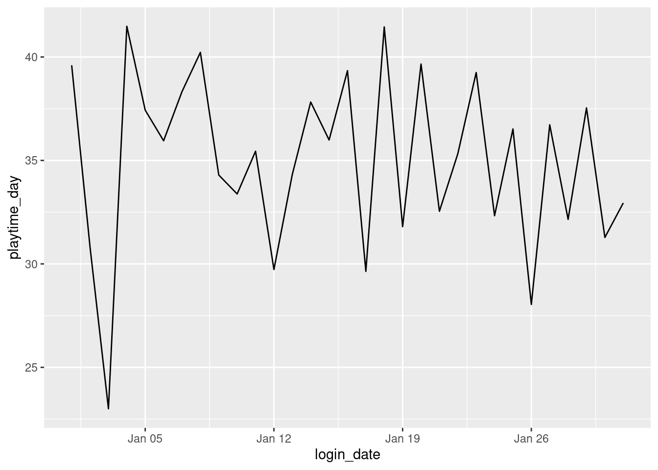
We find that right away it’s hard to read a tibble, even for summarized data. Since this is a simple table, we could very well make a line plot using ggplot. Using ggplot during the exploratory phase is always useful and it doesn’t require a lot of code:
ggplot(users_daily_playtime,aes(x =login_date, y =playtime_day))+geom_line()
What this plot tells us is that the average daily playtime across all users in January 2015 is roughly between 30 and 40 minutes. This is interesting but we have a lot more data in users_daily that we can use to tease out some even more useful summary info.
Let’s get the average playtime_day in January 2015, this time creating groups by country and getting the number of users in each of these country groups. This is to answer the question: are users from different countries more-or-less equally engaged (or not)?
# A tibble: 21 × 3
   country        n_users mean_playtime_day
   <chr>            <int>             <dbl>
 1 United States       78              32.3
 2 China               70              37.3
 3 India               55              31.9
 4 South Africa        47              33.3
 5 Philippines         44              34.7
 6 United Kingdom      36              38.6
 7 Austria             31              36.1
 8 South Korea         30              38.7
 9 Switzerland         27              32.0
10 Germany             25              35.8
# ℹ 11 more rows
We find from looking at the printing of the summary that we have not very many users. Upon splitting the total set of users in January by country, we get less than a hundred per country. Because of these low user counts per group, let’s choose to remove the filter() statement and use the whole year and re-run the summarizing statements:
# A tibble: 23 × 3
   country        n_users mean_playtime_day
   <chr>            <int>             <dbl>
 1 United States     5909              30.7
 2 Germany           3371              29.9
 3 South Korea       3107              30.3
 4 Russia            2810              30.1
 5 United Kingdom    2772              30.9
 6 China             2487              31.2
 7 France            2286              30.3
 8 India             2202              30.1
 9 Japan             2127              30.5
10 South Africa      1749              29.1
# ℹ 13 more rows
This is better, for now we have thousands of users per group. For users across different countries we find that the average play time per day is about the same: 30 minutes. This in itself is interesting. It does mean that users across these groups are equally engaged (and we did have that question answered).
9.2 Understand
We could now look at other metrics to see if there is some variation that is interesting. Let’s look at the IAP (in-app purchase) spend and the quantity of ad views. We’ll get mean() values again, both for the number of IAPs and ads viewed and the amount of revenue earned from both.
# A tibble: 23 × 7
   country        n_users mean_playtime_day mean_n_iap_day mean_n_ads_day
   <chr>            <int>             <dbl>          <dbl>          <dbl>
 1 United States     5909              30.7          1.11            3.34
 2 Germany           3371              29.9          1.07            3.29
 3 South Korea       3107              30.3          1.09            3.30
 4 Russia            2810              30.1          1.23            3.28
 5 United Kingdom    2772              30.9          0.991           3.37
 6 China             2487              31.2          1.11            3.41
 7 France            2286              30.3          1.21            3.32
 8 India             2202              30.1          0.811           3.24
 9 Japan             2127              30.5          1.08            3.31
10 South Africa      1749              29.1          0.889           3.17
# ℹ 13 more rows
# ℹ 2 more variables: mean_rev_iap_day <dbl>, mean_rev_ads_day <dbl>
The table above probably has the information you need but, even though it is summarized, it is very hard to read. It’s very much worth making a gt table to better present this summary data. You can organize the country column values into the table stub. You could format the values so they are easier to read. And you can color code the values within key columns so that it’s all much easier to parse.
Though some may characterize it as prematurely styling a table, it is good to include as early as possible things like revised column labels, column spanners, and consistent sizing of columns in a gt table. Even though we’re not at the sharing stage yet and still understanding the data and the hidden patterns within, basic table improvements through the use of the fmt_*() functions, cols_label(), tab_spanner(), and cols_width() do make it easier get an understanding of the data.
From the summary gt table we can see that the country has virtually no effect on the average daily play time. However, the average daily revenue from IAP does vary according to country; Norway users have an average daily spend of $48.31 whereas users from India spend an average of $6.41 daily on in-app purchases. There are also differences in ad revenue across countries, though the revenue gained from ad views is one order of magnitude lower. What’s more intriguing is that the average numbers of IAPs and ads are much the same across the users of the different countries. Since ad views have variations in revenue earned and IAPs come in a wide range of price points, it seems that users of different countries tend to spend differently when it comes to IAPs.
9.3 Explain
Once we understood that summaries can be useful for finding out that different countries have differing amounts of IAP spends, we can continue in this way and look for differences using other variables. There are several categorical variables from users_daily that could be used in a group_by()/summarize() pattern. Let’s see if the acquisition variable has any discernable effect on mean revenue from IAPs per day:
This summarized table is quite small (6 rows by 3 columns) so we could look it over as is (i.e., no need to re-tabulate in gt for better readability). There seems to be two things that stick out:
The "organic" group (players that came to the game independently of a campaign) is the largest group
The "apple" group, comprising players that installed as a result of an ad in the App Store, spends the most per day on IAPs
This is pretty useful information! And we can use this to make additional summaries. For instance, it might be good to see if there is a trend in spend for this acquisition groups over the 2015 year. We can do that with some manipulation of the users_daily table. Essentially, we’ll make an additional categorical column (month) through mutation of the login_date column via the month() function from the lubridate package.
# A tibble: 72 × 4
   month acquisition    n_users mean_rev_iap_day
   <ord> <chr>            <int>            <dbl>
 1 Jan   apple               13            17.2
 2 Jan   crosspromo          25            28.8
 3 Jan   facebook            50             4.55
 4 Jan   google              90             9.97
 5 Jan   organic            300            14.0
 6 Jan   other_campaign      71            33.3
 7 Feb   apple               13             8.69
 8 Feb   crosspromo          34            28.7
 9 Feb   facebook            71            23.7
10 Feb   google             155            21.4
# ℹ 62 more rows
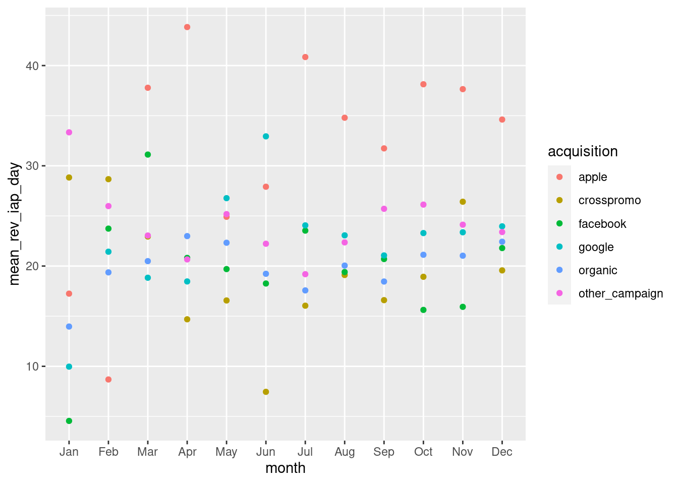
We can plot this using ggplot. This won’t be a line plot since our mean_rev_iap_day values belong to a specific month and acquisition. So instead of geom_line() being used, we’ll opt for geom_point(). The months will be categories on the x axis and the mean revenue per day will be put onto the y axis. We also need to be able to distinguish the different data points and, to that end, the acquisition variable will be assigned to the color aesthetic.
ggplot(users_daily_summary_by_acquisition_month,aes(x =month, y =mean_rev_iap_day, color =acquisition))+geom_point()
From the plot we can see that users introduced to the game via the "apple" campaign, for eight out of twelve months, had the highest average spend. And for those months, the difference between "apple" and the next highest-performing campaign was quite substantial. This additional summary provides useful information for the analyst. It shows how the different campaigns have performed and this information can be used to influence future advertising campaigns (perhaps for the 2016 year).
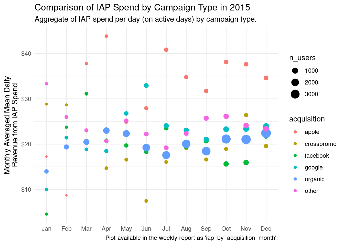
9.4 Share
The look of the previous plot was good enough to let us understand and even explain the key findings to others. However, if you want to share the plot it could be improved so that those key findings are clearly communicated.
Let’s have the following features in the revised ggplot plot:
a title and a subtitle, explaining the purpose and meaning of the plot
a caption that shows where the plot can be later found (for further inspection)
removal of the redundant x-axis label (it’s obvious we are looking at months)
an improved y-axis label and values formatted as currency values
points sized by the number of users in the grouping
a somewhat more minimal theme
We can make this all possible. The labs() function makes it easy to set the title, the subtitle, and the caption. Here we make the title describe what’s in the plot in general terms (Comparison of IAP Spend by Campaign Type in 2015") and the subtitle will have more specific information ("Aggregate of IAP spend per day (on active days) by campaign type."). You could even add in some statements that summarize the key findings in the subtitle. By using x = NULL in labs(), we effectively remove the x-axis label (which is not really needed here). The y-axis label is also given text that is specific and informative. With the \n used in the y argument, we can add in a line break since the label text is quite long.
The number of users per group is available in the users_daily_summary_by_acquisition_month table and we can visualize these values by including the n_users variable in the size aesthetic. A legend will be added to help readers get a sense of how many users occupy each group. Speaking of legends, we have one for the acquisition variable. If we’re not happy with the naming of the groups (since they’ll appear in the legend), we could use mutate() with an ifelse() statement and rename specific groups. Here, we’ve elected to rename "other_campaign" to "other" so that less room is taken up by the legend.
ggplot(users_daily_summary_by_acquisition_month|>mutate(acquisition =ifelse(acquisition=="other_campaign", "other", acquisition)),aes(x =month, y =mean_rev_iap_day, color =acquisition, size =n_users))+geom_point()+scale_y_continuous(labels =scales::dollar_format())+labs( title ="Comparison of IAP Spend by Campaign Type in 2015", subtitle ="Aggregate of IAP spend per day (on active days) by campaign type.", caption ="Plot available in the weekly report as 'iap_by_acquisition_month'.", x =NULL, y ="Monthly Averaged Mean Daily\nRevenue from IAP Spend")+theme_minimal()
We did quite a few things to make the plot better to share with others. Because this plot contains more information encoded in its aesthetics, it makes it easier to explain to other people during presentations or meetings. Further to this, the plot would be easier to understand even if the author is not available to explain it.