Explore: The first steps with a new pattern (e.g., get info you need, take stock, smell checks).
Understand: Learning anything can involve asking questions (what kinds? How to actually translate to code? Interpreting outputs personally, may lead to more exploration).
Explain: How do we take the answers and rationalize with the investigations? That’s covered in this pattern. How to document to oneself, programmatic text for resilient reporting. This is really about talking to yourself, in a way.
Share: Communication and collaboration. We’ll show you ways you can make everything presentable and create outputs in a format that allows for easy consumption and feedback. An example: reordering plots or tables to make them easier to interpret.
Tidy (and long) data is needed for ggplot-ing. Long (and tidy) data is needed to make those ggplots. If your data happens to be wide, or not long enough, you can try to use gplot but you might end up a little sad. It’s not easy to use non-tidy data with gplot; it might be OK for some plots but it will seriously make it difficult for many other types of plots. In this chapter, we’ll get the wide-to-long table reshaping pattern down. In this way, you won’t end up disappointed that you can’t make cool plots for your reporting work. You’ll instead know to use pivot_longer() like a boss and look damn good whilst doing it!
As always, we need packages. Here are the ones we’ll be using for this chapter:
tidyverse: to use the dplyr and tidyr packages
bakeoff: for the spice_test_wide dataset
gt: for various wide datasets we will make longer
10.1 Explore
The bakeoff package has so many great datasets. One that’s plum perfect for this chapter is the spice_test_wide table. It even has ‘wide’ in the name so you know it’s topical. Let’s have a look at it by printing it out:
This a small one! Only 4 rows and 7 columns, which is perfect for our exploration into data lengthening. The tell-tale sign of tabular data being too wide is repetition of column names (e.g., guess_1, guess_2, etc.). Want we want instead is a row for each observation. Here is a proposal for new columns (and what they would contain) that would probably make this table tidier:
baker: the baker name (same as the original, wide table)
guess_number: an index value for the guess (possible values: 1, 2, or 3)
guess_response: the response given by the baker when prompted
guess_correct: was the response the correct answer? (TRUE or FALSE)
The challenge here (and this is common in this pattern) is that some data is encoded in the column names. The numbers in the column names refer to the guess_number we want. Because of this, we have to use pattern matching with pivot_longer() to smartly break apart the column names into components.
Thankfully, the argument called names_pattern is available and ready for this type of operation. The pattern we need to use is "(.+)_(.+)". This matches some non-zero sequence of characters to the left of the "_", and a sequence of character to the right of the underscore character. The parentheses represent capture groups, where the one to the left is first and the one to the right is the second (it’s all very logical). This works in conjunction with the names_to argument. Here, we provide a two-element vector where the first element is the ".value" keyword and the second is "number". The first element indicates to tidyr that the text fragment before the "_" is the column name; this produces the number and guess columns. It’s best to see this in action:
# A tibble: 12 × 4
   baker  number guess                      correct
   <chr>  <chr>  <chr>                        <dbl>
 1 Emma   1      Cinnamon                         1
 2 Emma   2      Cloves                           0
 3 Emma   3      Nutmeg                           1
 4 Harry  1      Cinnamon                         1
 5 Harry  2      Cardamom                         1
 6 Harry  3      Nutmeg                           1
 7 Ruby   1      Cinnamon                         1
 8 Ruby   2      Cumin                            0
 9 Ruby   3      Nutmeg                           1
10 Zainab 1      Cardamom                         0
11 Zainab 2      Couldn't remember the name       0
12 Zainab 3      Cinnamon                         0
That pivot_longer() statement got us really close to where we need to be! We’d rather have the column names be a bit different though (we planned to have guess_number, guess_response, and guess_correct). We can easily use dplyr’s rename() to take care of all that. Two more things:
The correct column (renaming that to guess_correct) should have logical values
The number column (renaming that to guess_number) should have integer values
Those last two touch-ups can be handled with dplyr’s mutate() function. Here’s what’s needed to finish off this long table.
# A tibble: 12 × 4
   baker  guess_number guess_response             guess_correct
   <chr>         <int> <chr>                      <lgl>
 1 Emma              1 Cinnamon                   TRUE
 2 Emma              2 Cloves                     FALSE
 3 Emma              3 Nutmeg                     TRUE
 4 Harry             1 Cinnamon                   TRUE
 5 Harry             2 Cardamom                   TRUE
 6 Harry             3 Nutmeg                     TRUE
 7 Ruby              1 Cinnamon                   TRUE
 8 Ruby              2 Cumin                      FALSE
 9 Ruby              3 Nutmeg                     TRUE
10 Zainab            1 Cardamom                   FALSE
11 Zainab            2 Couldn't remember the name FALSE
12 Zainab            3 Cinnamon                   FALSE
Now, this was a particularly challenging exercise in transforming a wide dataset to a long, tidy form. But this type of table might be encountered every so often (it’s somewhat common within public datasets) so the lessons learned here could prove to be valuable.
10.2 Understand
The gt package has quite a few datasets that are considered to be wide. This is because that package is concerned with generating summary tables, and, the tables often end up a bit on the wide side before tabulation (this is natural). Let’s take advantage of the abundance of wide tables in that package and use the towny dataset for our next for examples. With that dataset, we’ll be able to better understand pivot_longer() and the process of lengthening datasets in general.
Alright that tibble is packed full of information, and it’s totally fine to simplify the table so our use of pivot_longer() runs more smoothly. Let’s do that, here’s the vision for the long table:
Take only the name, census_div, and population_* columns
Incorporate a year column, a population column, and density column
How do we do this? One way is to break the problem down and make two long tables, then join them together. It’s not a bad strategy so let’s go with it. Let’s start by making a long table that focuses on populations for the different measurement years.
# A tibble: 2,484 × 4
   name                census_div            year population
   <chr>               <chr>                <int>      <int>
 1 Addington Highlands Lennox and Addington  1996       2429
 2 Addington Highlands Lennox and Addington  2001       2402
 3 Addington Highlands Lennox and Addington  2006       2512
 4 Addington Highlands Lennox and Addington  2011       2517
 5 Addington Highlands Lennox and Addington  2016       2318
 6 Addington Highlands Lennox and Addington  2021       2534
 7 Adelaide Metcalfe   Middlesex             1996       3128
 8 Adelaide Metcalfe   Middlesex             2001       3149
 9 Adelaide Metcalfe   Middlesex             2006       3135
10 Adelaide Metcalfe   Middlesex             2011       3028
# ℹ 2,474 more rows
Nice! That worked out quite well. Just looking at the first ten rows shows that the pivot_longer() expression used was correct. In the above, we used the names_prefix argument (giving it the value of "population_"). This snips out the "population_" from each value that goes in the year column. And because the values in year came from column names, a mutate() statement, with as.integer(), was used to convert the character-based years to integer values.
Let’s now make an analogous, long table for the density table. It’ll be pretty much the same except the the last column (using density instead of population). Not surprisingly, the statements to create the towny_density table are strikingly similar the ones just above. It’s also reassuring to see that the row count for this table is the same as in the last one.
# A tibble: 2,484 × 4
   name                census_div            year density
   <chr>               <chr>                <int>   <dbl>
 1 Addington Highlands Lennox and Addington  1996    1.88
 2 Addington Highlands Lennox and Addington  2001    1.86
 3 Addington Highlands Lennox and Addington  2006    1.94
 4 Addington Highlands Lennox and Addington  2011    1.95
 5 Addington Highlands Lennox and Addington  2016    1.79
 6 Addington Highlands Lennox and Addington  2021    1.96
 7 Adelaide Metcalfe   Middlesex             1996    9.45
 8 Adelaide Metcalfe   Middlesex             2001    9.51
 9 Adelaide Metcalfe   Middlesex             2006    9.47
10 Adelaide Metcalfe   Middlesex             2011    9.14
# ℹ 2,474 more rows
Now, it’s joining time! We have a fine selection of joins to choose from. This time, however, we’ll use the full join through use of the dplyrfull_join() function. The by argument here is crucial to get correct. We can supply a vector of column names that are common to both tables. This will make full_join() perform a natural join. The columns that are common to both tables are "name", "census_div", and "year" so those’ll be used in the by argument.
towny_pops_density<-towny_pops|>full_join(towny_density, by =c("name", "census_div", "year"))towny_pops_density
# A tibble: 2,484 × 5
   name                census_div            year population density
   <chr>               <chr>                <int>      <int>   <dbl>
 1 Addington Highlands Lennox and Addington  1996       2429    1.88
 2 Addington Highlands Lennox and Addington  2001       2402    1.86
 3 Addington Highlands Lennox and Addington  2006       2512    1.94
 4 Addington Highlands Lennox and Addington  2011       2517    1.95
 5 Addington Highlands Lennox and Addington  2016       2318    1.79
 6 Addington Highlands Lennox and Addington  2021       2534    1.96
 7 Adelaide Metcalfe   Middlesex             1996       3128    9.45
 8 Adelaide Metcalfe   Middlesex             2001       3149    9.51
 9 Adelaide Metcalfe   Middlesex             2006       3135    9.47
10 Adelaide Metcalfe   Middlesex             2011       3028    9.14
# ℹ 2,474 more rows
The result is a table with the same number of rows (2,484), as the previous two. We have all the columns we wanted to have too. This is what success looks like.
If we wanted to, though, we could make the table even longer! Instead of having population and density columns we could instead have measure and value columns. The measure column would contain either "population" or "density" and value would have either a population value or a density value (corresponding to the label within measure).
To do this, the first step is to keep only the needed columns in towny. We’ll use select() to keep the name, census_div, population_*, and density_* columns. Then, we’ll pivot_longer() and that’s it! Here’s the necessary code and resultant table:
# A tibble: 4,968 × 4
   name                census_div           measure      value
   <chr>               <chr>                <chr>        <dbl>
 1 Addington Highlands Lennox and Addington population 2429
 2 Addington Highlands Lennox and Addington population 2402
 3 Addington Highlands Lennox and Addington population 2512
 4 Addington Highlands Lennox and Addington population 2517
 5 Addington Highlands Lennox and Addington population 2318
 6 Addington Highlands Lennox and Addington population 2534
 7 Addington Highlands Lennox and Addington density       1.88
 8 Addington Highlands Lennox and Addington density       1.86
 9 Addington Highlands Lennox and Addington density       1.94
10 Addington Highlands Lennox and Addington density       1.95
# ℹ 4,958 more rows
This is twice as many rows as the previous long table (4,968 rows!). As we did before with the lengthening of the spice_test_wide dataset, we used the name_pattern argument (pattern used: "(.+)_").
10.3 Explain
Now that we have explored small and wide data tables (changing them to long versions) and experimented with a fairly large (yet wide) table, let’s work with a wide dataset with measurement data. This one is called illness and it comes from the gt package. Let’s look at it:
# A tibble: 273 × 3
   test                        day    value
   <chr>                     <int>    <dbl>
 1 Viral load, copies per mL     3 12000
 2 Viral load, copies per mL     4  4200
 3 Viral load, copies per mL     5  1600
 4 Viral load, copies per mL     6   830
 5 Viral load, copies per mL     7   760
 6 Viral load, copies per mL     8   520
 7 Viral load, copies per mL     9   250
 8 WBC, x10^9 / L                3     5.26
 9 WBC, x10^9 / L                4     4.26
10 WBC, x10^9 / L                5     9.92
# ℹ 263 more rows
We adjusted the value for the names_pattern argument to "_(.+)" so that the number part of the "day_*" column names goes into the new column day. The tidyr package has a useful function called unite(). We’re using that above to join together the test and units columns together. In that way, we get the name of the test and the units for that test in the same column (called that test again).
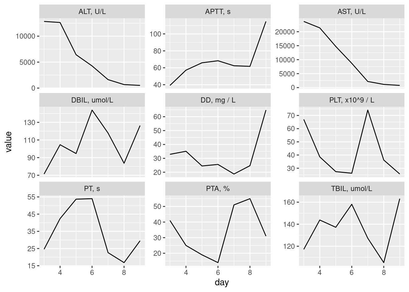
10.4 Share
Now that we have long data in the object illness_long, let’s make a ggplot plot. We’ll cut down the amount of test results to be plotted first (with filter()). Then, facet_wrap() will be used to facet the plots by the test.
This doesn’t look too bad, so long as the number of plots included is reasonably limited. There are situations where many more facets could be used but, in this case, we have lengthy labels and different y-axis scales (two things that take up more space).
While the plot above can certainly be improved, the thing we really want to be aware of is that the illness_long table (being long and tidy) was prepared for this type of plot. The only extra data manipulation operation involved was using filter() to limit the number of plots shown. Attempting to make a similar plot with the illness dataset without the reshaping is difficult with ggplot, so this pattern is essential is you do want to plot data that comes to you in a wide form.